In 1960, after completing his studies at the Chouinard Art Institute in downtown Los Angeles, a recent graduate printed up a set of business cards that read ‘Ed-werd Rew-shay, Young Artist.’
The cards were partly playful and partly serious. The text offered an accurate phonetic rendering of Edward ‘Ed’ Joseph Ruscha IV ’s first and last names; they stated his purpose and profession, even if Ruscha wasn’t entirely sure of his course in life at that moment. They also slightly spoofed the form; Ruscha’s father, Edward Ruscha, III – a midwestern insurance auditor – would have carried a calling card; but should a contemporary artist hand such a thing out?
If you received and kept one of these cards, you should count yourself lucky. In many senses, you could view Ruscha’s card as a signature example of his work. As he later said, “art has to be something that makes you scratch your head."
Such perplexing works have proven to be remarkably successful. Ed Ruscha is widely regarded as one of America’s most important contemporary artists; his canvases, often inscribed with words and sentences, sit within the world’s foremost public collections, and sell for millions, while his photographs, prints, books and multiples are praised and sought after by critics, curators and collectors alike. He has represented the USA at the Venice Biennale, twice – in 1970 and 2005 – and he continues to channel and express a certain interpretation of the American spirit that few have rivaled.
Ruscha was born in Omaha, Nebraska, on 16 December 1937. His family relocated to Oklahoma City while Ed was still at school, and in 1956, aged 18, he relocated to Los Angeles, to study art.
Initially, it wasn’t clear what type of art Ruscha would make, and what kind of artist he would become. “I was alert to the idea of going to art school, maybe being a sign painter,” he later recalled, “I came to California, and my eyes began to open once I got out here."
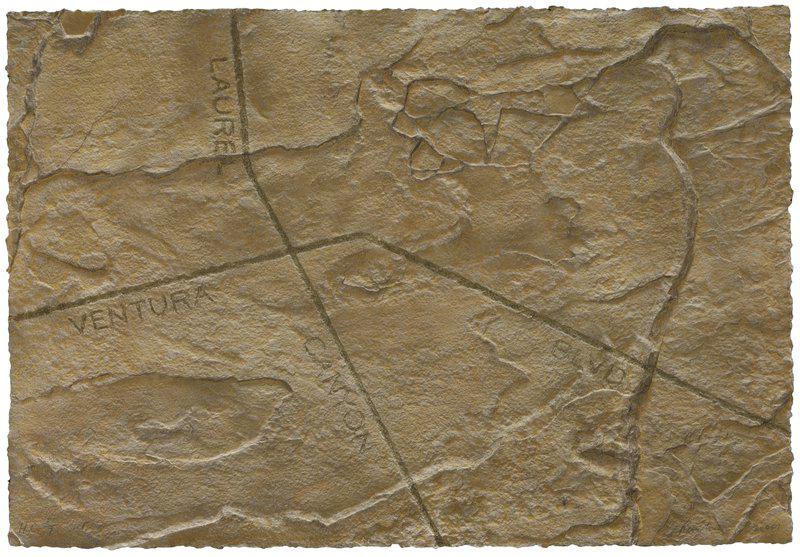
Ed Ruscha – Petro Plots: Laurel Canyon/Ventura Boulevard , 2001
In the 1950s, art schools such as Chouinard still fostered an admiration for the Abstract Expressionists , such as Jackson Pollock , Franz Kline and Willem de Kooning . The young Ruscha would have recongised their authority, but couldn’t reconcile these abstract, serene, gestural works with his love of comics, and his appreciation for typesetting, book binding, layout and design.
Fortunately, around the time he pressed up those business cards, he came across a piece of newsprint that changed his artistid direction. “I saw a reproduction in some obscure magazine of Jasper Johns ’ Target with Four Faces (1955) and Robert Rauschenberg ’s painting – the combined painting with the chicken [Odalisk, (1955-1958)]. That just sent me. I knew from then on that I was going to be a fine artist.”
Johns and Rauschenberg, American contemporary artists who guided a generation from the splashiness of the Ab-Exers towards the studied, commercial beauty of Pop Art , also shepherded Ruscha. Soon the young artist was working on knowing proto-pop works such as School Assignment (1957), a tempera-on-board work showing a tube of paint, a compass, a paint brush and a pencil – just the tools required to carry out an art-school exercise.
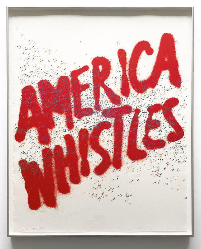
Ed Ruscha – America Whistles (Siri Engberg 84) , 1975
However, Ruscha would only truly establish his distinctly American style a few years later, following a trip to Europe. It was in France and Spain, in the summer of 1961, that the artist began to paint the first of his signature word paintings.
Unable to speak the language, he instead approached European signage in an abstract manner, painting hard-edged pictures lettered with the words Metropolitan and Boulangerie in oils on paper.
This style of painting clearly suited Ruscha that summer, though the European cultural climate did not. “After about six months, I couldn’t wait to get back. I felt like the real meat of exposure to culture depended on being in America," he later said. "I felt like there was a drive in this culture, a vitality, a real, living, breathing, animalistic happening with art and just about everything else that said ‘America is the place’."
Ruscha’s sensitivity to that drive and vitality placed him at the forefront of America’s burgeoning Pop Art movement. In 1962 his work was included in the Pasadena Art Museum’s exhibition New Painting of Common Objects, alongside pieces by Andy Warhol , Jim Dine and Roy Lichtenstein , in what is widely regarded as one of the first Pop Art exhibitions in America; and in 1963 he began to show at LA’s seminal Ferus Gallery, shortly after the gallery had debuted Warhol’s Soup Can.
His early, single word paintings, such as 1962’s Annie (in which the bubbly title typeface for the comic Little Orphan Annie rests on a yellow background above a blue panel) seems to show how how modernist abstraction, supposedly a mode of silence and renunciation, sits remarkably easily with the brash noisiness of a brand logo.
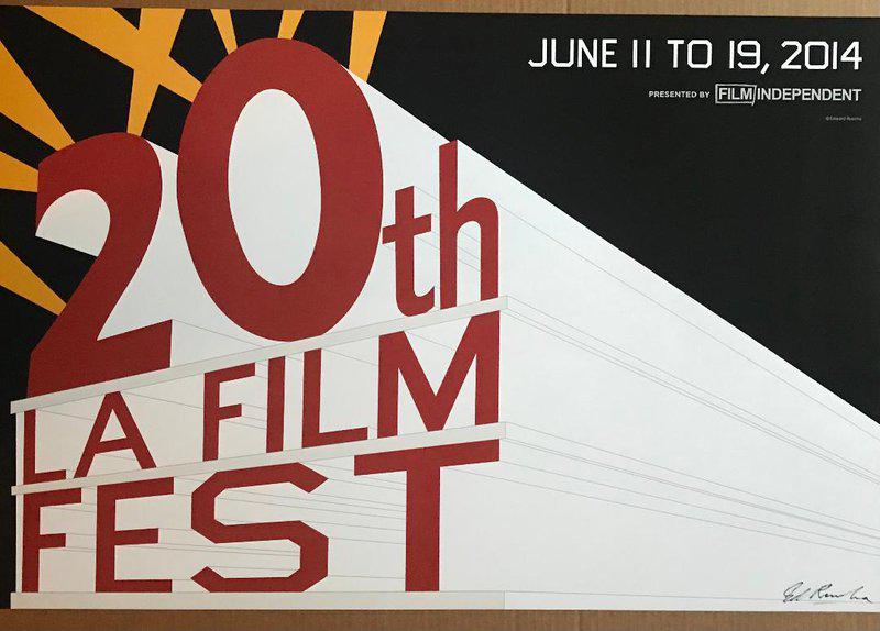
Ed Ruscha – 20th LA Film Fest (Hand Signed), 2014
Over the following years, he turned up the volume on these commercial signals, painting pictures of the 20th Century Fox Sign, Standard Oil gas stations and the Hollywood sign, while also developing his own photography, and book making as complementary artistic practices.
The artist’s gas station painting arose from an earlier photo and book project, Twentysix Gasoline Stations (1963), in which he presented black and white photos of Mobil, Chevron and Standard stations lying on the bare landscape along the stretch of Route 66 which runs between LA and Oklahoma City.
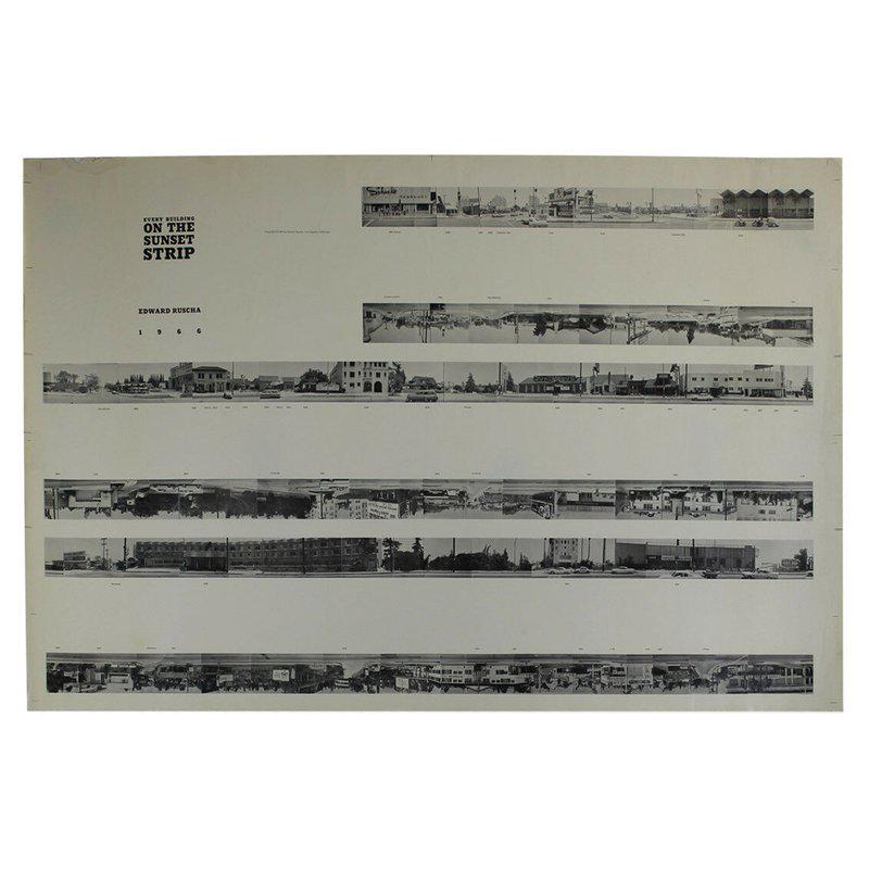
In 1966, he used a motorized camera mounted on a pickup truck to make another artist's book photographing the storefronts along Sunset Boulevard to create his 25-feet long, accordion-fold book, Every Building on the Sunset Strip.
Ed Ruscha – Every Building on the Sunset Strip 1966
 In 1967 Ruscha and his friend, the writer and musician Mason Williams even tossed a Royal typewriter out of the window of their speeding car and onto the edge of the desert highway, documenting the debris in the 1967 book, Royal Road Test.
Over the following decades fans around the world have created tributes to this project, tossing more recent consumer durables, such as an iMac G3, from car windows to photograph and publish the results. Other admirers have expressed their love for Ruscha in more conventional ways. The late British novelist JG Ballard credited Ruscha with having "the coolest gaze in American art," while the Californian writer Joan Didion said "his works are distillations, the thing compressed to its most pure essence".
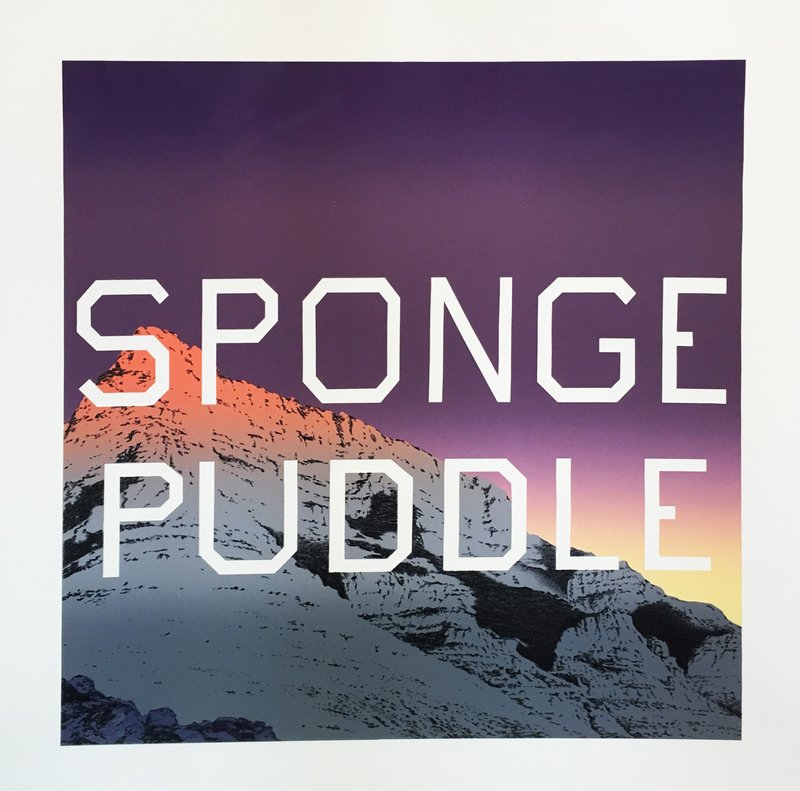
Ed Ruscha – Sponge Puddle , 2015
Ruscha’s art form part of the permanent collections of the world’s foremost museums, including the Tate, the Met and MoMA, and sits at the very center of many prestigious, private collections; in November 2018, Christie’s set a new auction record for the artist when it sold Ruscha’s 1964 painting, Hurting the Word Radio #2 for $52,485,000 in New York.
In the 1980s, the artist created his own typeface, Boy Scout Utility Modern, to use in his paintings, many of which combined text with landscapes.
His Metro Plot and Petro Plot paintings, from the 1990s and early 2000s, offer abstracted views of the LA street map, with Hollywood, Santa Monica Blvd., and Laurel Canyon snaking across the canvases, while his Mountain paintings, from the same period, depict snow peaks over which has written a range of texts.
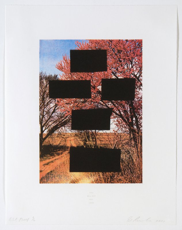
Ed Ruscha – YOU WILL EAT HOT LEAD , 2001
More recently, his Country Cityscapes series, dating from the early 21 century, combine simple bucolic scenes with series of blank boxes; the boxes' size and spacing corresponds to a menacing text which appears in the work’s title and, in smaller print, in the image's lower margin. Most of the words were written by Ruscha, but at least one is drawn on a note from a real bank robbery in Los Angeles.
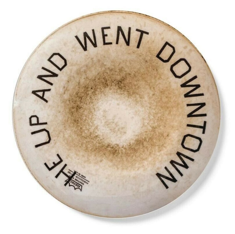
Now in his mid-eighties, the artist continues to work, producing landscapes, still-lifes, and both long and short-form text works that seem to distill the hard, simple beauty of Americana. He has used gunpowder, egg yolks and even the Sixties and Seventies diet drink Metrecal to create his works, painting pigments on satin, moire, taffeta and (most recently) discarded drum skins.
Ed Ruscha – He Up and Went Downtown , 2020
Whatever the medium, the effect is remarkably consistent. As the New Yorker’s Peter Schjeldahl once put it, to view a Ruscha work is to trigger “a sensation of being engulfed in the very soul of American language making, that intersection of mind and tongue where meaning and laughter blend.”
To see more of this always interesting artist's work, take a look at Artspace's Ed Ruscha page.


