Long associated with banality and poor taste, hotel art seems to be in the midst of a renaissance as the art world and luxury brands become increasingly intertwined. As we discussed with the Fontainebleau Hotel’s curator Jackie Soffer, top-tier hotels are increasingly coming to recognize (and invest in) the current popularity of contemporary artworks. It's in this spirit that the owner and designers of Manhattan’s Eventi Hotel brought on Art Consultant Kyle DeWoody and Associate Art Consultant Laura Dvorkin to source and install the hotel's new collection, which features works by Lorna Simpson, Alex Katz, and more cutting-edge artists.
Although young (in their early 30s), both women have plenty of experience in collection-building and talent-spotting. DeWoody founded and ran Grey Area, an art/design business that specialized in unexpected and often humorous editions and installations with a variety of au courant artists, while Dvorkin helps to manage the holdings and exhibitions of Beth DeWoody, the notable collector and Whitney board member who also happens to be the mother of Kyle. Here, the two experts give us a glimpse into the hard behind-the-scenes work that goes into building and showing a world-class art collection.
What was the mission for this project?
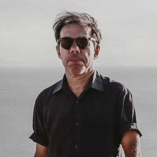
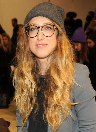 Kyle DeWoody
Kyle DeWoody: To begin with, the mission was, “This is not a normal hotel, so let’s do this right and showcase some great work.” Luckily, the owner and the other creative teams that we were working with were on board with that idea. For me, the idea was to have a real mix of established and younger artists, of hot artists and those who aren’t as trendy. The overall intention was that the work would last, that it wouldn’t be just of the moment but actually enduring.
Under the creative direction of Reunion Goods & Services, Laura and I and the design team We Came in Peace were brought into the project. They saw an opportunity to get some great pieces in there, instead of taking the usual hotel art route. I think what really pushed them over the edge was the fact that their location in the Floral District—essentially East Chelsea—was starting to become more of an art destination, with Casey Kaplan opening up around the corner and Cristina Grajales moving her gallery just a few blocks away. They agreed that this created an opportunity to make the Eventi a destination for art lovers in itself.
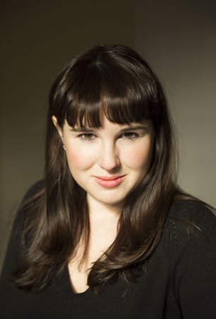
Laura Dvorkin: We took chances with the collection. We moved away from typical hotel art and introduced both established contemporary artists who are important in the context of museum collections and have exhibited widely as well as emerging artists we love who are very promising. We didn’t go with the obvious choices—we wanted things that are more challenging.
What was the scope of this project? How many works did you bring and what were the spaces that you were working in?
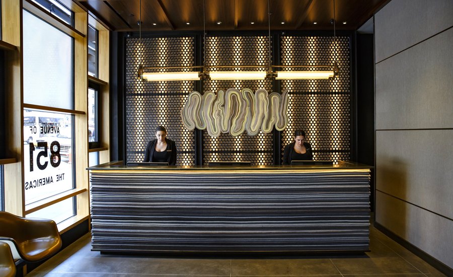
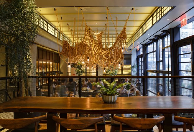
KD: I don’t have the exact numbers, but we were presented with these spaces at various stages of completion so we just went around and decided ourselves where the ideal spots for work would be. As Creme, the interior design team, finished their work and as we chose certain pieces for the hotel, we saw that some works might fit better than others. For example, once the Kwangho Lee light piece was installed it of course had an effect on the other works in the room—we didn’t need as many, because that has such a powerful presence. We ended up not doing all the spaces we thought we would, but we also did spaces we weren't planning to do.
We were thrilled that the owners were okay with that Kwangho Lee piece, because that was a big commitment. It’s not a painting on a wall that you can take down in five minutes—getting the right configuration and installing it correctly is a very thoughtful process. The whole project ended up being a very organic, collaborative effort.
LD: Kwangho Lee’s piece was actually a commission. He first came to see the space and worked with Kyle, the owner, and me, to create his vision. We finally flew him in to do the piece on site.
I worked with many installers on producing these installations—it was a first for me, because these were a lot larger than what I’ve done before. For the Kwangho Lee piece, I had to come in at 1 am every night for a week after the restaurant closed with scaffolding, five installers, and the artist. We worked until 6 am and then took everything down so at 7 am when they opened for breakfast everything was back to normal.
How much input or oversight did the hotel have? Were you on a short leash in terms of being able to assert your taste?
KD: There was a getting-to-know-you period at the beginning for sure. That stage is a little more formal, with a lot of proposals and a lot of feedback. Once we both understood each other’s vision, it started going a lot quicker. There was more trust in us to make the right calls.
LD: It can be tough to explain the value of this kind of art to other clients, but the owner really saw the importance of having a strong art collection in his hotel. As we got to know each other, I could tell right away if he was really into something or wasn’t so enthused, but in the end he wanted us and the artists to be happy with it, too. In those times where we said, “This piece is amazing, it really needs to be in this space,” he was very open to our input.
You both mentioned that you’re trying to move away from the stereotype of bad hotel art. How would you define hotel art? And how did you balance the impulse to install high-quality, sometimes challenging artworks with the need to show things that a broad range of hotel guests can enjoy and appreciate?
LD: For me, hotel art usually has a clear decorative intention, but I think the works in this collection are far more conceptual. That may be the real difference, in short. Our work is also about introducing new materials to the setting. The Kwangho Lee light installation is made entirely out of electrical wire, for instance, which adds a more sculptural element. Another example is the Tony Matelli mirror—it’s made to look like a dusty mirror by using layers of urethane. You might see a decorative mirror of some kind in a hotel, but this adds a new element because his work is very idea-based.
KD: Defining hotel art is not something I would like to do [laughs], but I guess I would say it’s something like quote-unquote interior design art, like what you’d see on HGTV—stretching fabric or framing wallpaper. I also think of ‘70s-style lithographs of French paintings in old frames, but that in itself can be really cool too. In this case, because we were building a collection, we didn’t want it to feel like it was bought to match the décor. It’s about walking that fine line between works that fit into the décor so much that they disappear and works that conflict with the décor.
I think finding good, interesting work that fits with the décor is a strength of mine. I know that’s not necessarily the best way of thinking about art, but when you’re dealing with a commercial, public space it is important. There’s a lot of great work and talented artists out there. Finding something that aesthetically fits the world we were working within was just a matter of looking at a lot of art, or in cases where we had a strong sense of what we wanted, commissioning a piece.
What are some of the highlights or big scores from this project, in terms of the works that you sourced or commissioned?
KD: That's a tough question. The first great moment was getting a piece from the Cuban artist Ernesto Leal, which was one of the first commissions we got. It was exciting because he was an artist that I had met just two months before, if that, on a trip to Cuba. It’s not a small feat to commission a work from Cuba and get it to New York—it was a fascinating process and it was cool to see that something like that was possible.
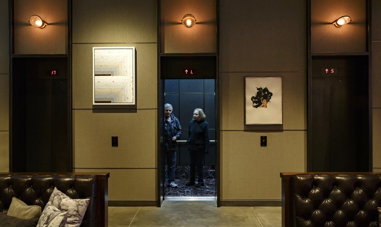
Most recently, we were able to commission Augustus Thompson to do a mural directly on the canvas material that was installed on the wall of one hallway. He’s a really exciting young artist. Finally, I was thrilled to get the Lorna Simpson in there because I’ve loved her work for years. As much as a client wants great work, there’s always a bottom line in terms of budget, so it’s always great to be able to include works of more value. It was also fun to add some light, provocative pieces, including six geometric prints that depict women intertwined in cubes by Yvaral, Victor Vasarely's son, and a vintage lingerie set hand-embroidered with Tupac lyrics by Zoe Buckman.
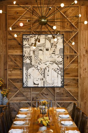
LD: Ruby Sky Stiler’s story sticks out to me. She was making figurative wall pieces a few years ago and revisited that in her recent show at Nicelle Beauchene. While she usually creates these works on a smaller scale, we needed something large to fill one of the spaces. Her process of producing our commission actually added to her new series—she started thinking bigger after making that piece for us. It was really nice to work with her during that process, and she was really happy to be doing it. It’s always great when the clients are happy, the artists are happy, and we’re happy [laughs].
KD: That piece was actually for Laurent Tourondel’s restaurant L'Amico. He was really hands-on throughout the whole process of getting all the elements of his space together, including the art. I know he was thrilled about the work and how well it fit with his space, so that made us happy too.
What kinds of things did you take into account for this project that you might not have for other, non-hotel projects?
KD: Obviously, there are more basic concerns for the works than there might be in a private home—making sure things are really locked into place, giving some pieces deeper frames so if someone’s arm rubs against it would hit the frame instead of the work, being aware of where doors open or trays are stacked, things like that. We have a large piece by Mariah Robertson that goes pretty low to the ground, so we wanted to make sure that piece was behind Plexiglas so it’s not damaged by the luggage trollies going by [laughs]. There are definitely unique things to consider in terms of the physical requirements of the space.
LD: At one point, we had to install a piece on glass—there was always the challenge of working around the different materials on the wall. You can never underestimate what hotel guests will do. We’re all so used to respecting and not touching the artwork, so it’s way different from installing an exhibition. When you put on an exhibition, you know it’s temporary. In this case, we were doing commissions and acquiring works that are going to be in a specific space for a very long time. That was a big difference too, and I think we really succeeded at that.
What’s next for you two? Is there another commission on the horizon?
KD: We are in discussions with them about potentially doing the second floor of the hotel. They’re renovating it to make it a large bar and event space. I’m super excited to see what they do, because it has such amazing bones—there’s great potential there. They’re finishing it up now, so hopefully we’ll be doing another floor soon.


