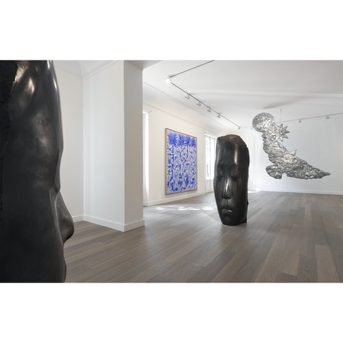
If you are even a casual appreciator of art in New York, the chances are that you have stepped into one of Annabelle Selldorf’s spaces, and been entranced. Perhaps the most coveted architect among the minimalistically inclined art elite, Selldorf has designed a broad spectrum of the city’s art sites, from the Neue Galerie uptown, steeped in Old World splendor, to the galleries of blue-chip titans like David Zwirner and Hauser & Wirth, where her tautly balanced settings at once put the viewer at ease while calling them to attention. Her buildings are special places, where one wants to return.
Born in the inveterate art city of Cologne as the daughter of a furniture-designing father, Selldorf now runs the 65-person firm Selldorf Architects out of New York City, which, together with its renowned art commissions, also produces luxurious residential buildings (10 Bond Street in SoHo, for instance), commercial flagships (the new Steinway headquarters), private homes, and other undertakings. While each of these is tailored to the specific quiddities of the site in question, an overarching architectural philosophy can be detected across them all, which, in the simplest terms, can be boiled down to a love triangle between Selldorf, the hieratic Modernism of Mies van der Rohe and Louis Kahn, and the classically decorous, cake-icing architecture of pre-WWII Europe. To a certain sensibility, the combination is irresistibly delicious.
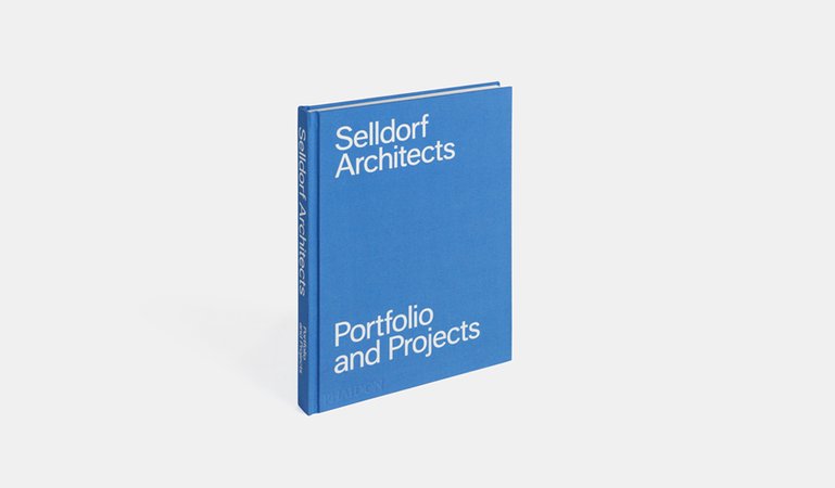
Now, Selldorf’s achievements are being celebrated in a beautifully produced Phaidon monograph, the fruits of a longtime dialogue between the architect and the celebrated photographer Todd Eberle. At the same time, one of the architect's most outsize projects, the new leviathan of an art gallery for Hauser, Wirth, & Schimmel in Los Angeles (which she consulted on), has opened to enormous crowds. To discuss the themes that run through her lifelong work, and to delve into her thinking around what makes an art setting tick, Artspace editor-in-chief Andrew M. Goldstein spoke to Selldorf about her approach, and her belief that “architecture is art—in fact it is the mother of all arts.”
Related Links:
10 Jaw-Dropping Contemporary Masterpieces by Selldorf Architects
7 Ways of Understanding Annabelle Selldorf's Lusted-After Architecture
You are famous for your terrifically elegant gallery designs, which have become sought after by the world’s top galleries as expressions of art-world sophistication. To begin, what were galleries like when you were starting out as an architect? And where did their design arise from?
In some ways it wasn’t that fundamentally different from what you see today. The contemporary galleries were white boxes—the white cube. Where did it begin? It’s an interesting question. I think it grows out of the Modernist school, if you will, and goes back to Bauhaus, to unadorned spaces. I remember galleries in Germany when I was a kid, and they were all white cubes too. Largely they have remained the same, though I think what has changed is probably the sophistication of certain aspects of the white cube.
I remember the brief was always to provide a neutral background for art. I’ve always disputed that such a thing could exist. I think “neutral” simply doesn’t exist, because even a spare context is still a context. But having said that, a degree of neutrality of course is desirable. If you think about it, having a room that’s relatively unadorned creates a quiet backdrop for looking at art. But within reason.
What I find very interesting about the white-cube convention for displaying art in a gallery setting is so divorced from the traditional histories of art, in a way, which have either been shown in grand, temple-like museums or displayed in domestic settings, such as the salons of Gertrude Stein, where it lives alongside furniture. It’s almost an intensification of the strictures of Modern architecture—an attempt to create a sensory-deprivation chamber, or to echo clichés of an abstract spiritual realm.
There are plenty of people who are uncomfortable with the white cube, and the discipline that goes along with it. And so they try to create something else. Then again, it seems to me that what the house-like exhibition you describe does is that it creates a setting within a particular taste, and people don’t often identify with that. They often lose concentration. I don’t think that it’s an issue of there being a right or wrong one, anyway. It’s interesting, too, that when you look at Old Masters, you don’t exhibit them the same way that you would contemporary art or Modern art.
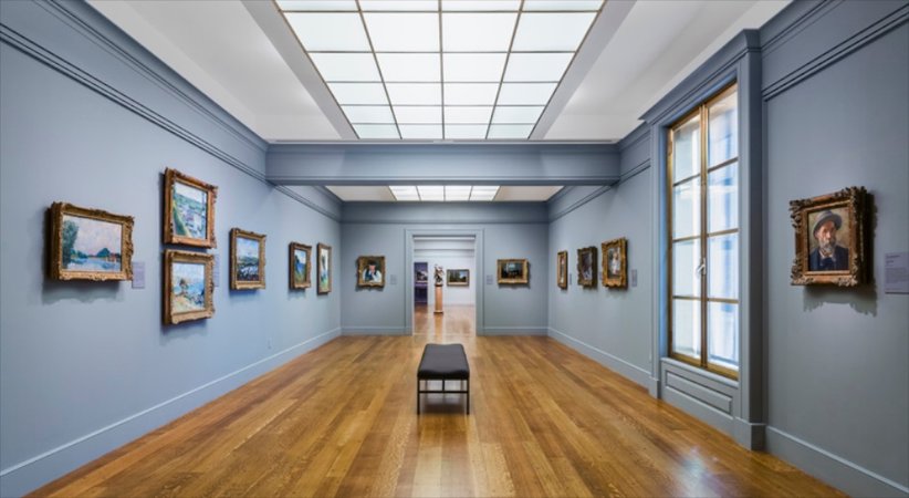 The Impressionist galleries at the Clark Art Museum in Williamstown
This of course is something you have experience with at the Clark, where you married rich, classical wooden floors with concrete features and a modern-looking gridded ceiling. How is the proper setting for an Old Master painting different from that for a Neo Rauch or a Richard Serra?
I can’t totally generalize about that, because I think, to begin with, that it depends on the exact pieces that are in there, and it depends on the given space. It’s never quite as simple as that. I think you always have to go a little bit deeper. [Laughs] I’m chuckling because I know that’s not a fully satisfactory answer, but I think I’ve always said that: “It depends.” I do believe that every gallery space we’ve designed is different from every other one, and they’re different because they are specific.
They work to a specific set of conditions above and beyond the fact that they are art galleries—they each have to do with the kind of art that gets exhibited, the type of building that the gallery is located in, whether it’s new constructions or fits into an existing thing. At every turn you have to reexamine all of the aspects and components that come together. I would like to think that they are specific to the way a particular gallery thinks about installing art and thinks about their visitors and their clients.
Going back to the white cube for a moment, one thing that is kind of funny, in a way, is that as gallerists further divorced themselves from lived experience by making their spaces more and more minimal and austere, their collectors began to reshape their homes to mirror the aesthetic of the gallery space, leading them to live in ultra-minimal, white-cube settings themselves.
Well, I think that’s a little bit of a two track situation. I think it’s not just collectors. I think that with the introduction of Modernism in the early 20th century you found a great many more unadorned spaces, and they in turn lent themselves to the viewing of contemporary art. If you look at early Mies van der Rohe houses, like the Tugendhat house, that’s really very interesting because there’s this eclectic mix of old rugs and antique furniture together with a very Modernist interior.
To me, it’s always interesting when that kind of building does both. I’m not so interested in the exclusion of one style or the favoring of another—I’m interested in finding a balance and support and harmony for the art when we’re showing it. To that end, I don’t think it’s so much about dogma. But, have you been to Frieze Masters?
Yes, I have. I know you designed the decorous setting the fair uses in Regent’s Park.
Last year, there were one or two galleries that transformed their booth on the inside to look like it was another era within which they were showing their art. And I thought it was sort of a strange and somewhat willfully sentimental change of the space that I felt wasn’t credible. Where I’m going with this is to say that some things don’t lend themselves to be anything other than Modern, and other things can only work in Modern settings.
Like, take the Acquavella Gallery—it’s very much a testimony to the time in which that space was built, and yet, they’re perfectly able to show Modern and contemporary art in the walls they’re in, and we’ve managed to create a calming balance of the different architectural elements for the viewing of art. Whereas if you looked at Hauser & Wirth on 69th Street, there we had the opportunity to build a space more or less from scratch, and that space is much, much more contemporary, and yet it is proportioned and conceptualized to be in sync with where this building is located, the size of the surrounding spaces, et cetera.
Stylistically—and I hate that word—they describe two very different natures of a space. You have to somehow find truth in the process.
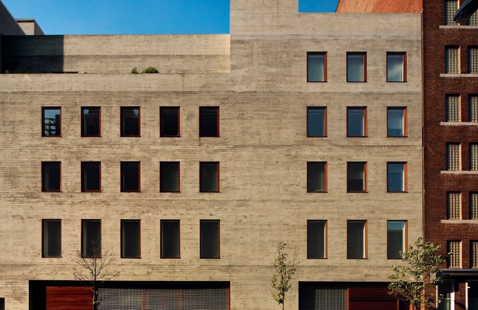
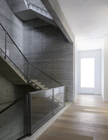 Above, David Zwirner's 20th Street gallery; below, its staircase
Your Acquavella gallery is a gorgeous space, with its stately staircase and abundance of marble but at the same time it has very Modern touches in terms of details like the visible track lighting and the furniture. This is what I especially enjoy in your spaces, the fact that you create a delicious tension between incredible luxury and raw, Modern materials that tend to be somewhat industrial in feel. For instance, at your David Zwirner Gallery, you somehow made the concrete on the walls of the staircase look like velvet—it’s unexpectedly decadent. There’s often a push-and-pull balance between the modern and classical, and between hard, rectilinear structures that are softened by curved elements or warm materials. How did you arrive at the kind of style?
Well, bottom line is, I don’t think that it’s a style. Bottom line is, it’s a way of going about what you do. I think I talked a little bit about the desire for specificity in how you approach something, and at the end of the day, you take that as far as you want. I sort of feel like in our work we try to have two opposing pressures against one another, or we could also call it tensions, whichever makes it more visual for you.
But on one end of the spectrum is the desire to do the most with the least, and on the other end of the spectrum is the full engagement and the passion and the love for the wealth and richness in any material. So, I’ve been accused of using cooking as an analogy, but I think that there’s a little bit of truth in the comparison. I like to use few ingredients and think that you get more taste out of, or more pleasure out of, a single element rather than mixing many of them.
Are there any architects or architectural periods or buildings in particular that entered into the groundwater of your architectural approach?
Well, look, I’m German, so how can I escape the great Baroque architects? And then go to [19th-century Prussian architect Karl Friedrich] Schinkel—I think these are things you just can’t avoid absorbing in your understanding of culture. What you’re talking about is interesting because some part of the answer might be intellectual or personal, but I think some unconscious part of it is simply the makeup of our intellectual disposition, if you will. And that’s why I said, “Look, I’m German.” So, the sturm und drang of artists like Schinkel is something that I think is extremely interesting.
Are there any of these great settings across history that you think of frequently, or that you view as a kind of useful paradigm?
What happens to me is that I find there are many. One is impressed or is influenced by things that you’ve seen in the course of your life. I will never not think about that big, grand room in the Accademia in Venice where you have those fantastic Venetian paintings of a different scale, and where the scale and proportion of that room is simply incredible, and how you enter it, and everything about it. Its materiality is a part of it as well.
But then you also have to think about the Pinacoteca di Brera in Milan or the Kunsthistorisches Museum in Vienna or, I don’t know, there are so many great museums and so many great places that it’s hard to single any out. Now the Art Institute in Chicago comes to mind. And I never quite know what is it that attracts me so much. Is it the art? Or is it the space, or how you move around in that space? Probably it’s a combination of both.
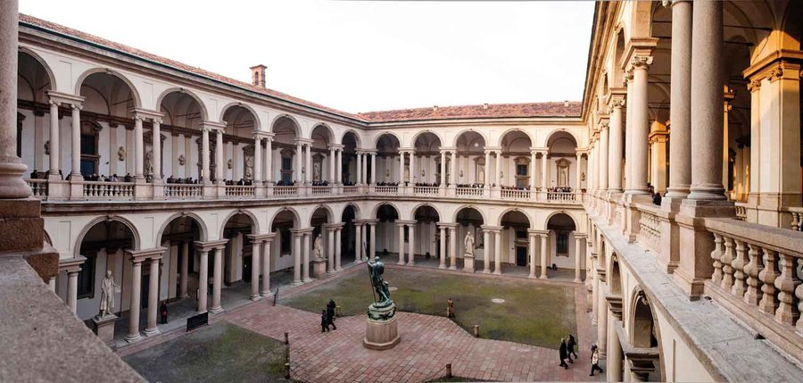 The Pinacoteca di Brera in Milan
What is it that you like to feel when you walk into a space to see art? What do you want the architecture to do?
Again, it’s not one thing. What pops in mind for no particular reason is one of my most favorite exhibitions of all time, “Bronze”at the Royal Academy four years ago. The space was dark and very dramatic, and the bronze was very dramatically lit. Everything about it was great. The way the pieces were installed, the way they were juxtaposed to one another, the way you were led but allowed to go back and forth. And I don’t know that I would have done the same thing, but I thought it was absolutely amazing.
Generally speaking, I like artworks not to be a spectacle, but to be allowed to be discovered and sort of calmly appreciated. But that should by no means indicate that you don’t have to create moments of tension and strength. And some of that is intuitive, and a little bit of it has to do with experience.
I know that Roman architects were building spaces for contemplation, the convention was that they needed to be marked by moving water, shade, and greenery. Are there any elements that you feel are conducive to taking in an artwork?
I always think that light is incredibly important, and I’m a big fan of daylight. Traditionally, many museums and galleries did without daylight, but I think that in the presence of daylight we know how to locate ourselves, and it gives us a sense of grounding, so I tend to think that whichever way you can introduce daylight such that it doesn’t get in the way of things, it is a good thing.
At the Clark for example, we have windows that allow you to look into the garden and so you have the different aspects of the appreciation of nature together with the appreciation of art. But in an urban circumstance, that may not be what’s necessary. I think also abstraction of daylight often nowadays gets pushed too far, where daylight is so completely abstracted that it’s no longer daylight. It becomes something else.
You mean through protective screens and different kind of window treatments?
Yes. For example, there’s no better daylight than at the Menil Collection in Houston. It’s just absolutely awesome, because you feel that you’re in a real atmosphere. It may also have to do with the courtyards that are a part of it. But, yeah, I think daylight is really the key to everything.
What about wood? How does the warming presence of wood impact the art experience?
I don’t know. I think not specifically. You can imagine in a curated exhibition somebody might say they want to have wood paneling on the walls. Where the floors are concerned, I can see different arguments for this, that, or the other material, from woods to stone to concrete to Terrazzo. It depends on what the situation calls for.
For example, at Hauser & Wirth in London, we were very lucky to be able to give one gallery a concrete floor, which is terrific for installations of a particular scale, and to give another gallery there a beautiful white plank-wood floor. Woods that are light in color create a slightly more domestic, or warmer, surrounding, and so in certain situations that may be desirable. But, it’s not something that I would think as a specifically necessary thing.
So, it’s not like paintings look better when there’s wood and sculpture looks better on concrete or something like that?
No, I don’t think so.
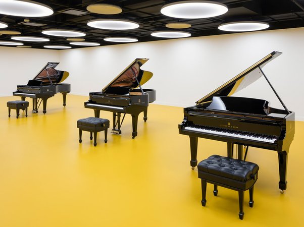 The Steinway headquarters
To change topics a bit, in your Phaidon monograph you mention that we are going through a period of the “banalization” of architecture “in a culture that is almost exclusively based on images.” Can you elaborate on that a bit?
Well, I think it’s true for architects, and I think it’s true for a lot of things. We process so much information that our way of approving or disapproving of things is largely based on a quick assessment. In architecture in particular, with the onset of photorealistic renderings, people are led to think that all they have to do is look at something and say, “I like it,” or “I don’t like it,” without giving much consideration to what something does and what the issues at stake are.
So, what I think is fantastic is that people are more interested in architecture than they were before, generally speaking. What’s perhaps a little bit less good is that unlike, say, I don’t know, mathematical philosophy, you wouldn’t think that you can just understand what architecture is by looking at a few pictures—you’d have to appreciate that there is a lot more to it.
I think it’s really hilarious that people think that the difference between you and I is that, if you were to spend the time, you could just make a drawing of a house, and that would be reasonably easy, right? You could say three windows on that side and four windows on the other, however you make that decision, whether it’s because you like the exterior elevations to have a regular appearance or whether you like for the outside to be true to the function that goes on inside. But, it’s just a lot more than that.
Suffice it to say that in an image-driven society where everybody is constantly on Facebook, Instagram, or on the Internet in general, you can see everything. I cannot say how much I believe that seeing is important. But, I also feel that in the big picture, architecture is more than just what you see at a glance.
The way we view art has changed dramatically over the past few decades, thanks in part through the global proliferation of smartphone cameras and the rise of selfie culture. A commonly invoked example of this change is the Mona Lisa room at the Louvre, where visitors jockey for the best photo position and then leave, with the idea that the image can be viewed at leisure later on. Most people in this circumstances seem more or less uninterested with the “aura” of the objects before them, or their patina or craquelure. As an architect who makes spaces for viewing art, how do these considerations enter your thinking?
For me, it’s not something that I want to think about, because it’s distracting. I like to think about how you can get past these things. Do you know what I mean? Another person’s approach might be to say, “I have to really understand what fosters this tendency.” But I just avoid it. Is that a lame thing?
I think there are architectural solutions, though, because there are some places where it just doesn’t feel appropriate to act so brusquely with the art, places where it’s less of a mass experience. For instance, the Frick, where everything is quiet and hushed and there aren’t that many people, is very different from a place like MoMA, where so many of the non-gallery spaces feel a bit like an airport, meant to accommodate huge visitor traffic in a way that gets them through as quickly as possible.
I think that’s true, but it’s also a bigger topic than just architecture. It’s the question of the spectacle.
You mentioned before how the pervasiveness of images on social media and the Internet is beginning to impact architecture, and it’s also starting to prove a competitor for museums and other art spaces, because so much can be seen without leaving ones home. As a result, museums are charged with the challenge of making it urgently necessary for visitors to be present in the physical site. Some are trying to use spectacular architecture, some are using live performances and other time-based attractions that live in the space. Others are attempting a hand-holding approach, through educational apps like the ones the Brooklyn Museum is offering to allow visitors to have live question-and-answer sessions with curators, but only within the building. Have you been watching these developments? Has it been playing into your thinking?
Not really. I mean, in a general way, probably. I think it’s very interesting how people use architecture as a point to jump off and do different things, right? I wonder why that is, because I feel that there is so much to do in real architecture—I mean architecture in the traditional sense. It probably sounds terrible to say, but it just seems to me that different generations have to deal with different issues in new and other ways. It’s a part of their differentiation, and it’s totally interesting. It’s just not where I work from.
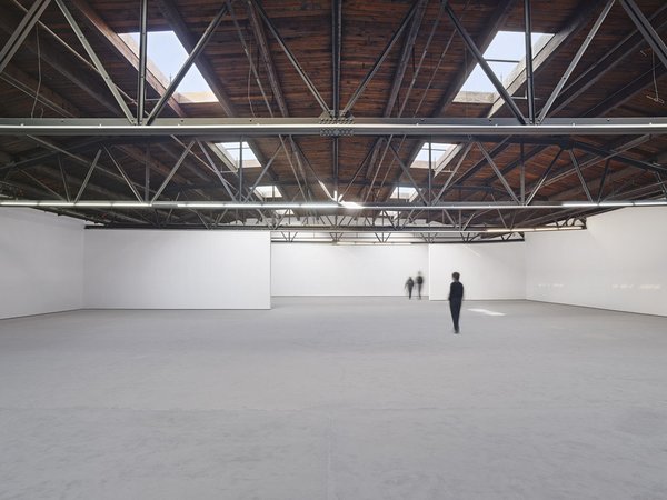 Hauser & Wirth's space in the former Roxy building
Now, Hauser & Wirth is in the process of relocating from their gargantuan space in the former Roxy, which has sometimes been criticized for overwhelming the art with its sheer scale, to a new, purpose-built five-story gallery of nearly 32,000 square feet that you are building for them on 22nd Street, set to open in 2018. What does a five-story Chelsea art gallery look like?
Well, there’s already a David Zwirner gallery that’s five story tall, which I built. And five stories is an interesting thing. For me, it’s not so much about what it looks like but rather how it functions, and if you think that a gallery is a public space then you have to make it possible for people to enjoy five stories. Galleries are free, open, public spaces, really, right? And so, it has to do with the street. Making the gallery available from the street is extremely important to us, both at Selldorf but also at Hauser & Wirth, because there’s this connection and a sense of community in bringing art to the city, and allowing people to have an interaction with art in a very direct and welcoming way.
So, now there’s the opportunity to create a skylit gallery space, but what goes along with that idea is that it’s on top of the building—it’s high up, relatively speaking, because in between are other functional things that have to happen, such as showrooms, offices, workshops, libraries, and things like that. The way we went about it is to say five stories is probably more than everybody will get to via a stair, so we have to have a comfortable elevator that runs everybody up and down, but we also wanted a staircase, so the staircase is very important. All of this to say that the interior of the building will emanate to the outside.
The façade is interesting because it talks about what’s going on inside, and at the same time it fits because it’s in a mid-block condition. It fits very elegantly, I think, between 548 West 22nd Street, the old Dia building, and its neighbor to the east. I always think that buildings, any buildings, especially art buildings, have to somehow have to have an urban presence, and that has to do with what I just talked about—that you’re welcoming and that you’re bringing people in, because this is quintessentially a public space.
You achieved that sense of welcoming the visitor from the street at the current Hauser & Wirth on 18th Street, where the Martin Creed staircase visible through the large glass front doors is a very attractive portal that beckons you in. Will the new building have a similar kind of impressive art corridor, or art entrance?
Well, you’re going to just have to wait and see.
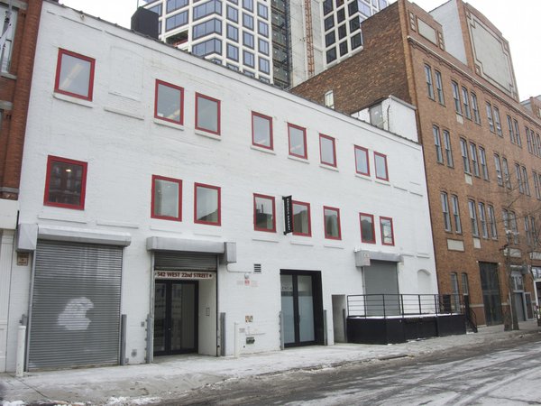 The next Hauser & Wirth site in Chelsea
Your upcoming Hauser & Wirth space in Chelsea seems to exemplify an architectural shift in the way that galleries are approaching Chelsea. For a long time, the neighborhood’s allure for dealers was that it was an old manufacturing hub with huge, vaulted street-level spaces that were great for showing art and affordably priced. Nowadays, because the price of real estate in the area is going so sky high, many of the middle-tier galleries are fleeing, while the top blue-chip emporiums like David Zwirner, Hauser & Wirth, and Pace have begun building these enormous, multi-floor facilities that actually have more in common with museums than with galleries. This is particularly evident in the new Hauser, Wirth & Schimmel space in Los Angeles, which sprawls across a 100,000-square-foot former flour mill, and is run by former MoCA curator Paul Schimmel. What is going on here, exactly?
What you’re talking about is an interesting phenomenon, because a lot of it has to do with the cost of real estate. The galleries are fleeing because their rents are rising, but the larger galleries were able to purchase their space, and that is really the important thing. If you own something, you can say, “This is where I am going to operate from, and this is where we’re going to stay.” So, it’s an investment, and that gives a level of seriousness to the whole situation, which is why you can then say, “Ok, let’s make different kinds of exhibitions.”
Zwirner, Hauser & Wirth, Gagosian, Pace, all of them are doing these museum-like shows because they’ve taken a different attitude to showing art, and they’re providing a new context. I keep saying that what’s remarkable about this is that these shows are totally available for everybody, free of charge, any time during gallery hours, just to take the edge off the work that they do with emerging artists.
So, it’s interesting because it has to do with economy. Of course it does, and there you go. It’s kind of interesting, too, because it influences the spaces and how they’re made and come together.
If you think about it in terms of public space and of creating something like a mini-museum, well, then museums tend to have educational facilities, they have gathering spaces, sometimes they have dining options, sometimes they have other kinds of facilities like coat-checks. Are any of these elements going to work their way into the upcoming Hauser & Wirth building?
Yes, is the short answer. Some of that. And that already exists in a lot of galleries now that the galleries publish their own catalogues, so they create a kind of bookshop where people can stay on and browse, and at Hauser & Wirth there’s the Roth Bar, which is a terrific space for people to come together. But you’re right, elements like this will find their way into it, and a lot of it has to do with letting people spend more time with the art and spend more time coming together in these places.
At the same time, as museums are losing funding and struggling to maintain their autonomy, these kinds of buildings project a future where a lot of people step into things that look like museums but are really self-interested selling contexts, which is a very different kind of thing. What does it mean when the museums are actually selling galleries?
That’s a long and complicated discussion, because it has to do with more than the architectural implications—it’s really about what’s possible in a museum, what’s possible in a commercial art gallery. For us, it’s been a fantastic experience, because the spaces that we make are done with a great deal of consideration about long-term planning. I think that’s a good thing.And I’d like to do more museum spaces, because I really think that they are important cultural institutions.
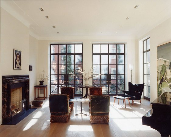 David Zwirner's East Village townhouse
Now, you’ve designed beautiful galleries for some of the world’s top dealers, and at the same time you’ve also designed residences for the gallerists themselves. David Zwirner, Christophe Van de Weghe, and Per Skarstedt, for instance, are among your residential clients. I wonder, when these people work with art all day long in their exactingly designed art galleries, what do they want to come home to in their residences?
That’s a good question, actually. I think the great thing about working with many of these people is that one speaks the same language and uses the same references. All of them, in addition to selling art, collect art. They’re all art fiends. That’s what they do all day long and that’s what they like to talk about and that’s part of their life. So, in working with me, or working with Selldorf Architects, there is that ongoing dialogue that continues in the private realm, and it has to do with the things that we see and experience. But on some level, it’s also about making a home for someone who travels all the time and comes home after buying things and needs to have things on their walls and so forth.
I’ve never actually thought about what you’ve just said before, but I feel that in addition to this being this specific activity, it also is testimony to the great relationships we have and that I’m extremely proud of, because when you work on someone’s home you get to know that person very well. And so, there’s a kind of intimacy and friendship and dialogue that one has to have with one another that’s really great.
Would these spaces be interchangeable?
Not at all. No. They are as specific as everything else that we do. And I think that’s a very important thing. If all the galleries we did looked the same, I don’t think we would be working with the caliber of people that we work with. I think it’s because what we do is very, very specific and very personal.
Art people are so obsessive about their passions, I wonder if in other fields a banker would want his house to look like a bank, or a musician would want his house to look like a stage, and so on.
I love that you’re asking that question because I think that makes a perfect graduate-school thesis—what would a house for a banker look like? I’m afraid the reality of it is not nearly as interesting as a theoretical questions.
It’s like people who look like their dogs.
Oh, people do look like their dogs! Have you noticed that?
It’s really funny.
It is uncanny. I have a dog, and my partner and I both look like our dog.
I wonder which came first, the chicken or the egg.
I don’t know.
Coming to a close, you worked with the great architectural photographer Todd Eberle on your Phaidon monograph. How did you come to select him as the photographer and what was that process like?
Todd is a friend of many, many years, and we’ve always wanted to do a book together. So when this one came around, I called him up and said I really want to work with you and finally realize this idea that we had literally 15, 20 years ago to do a book that’s a little bit different than just a presentation of projects, but that is really a presentation of Todd’s way of looking at architecture. He liked the idea still, and off we went.
Finally, did you design your house?
My apartment? I did, yeah.
Is it an art-filled expanse? Are you like the dealers that you work with in terms of being an obsessive art collector?
I’m not an obsessive art collector, but I am—what’s the word—an amasser. You know, you realize that it’s part of growing up and becoming older is that you’ve been around for a long time and, all of a sudden, you have a lot of stuff. So, the short answer is, yes, my house is full of art. And, I love it, and it’s inspiring to me and it’s fun to see how things come into your life and become part of your life. So, it’s amusing.


