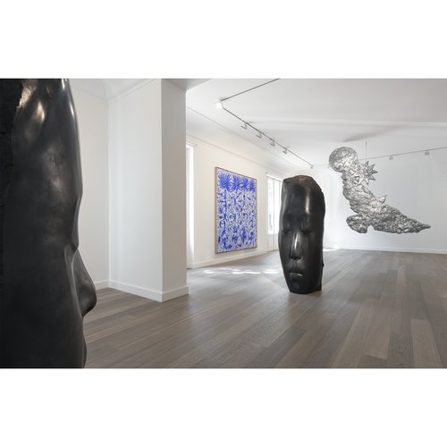
Abandoned spaces are complicated, especially in relation to the art world. While an artistic makeover can revitalize a decrepit and forgotten building, if the renovation takes place in a working-class neighborhood, it often creates a gentrification ripple effect (also known as “artwashing” ). It’s certainly important to take a critical look and consider the larger picture when admiring dying architecture that has been brought back to life. Author Dan Barasch does just that in his new book Ruin and Redemption in Architecture , which examines the scale and diversity of abandoned buildings internationally, and how their transformation has the power to change lives and communities. Here, we’ve excerpted five of the most extraordinary art-related transformations from the book.
 Ruin and Redemption in Architecture
is available on Artspace for $59.95
FONDAZIONE PRADA
(Former Gin Distillery)
Milan, Italy
OMA, Transformed 2015
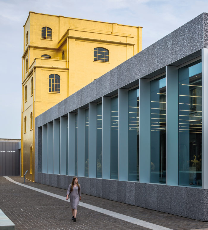 Fondazione Prada, image via Design Curial.
A gin distillery was built in the 1910s on Largo Isarco in the industrial zone of Vigentino, south of the center of Milan, but later abandoned. Though left in disrepair, the original warehouses, silos, and laboratories remained on the site, which lay adjacent to a train station and offered a unique set of contrasting scales and spaces. Inspired by the rawness of the site and its location on the outskirts of Italy’s fashion capital, Fondazione Prada determined to transform the area into an arts center. To re-envision the space, Miuccia Prada and Patrizio Bertelli, the cofounders of Fondazione Prada, turned to longtime collaborator Rem Koolhaas of OMA and his firm’s research arm, AMO. The Fondazione—focused as it was on moving beyond the realm of fashion, and dedicated to art, film, philosophy, and other disciplines—had been holding contemporary art exhibitions in abandoned warehouses and churches since 1995. Recognizing both a need to permanently house the couple’s art collection and also to fill a void from lack of public support for cultural institutions across Europe, the Fondazione purchased the land and funded the entire project.
Koolhaas’ design creates a diversity of spaces for presenting art in a variety of media. A nondescript building, nicknamed the “Haunted House” by Miuccia Prada herself, was dramatically transformed by encrusting it in 24-karat gold leaf, leaving only the glass of its windows exposed. The reflective gold material offers a glittering counterbalance to the gray landscape of adjacent historic buildings and the Milanese skyline. The luxurious color stands as an iconic beacon of the renewed space, despite its relatively inexpensive material cost. The exteriors of other buildings are left largely untouched while yet others are reconfigured to merely appear untouched, balancing the introduction of new materials of glass, concrete, and aluminum.
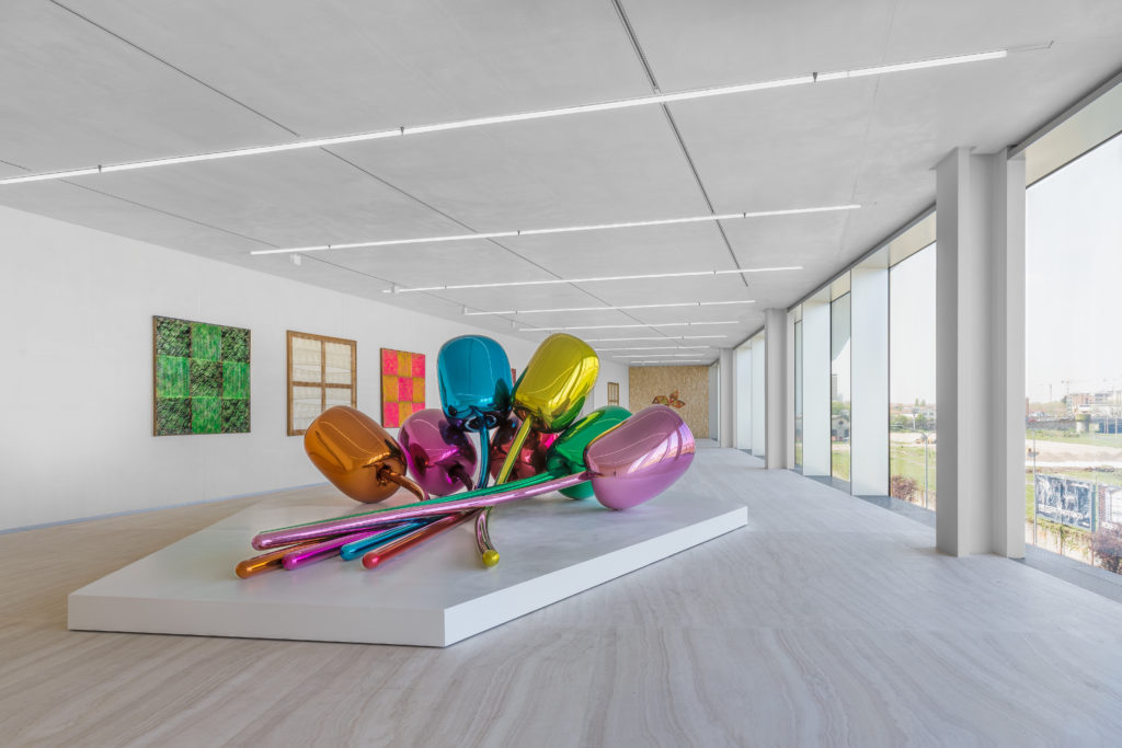 Exhibition view of “Atlas” at Torre – Fondazione Prada, Milano. Photo by Delfino Sisto Legnani and Marco Cappelletti. Courtesy Fondazione Prada. Image via Artnet.
OMA created three new structures on the campus, which encompasses 120,000 square feet (11,100 square meters) of exhibition space: a two-level gallery space, the Podium, and a multifunctional auditorium, the Cinema, both of which opened in 2015, and a new nine-story tower building, the Torre, completed in 2018. Bar Luce, a candy-colored café designed by filmmaker Wes Anderson, offers references to Milan’s nineteenth-century shopping arcade, the Galleria Vittorio Emanuele, and manages to cultivate an environment that allows visitors to feel as if they are part of a movie set.
Notably, there is not a Prada backpack or a couture item for sale—a conscious decision by the Fondazione cofounders to downplay any corporate branding and commerciality that might have tempted others. The complex therefore manages to focus entirely on the display of ideas and creative expression, without explicit traces of the venerable fashion house behind it. The space hums with an unshakable spirit of utilitarian beauty—much like Milan itself, much like the original distillery buildings, and the designers behind it. While Milan has long been recognized as an international center for fashion and furniture design, the introduction of the Fondazione Prada has now created a global destination for contemporary art as well.
TATE MODERN
(Former Bankside Power Station)
London, England
Herzog & de Meuron, Transformed 2000
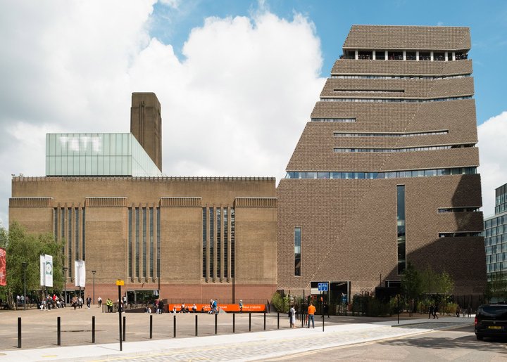 Photo of Tate Modern by Jim Stephenson. Image via Tate.
Originally built in 1891 to supply electricity to the City of London, Bankside was designated during World War II to become London’s only oil-powered electricity power station. City officials commissioned the designer Sir Giles Gilbert Scott, who was then well known for having designed iconic London structures such as Battersea Power Station, Waterloo Bridge, and the red British telephone booth. Opening in 1963, the new Bankside station was envisaged as a “cathedral of power,” underscoring the vaunted role of electrical power in twentieth-century urban society and architecture. It was vast and imposing, with a central chimney nearly 325 feet (100 meters) tall and its main bulk extending 650 feet (200 meters) long with a grand turbine hall at its core, a boiler house to the north, and a switch house to the south. Public discomfort relating to its proximity to St. Paul’s Cathedral—which sat just opposite, across the River Thames—led to requirements that the power station be 50 feet (15 meters) shorter in height than the cathedral.
Decommissioned as an electricity generation facility in 1981, Bankside fell out of use for over a decade. The surrounding Southwark neighborhood continued its decline, with a postindustrial sense of dilapidation throughout the 1980s. Acquired by the Tate Gallery in 1994, a design competition led to the selection of Herzog & de Meuron for its repurposing into a gallery of modern art. Inspired by both cost constraints and its awe-inspiring scale, the redesign included retention of the core original structure and few grand alterations. Stripping the building back to its bare steel-and-brick frame, the huge machinery and roof of the main turbine hall, together with the roof of the old boiler house were removed, allowing the previously dark power station to be drenched in natural light. The main turbine hall was gutted for installations, while the building’s separate parts house galleries of varying sizes. The two-story, glass extension on one half of the roof and the rooftop “light beam” bring twenty-first-century modernity to the brick structure, enhancing and lightening the behemoth rather than radically adapting it. The turbine hall becomes a main plaza to the unpretentious exhibition spaces, where no gallery is privileged over any other. A long ramp in the entrance hall adds an ethereal effect, both inviting visitors into a grand plaza and reminding them of the scale of the building.
After opening in 2000, Tate Modern welcomed 5.25 million visitors in its first year—immediately doubling the foot traffic of all three existing Tate galleries combined (the original “Tate Britain”, and outposts in Liverpool and St Ives). This overwhelming popularity led to an expansion into the Tanks and the Switch House in 2016—again, redesigned with a light touch by Herzog & de Meuron—allowing for a diverse array of exhibition, installation, and event venues. Today Tate Modern is one of the largest and most visited modern art galleries in the world, and has led to a dramatic transformation of Southwark as a cultural destination. It represents the quintessential transformation of the postindustrial age: a “cathedral of power” becoming a “cathedral for modern art.”
ZOLLVEREIN KOHLENW
ÄSCHE
(Former Zollverein Coal Mine)
Essen, Germany
OMA, Transformed 2007
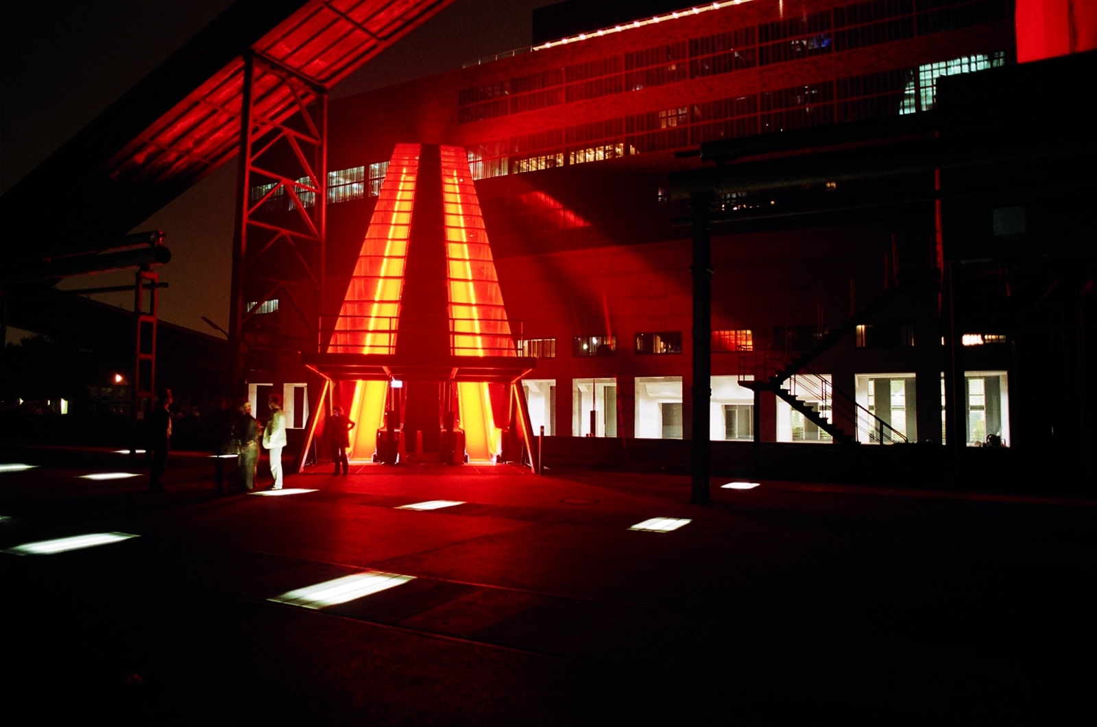 Zollverein Kohlenwäsche. Image via OMA.
First built in the western German city of Essen by industrialist Franz Haniel, the Zollverein coal mine produced coal for over a century, from 1851 until 1986. Over time, it expanded significantly, becoming the largest coal mine in the world with an impressive array of buildings, railways, mining shafts, coking plants, and even housing and consumer amenities. In 1932 a new coal-washing facility known as Shaft 12 was opened. Designed by architects Fritz Schupp and Martin Kemmer, it immediately received attention for its Bauhausinspired design. Its simple, Modernist, cubical structures reflected the significance of the coal industry for the rapidly growing German nation. By the outbreak of World War II, the mine was producing 3.6 million tons of coal annually and its twin-trestle winding pit tower became a highly admired landmark within the region.
The process of coal production was modernized and consolidated throughout the twentieth century, resulting in the mine’s owners voting for its closure in 1983. Though the 250-acre (100-hectare) plot was abandoned as an active site of coal production in 1986, the state of North Rhine-Westphalia purchased the entire complex as a site of historical significance, worthy of preservation and repurposing. The site lay unused into the 1990s: grasses and meadows began to slowly reclaim its steel-and-brick buildings. In 2001 it was named a UNESCO World Heritage Site and local authorities focused on transforming the abandoned mine into a center of art and design, as well as a showcase of German industrial history.
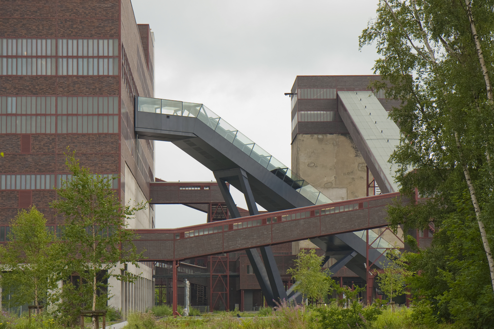 Zollverein Kohlenwäsche. Image via OMA.
In 2002 Rem Koolhaas and his team at Office for Metropolitan Architecture (OMA) were selected to redesign the former mine. Over the next eight years, OMA’s master plan for redevelopment was set into motion, using the rail tracks between the coal mine and production facility to connect the various buildings to each other and to their natural surroundings. Remnant structures were transformed, becoming spaces that blended modern fixtures with the rawness of the original site and evoking its former industrial use. The Kohlenwäsche, or coal washery, was repurposed into a visitor center accessible from large outdoor escalators, illuminated with glowing orange light to remind visitors of the mine’s fiery past. Transformed into a cultural destination with an industrial-heritage museum, a design museum, exhibition spaces, creative studios, restaurants, a theater, and even a recreational pool, Zollverein today draws over two million visitors annually.
In 2007 architects Heinrich Böll and Hans Krabel worked with OMA to design the Ruhr Museum on the site of the former powerhouse, which focuses on the natural and cultural history of the Ruhr region and its coal mining history. As Germany joins other nations in attempting to decrease its production and consumption of fossil fuels, the museum takes on added significance as a key to the country’s historic dependency on coal energy. Capturing the imagination of visitors several generations removed from the industrial era, Zollverein’s vast grounds, rail yards, and buildings offer a valuable insight into Germany’s past, and a hopeful narrative on the power of design.
STONY ISLAND ARTS BANK
(Former Stony Island Trust and Savings Bank)
Chicago, IL, USA
Theaster Gates
, Transformed 2015
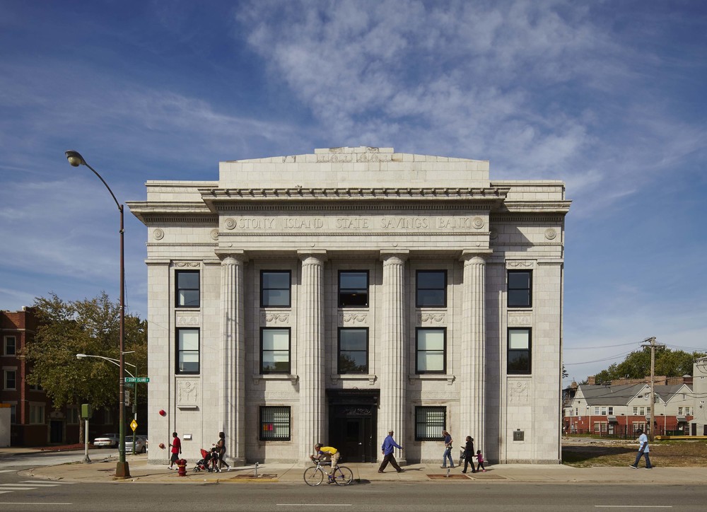 Stony Island Arts Bank. Photo by Tom Harris. Courtesy of Rebuild Foundation.
On the South Side of Chicago, the Stony Island Trust and Savings Bank Building was constructed in 1923. A symbol of the growing prosperity of the neighborhood’s middle- and working-class community, the bank was built in Classical Revival Style by architect William Gibbons Uffendell, featuring great fluted columns and evoking the feeling of a modern temple. The 17,000 square foot (1,580 square meter) building was designed with a twostory arcaded hall for bank tenants, with a grand, coffered, barrel-vaulted ceiling overhead. The third floor, built for rentable office space, featured elegant wood-and-glass-lined corridors and rooms.
Hobbled by the Great Depression, the bank itself was out of business by 1931. Over the next few decades, a succession of banks purchased and sold the building while major demographic and economic changes took hold in the surrounding area. By the 1970s Chicago’s South Side had been transformed into a predominantly African- American community, while a lack of investment in the neighborhood led to significant deterioration and demolition of local buildings. In the 1980s, the building had been vacated, and was abandoned for nearly three decades.
In 2012 local Chicago installation artist and urbanist Theaster Gates and his nonprofit organization, the Rebuild Foundation, purchased the building for one dollar and set about transforming the space into a community amenity to house a new kind of arts organization. Building upon previous reclamation efforts known as the Dorchester Projects, in which four nearby abandoned buildings had been converted into community venues, Gates first set out to raise five hundred thousand dollars by salvaging marble slabs from the site and selling them at the Art Basel art fair as “bank bonds.” With additional resources, Gates then took on the mission of transforming the space to preserve its historical integrity and envision a more robust civic purpose for it.
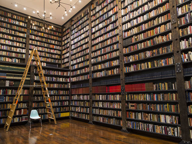 Interior of Stony Island Arts Bank. Image via Timeout.
His redesign retained key details of the historical bank—including marble doors, plaster archways, terrazzo-tile floors, vaulted ceilings, and wooden telephone booths—while new furniture was custom built using reclaimed wood from local structures like water towers. Opening in 2015, the Stony Island Arts Bank was rehabilitated into a multipurpose space devoted to the promotion of art, architecture, and black culture. The space features an archive of black publications like Jet, Ebony, and Negro Digest, alongside a small collection of racist collectibles known as “negrobilia,” which a prominent African-American banker acquired in order to remove offensive materials from public circulation. A wood-paneled room contains a collection of vinyl records from the “godfather of house music,” DJ Frankie Knuckles, and the building also features sixty thousand antique glass lantern slides of historical art and architectural images. A reading room and rotating set of community-focused installations ensure a vibrant hum to the space, which has been designed to serve as a hub for art enthusiasts and local residents alike.
In reclaiming the former financial center as a new cultural center, Gates infused this transformation with a sense of social and racial justice. The Stony Island Arts Bank boldly addresses a legacy of racial discrimination in Chicago and across the United States, with an emphasis on underrepresented narratives on African-American culture, history, and heritage.
ZEITZ MUSEUM OF CONTEMPORARY ART AFRICA
(Former Grain Silo Complex)
Cape Town, South Africa
Heatherwick Studio,
Transformed 2017
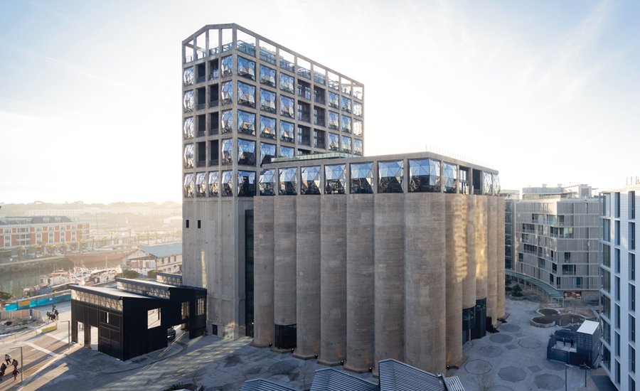
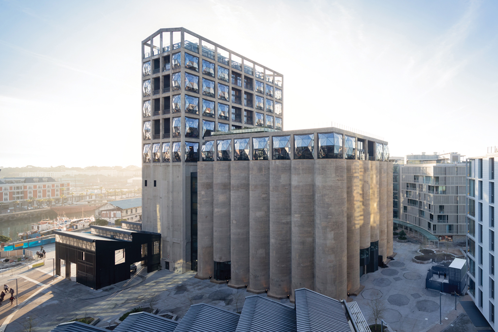 Zeitz Museum of Contemporary Art Africa. Image via Artnews.
Built in 1921 on the Victoria & Alfred Waterfront of Cape Town, the Grain Silo Complex instantly became the tallest building in the Southern Hemisphere and in sub-Saharan Africa. The silos were used to store and grade maize from the surrounding region, and remained an iconic feature on the city’s skyline for decades, extending over 185 feet (56 meters) high. The imposing complex comprised two main parts: a grading tower and forty-two 108 foot (33 meter) high concrete cylindrical tubes, each 18 feet (5.5 meters) in diameter. With the advent of containerized shipping, the complex was decommissioned in 2001. Yet its prime location on the Victoria & Alfred Waterfront, the most visited site in Africa, presented ample opportunities for transformation.
Developers and owners in the local business district debated possible reuse for years, until a $38 million (R500 million) development plan was announced in 2013, one part of a master plan for the entire silo district. Jochen Zeitz, a German businessman, art collector, and former CEO of Puma, worked with curator Mark Coetzee to turn his private collection into the first major museum dedicated to contemporary art from Africa and its diaspora. The London-based designer Thomas Heatherwick was engaged to design a museum of public civic significance, while preserving the site’s historic shell.
Heatherwick’s London studio designed a comprehensive rehabilitation of the entire structure of the silo complex, creating 100,000 square feet (9,300 square meters) across nine floors, with 65,000 square feet (6,000 square meters) dedicated to exhibition space. The top six floors of the fifteen-story building were transformed into a five-star hotel. The design objective for what Heatherwick described as “the world’s tubiest building” was to give human dimension to the hulking concrete structure. To do so, the proposal carved out a central space of the tubular section for a social area, slicing through the cylindrical storage containers. Where the tubes were cut back, the edges reveal a contrast between the old material and the new laminate (inlaid in order to reinforce the structure).
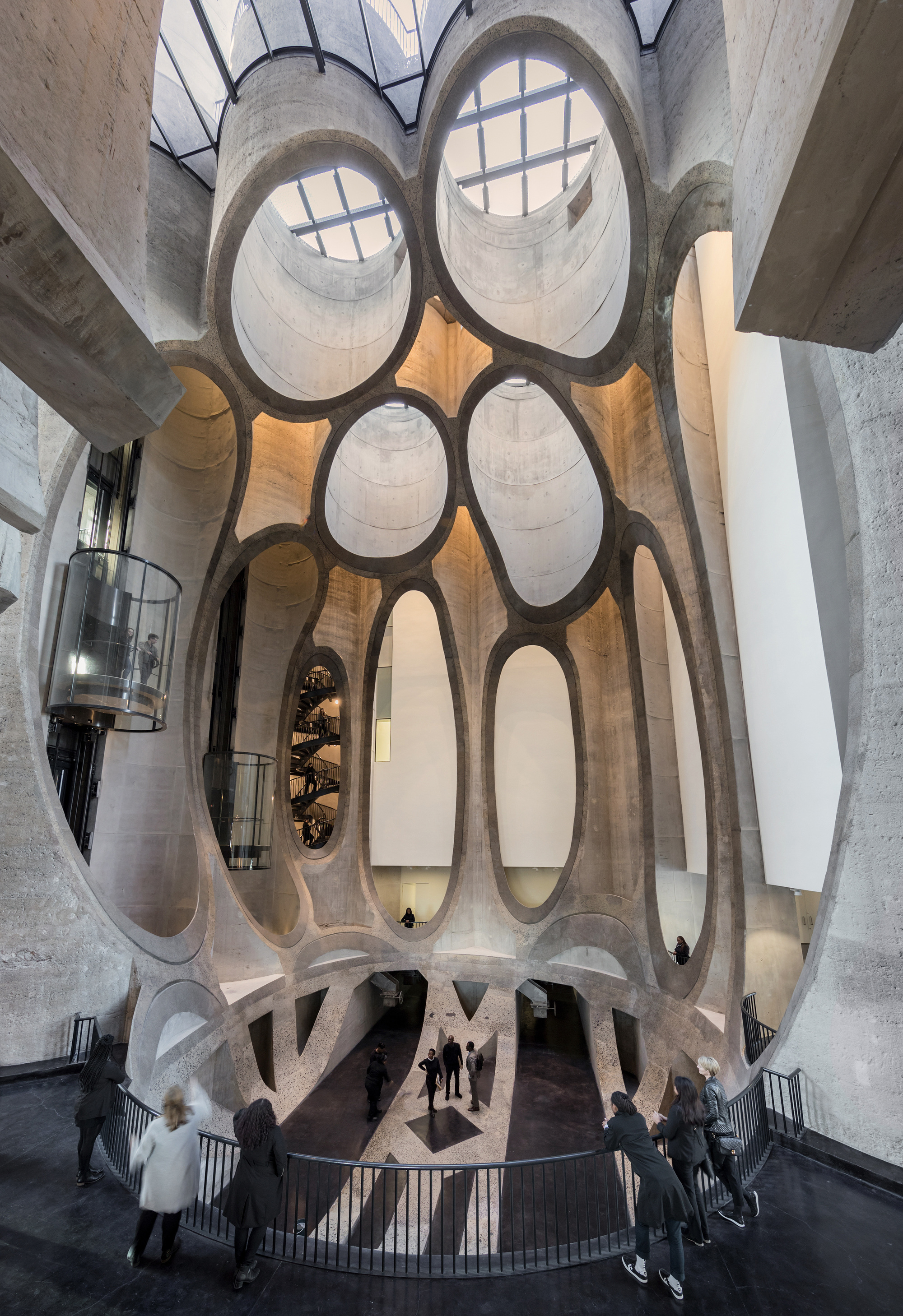 Interior of Zeitz Museum of Contemporary Art Africa. Image via Archdaily.
The completed museum revolves around a huge atrium that spans the entire height of the tubes. Its shape is based on that of a single grain of maize—the product stored in the silos for so many years. This cathedral-sized atrium provides a network of gallery spaces within the tubular forms. To admit daylight, the carved-out tubes are capped by layers of laminated glass superimposed with fritted patterns commissioned from the late West African artist El Loko. This creates a glazed rooftop that is walkable and features a sculpture garden. The concrete walls of the grading tower are also cut away to create kaleidoscopic windows that allow natural daylight to generate a myriad of textures and colors throughout the interior.
The Zeitz Museum of Contemporary Art Africa (Zeitz MOCAA) opened in September 2017 and is the largest African art institution on the continent. It features one hundred galleries showcasing art created since 2000, along with spaces devoted to arts education, screenings, and performances. In both design and use, it reflects a powerful, stunning shift in the global narrative of African art.
RELATED ARTICLES:
Art & Gentrification: What is "Artwashing" and What Are Galleries Doing to Resist It?
From Vandalism to Fine Art: Alicia McCarthy on Bay Area Graffiti Culture Since the '90s


