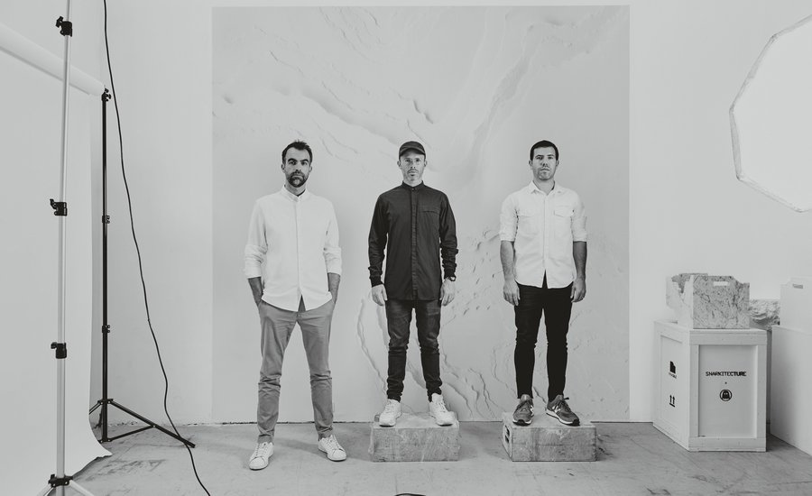
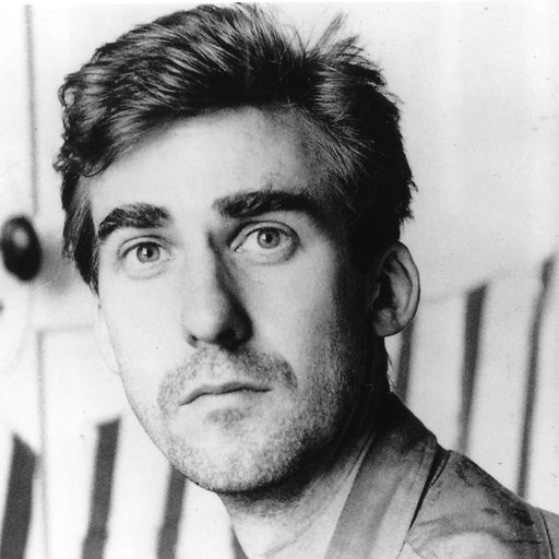
These days, it can be hard to tell the difference between a gallery and a flagship retail store. In a time where branding is everything, an increasing number of major companies are collaborating with artists and design teams to create immersive, experiential installations to express a lifestyle or aesthetic rather than a product. At the forefront of this movement is Snarkitecture, a design studio founded in 2008 by Alex Mustonen and Daniel Arsham (later joined by partner Benjamin Porto in 2014). Priding themselves on collaborative design that operates at the intersection of art and architecture––and boasting an impressive array of clients including Calvin Klein, COS, the New Museum, Beats by Dre, and Kartell––Snarkitecture has quickly established itself as one of the world's most sought-after design studios.
This month, Snarkitecture will take their design sensibilities to a museum setting with their first comprehensive museum exhibition "Fun House," opening July 4th at the National Building Museum in Washington D.C. as part of the museum's imaginative Summer Block Party series in the historic Great Hall. The exhibition will consist of a freestanding structure that resembles a traditional home, filled with interactive rooms featuring Snarkitecture's lauded designs, installations, and objects including Dig (2011) and Drift (2012).
In honor of the exhibition, we've excerpted Phaidon's brand new book Snarkitecture, in which founders Daniel Arsham, Alex Mustonen, and Benjamin Porto talk about how Snarkitecture came about; specific projects they've worked on; and their goals for collaborative design on a grand scheme.
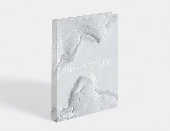 Snarkitecture 3D Bookshot, Image courtesy of Phaidon, Available for purchase on Artspace $59
The following text is based on a conversation that was recorded at Snarkitecture's studio in New York in September 2017.
Daniel: Alex and I went to school together at Cooper Union. I was making work about architecture but was pretty bad at drawing architecture, so I think the first thing I asked for Alex’s help with was drawing a set of stairs––a drawing we still have in the studio.
Alex: At Cooper Union, Daniel went to the art school, and I went to the architecture school, and somehow in the interdisciplinary approach of Cooper was the initial seed for the idea of this practice––that we could strengthen our work by looking outside our primary disciplines. And even though the programs at Cooper felt relatively focused, there was an overlap that happened between art and architecture, specifically in the shop, that encouraged that seed of an idea.
Daniel: It was very much because of the shop. The two schools––Art and Architecture––share the same workshop and it had areas for wood, metal, casting, pretty much everything. So everyone from the art school and the architecture school were all making things in there together.
Alex: Another thing that came out of our studies at Cooper and the focus on making (and to some extent craft) was the idea that you had to be able to realize the things you designed. Even if the realization was only in the form of a physical model, it reinforced the importance of thinking about how material and structure come together.
Daniel: There were lots of basswood and cardboard models. I remember going down to the studios of the architecture school and thinking, ‘This is my worst nightmare.’
Alex: I felt the same way going up to the sculpture studios!
Daniel: It was such a contrast––order in the architecture studios and chaos in the sculpture studios.
Alex: There was a lot of chaos in the architecture studio too. But I think that when we started Snarkitecture we were focused on the idea of making––that it wasn’t just a theoretical practice. I felt strongly from the beginning that we were very interested in realizing ideas––in finding ways to create physical, tactile experiences. I think a lot of younger architecture firms begin with competitions that involve creating proposals for theoretical projects. In contrast, we very quickly moved away from that as a model for our practice. Even if it was for smaller scale opportunities, we were drawn to projects where we could see our ideas physically realized in a way that allowed people to experience them.
Daniel: Our first studio on Box Street was probably the first manifestation of that ‘making- driven’ approach.
Alex: I agree––I think the studio itself was a very important part of the origin of Snarkitecture. Daniel was living in Miami where he had moved after school and started his art practice, and I was in New York working as a freelance consultant after working at different architecture offices.
Daniel: I really started thinking about Snarkitecture as an idea when we were working together on a project I was doing for Dior in Los Angeles––which was an installation inside a fitting room––and the project required some knowledge of architecture.
Alex: In the early days of Box Street it was just the two of us in a room that was about 1,000 square feet. We sat at two desks facing each other in an otherwise completely empty space.
Daniel: The origin of the name Snarkitecture came from a conversation that Alex and I had about wordplay and about combining architectural ideas in a playful way. And in that discussion we stumbled upon ‘Snarkitecture’––which comes from a Lewis Carroll poem, "The Hunting of the Snark," about a group of misfits who are searching for a creature called the Snark. They don’t know what it looks like, where it is, or how to find it. Their ocean chart is a blank white piece of paper. So for us there was a link between trying to find something that is undefinable and using limited resources to achieve that.
Alex: ‘The impossible journey of an improbable crew to find an inconceivable creature.’ There’s something in this idea about the search for the unknown that was very much aligned with what our goals were for the practice. This blank white ocean chart that acted as the map for their journey opens the idea of going into the white or exploring the void.
Daniel: We didn’t use the map as a chart to find anything, we used the map itself to make things.
Alex: Carroll also played with language in a similar way to how we play with architecture. He invented this nonsense word ‘Snark,’ and also the idea of the portmanteau––taking two existing words and combining them to create a new word with a new meaning. I think we’re often thinking about that with architecture––taking things that we know from our everyday surroundings and combining, or reimagining them, in unexpected and playful ways.
Daniel: There’s also a relationship with the play of scale and materials that exists in stories like Alice in Wonderland, the reinvention of the everyday. Everything on the other side of the looking glass is exactly as it is, except it’s all backwards, and that notion of reversal, confusion of the expected and the everyday, is something that is present in almost everything that we do.
Alex: Right around the time we were discussing the name Snarkitecture, I remember going to see the Gordon Matta-Clark show at the Whitney...
Daniel: Gordon Matta-Clarkitecture.
Alex: Exactly. And you know, his thing was Anarchitecture, and there was a scrap of paper that was in a vitrine that had all of these alternative names for Anarchitecture, but Snarkitecture was not one of them.
Alex: We had done a couple of competition proposals that made us decide once and for all never to do competitions again. I always think of our first project as being the artist’s space for Legal Art. It was a minimal project both in terms of the budget and scope but it was an important one.
Daniel: That’s how I convinced the client to go ahead with the proposal for the Legal Art project. I told him that if he was going to spend X amount to develop the space anyway, why not give us that exact same budget and we would reorganize things and make it better.
Alex: Despite the constraints I think we achieved some interesting things. I like to think that it’s a good space for artists––but for us personally it was the first project that we physically brought into the world. I think that after Legal Art we started to expand the idea of working with other creatives. Our clients weren’t necessarily commercial developers or people looking to renovate their home. They were––and are––people who come from creative backgrounds, including, importantly, connections and friends Daniel had in the art world. Around this time we started prototyping a lot of our work, which eventually led us into designing objects and furniture even though that kind of small work wasn’t really something that we had originally considered as part of the model for Snarkitecture as a design practice.
Daniel: That’s true, but we used to do week-long summer charrettes or residencies, where we would spend days making hundreds of drawings with the entire studio team.
Alex: The first time we did a summer residency, in 2009, we moved the entire studio to a deconsecrated church in Hudson, New York for two weeks. It was in collaboration with the choreographer Jonah Bokaer who we worked with to develop the stage design for Why Patterns that summer. We built Why Patterns for a 2010 premiere in Rotterdam before it came back to the U.S. at Jacob’s Pillow. Then the second summer we spent in Hudson, in 2010, we decided to spend it making furniture.
Daniel: To design the furniture we created hundreds of concepts and drawings, using a model based on coupling conceptual frameworks with materials and programs. For instance, we would start with the program of a table, and then find ways to make it perform in unexpected ways such as bending, melting, folding or rippling. The creative process became much more specific and structured throughout these sessions, allowing us to generate hundreds of different variations on a theme, very quickly and simply.
Alex: The other thing that was really important about those sketching sessions––and we still do this in the studio––was to bring everyone who worked at Snarkitecture into that process, including people who don’t necessarily have a background in design. It’s been incredibly useful and interesting to get reactions and feedback––as well as input into the actual design process––from people who are from different disciplines.
Ben: The exercises that the whole studio participates in are about taking something very familiar or functional, like a couch, then combining it with a set of conceptual ideas. We have literally hundreds of drawings from those sessions that we still refer back to––they’ve become a sort of reference library for the studio.
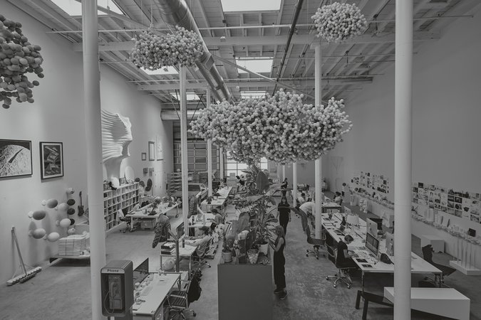 View of the studio with Daniel Arsham sculptures hanging from the ceiling, 2017. Image courtesy of Snarkitecture
Alex: Those first sessions led to the design of four pieces: Slab Table, Ghost Chair, Slip Bench and Excavated Mirror which were the first furniture pieces that Snarkitecture made.
We set up a shop in this tiny room in the basement of the church in Hudson, and came up with plans for our first furniture pieces. They were made without any client, end user or commercial model for selling them. They were just pieces that we made for ourselves that explored ideas about instability and objects that appeared one way but functioned in another. They became talking points for visitors to the studio and indirectly led to us meeting Sam and Claire from Volume Gallery in Chicago who, in 2011, asked us to develop a new series of furniture, which was first shown in Chicago and then subsequently at Design Miami. Of the objects we produced that summer Slab Table has a special significance. Ping-Pong had become really popular in the studio and Slab Table became the centerpiece of that obsession.
Alex: Richard Chai was another early project that was very important for the practice. It was the result of a competition called Building Fashion, organized by Boffo and Architizer. They had secured access to a shipping container underneath the High Line and we were paired with fashion designer Richard Chai, who had just won CFDA (Council of Fashion Designers of America). Our initial proposal was an angled plane that cut through the space, rotated on two axes. But you could only walk in this small walkway in the middle of the store, you couldn’t access the rest of the space unless you went underneath this plane. I remember that when we met with Richard, he basically said ‘I hate this!’
Daniel: Well, it was perhaps more like: ‘I like something about your approach, but I hate this design.' Given that, we decided to do what we really wanted to do, rather than trying to fit too much into the parameters of the competition. So we thought ‘OK, we’re just going to propose what we really want to make.’ And that actually ended up being exactly what he wanted.
Alex: The premise was to fill the entire volume of the space with a completely solid material and excavate the store from within. We ordered $5,000 (the entire project budget) worth of EPS foam and had it shipped to our studio, where we prefabricated the entire project. We taped out the outline of the space, then filled it with the foam and formed it using a hot wire cutter. Then we took it apart, put it in a U-Haul and re-installed it all in the shipping container on site. The store was only open for a week, but for a long time after that we heard from people who had found their way there and remembered their experience. It also ended up on the cover of Frame that year. That project felt very different to what was happening in retail architecture at the time. And in many ways, the way we worked on the project is representative of the DNA of Snarkitecture’s creative process.
Daniel: And at least conceptually, that project led to Dig at the Storefront for Art and Architecture in New York. Eva Franch i Gilabert was taking over as director at Storefront and she asked us for a proposal for a site-specific installation. I remember having a drink with her at Café Select right by Storefront and I just drew it on a napkin for her and said ‘we’re going to fill the entire space with foam and then spend six weeks digging a cavern out of it.’
Ben: I think both Richard Chai and Dig are a departure from architecture in any traditional sense. There was a focus on testing architecture’s parameters and possibilities.
Daniel: Dig explored an architecture of excavation or subtractive architecture, rather than additive. It embodied the idea of pushing, pulling and removing material to create space.
Alex: And these ideas continue to filter through the studio in more general themes such as the question of precision versus looseness. Dig was an incredible opportunity. To have that kind of exposure and visibility as a young practice in New York was amazing. And to create an installation for a gallery space that is itself a legendary collaboration between artist Vito Acconci and architect Steven Holl was a rare and meaningful privilege for us. Dig reinforced the idea of interaction by inviting people into architecture. People went into that project and experienced all kinds of associations from snow forts and childhood play spaces, to Star Wars. Interestingly, so many of the adults that visited Dig had a kind of childlike reaction. That is something that we have tried to build on in terms of introducing ideas about play and exploration in subsequent projects.
Daniel: That was around the time that we got the commission for Design Miami, which was our first large-scale public project. They had an existing budget and a brief to create a two-dimensional treatment for the tent facade, which we basically ignored.
Alex: I remember meeting with Alexandra Cunningham Cameron and Daniel and eating chili cheese fries on the rooftop of a bar in Miami. At that point the designer of the year hadn’t been chosen, so the area around the entrance was still available. So we pushed for the commission to become a pavilion project as opposed to a facade project––for it to be something that people could enter and be inside of that would act as a gateway to the fair.
Daniel: I remember we went through a bunch of different design scenarios. I definitely wanted it to be something that was going to be impactful yet very simple.
Alex: We had been working with inflatable materials from the beginning and some of the concepts were more ambitious than others, but I think the cylinder-based scheme we landed on was one of the more refined options.
Daniel: It almost didn’t happen because the cylinders were fabricated overseas and there was a big delay in the shipment.
Alex: It was down to the wire. I was there on the weekend that they were supposed to be installing them and they were still stuck in customs. I had to go to the UPS warehouse, find them and follow the truck delivering them to the site. There was a wild moment halfway through the installation when there was a really big windstorm. And even though we had calculated for structural loads and had all the right permissions and approvals from the city, the structural integrity relied on the entire system being installed to contain it within the structural framework, along with the structural Velcro to hold it all together. The windstorm blew off a couple of the tubes and I remember getting a message from Marianne Goebl, the director of Design Miami at the time––very concerned that she’d seen an inflated cylinder blowing down the street in Miami.
Daniel: I wish we had a video of that!
Daniel: The most complicated part of the A Memorial Bowing project was the coordination. It was the first time that we had hired major outside contractors to fabricate something. The scale of it meant that, for example, there were structural engineering drawings for each of the letters, including these massive footings. Due to the scale of them, each letter had to be built like you would build a structural column in a building.
Alex: Which is a very different design process from those early projects like Richard Chai, where we physically built them in the studio and installed them ourselves.
Daniel: The kind of projects that represented the underlying ethos of the studio where we could say ‘let’s just make it ourselves.'
Alex: The other projects that were in the studio at that time generally had very limited budgets––often under $10,000 to design and build out an entire space. Then the ballpark public art projects came in with a combined budget of over $1 million and we controlled the entire process, acting as artist, designer and general contractor, in charge of not only conceiving and documenting the design, but hiring and managing all the subcontractors. It was interesting to go from designing and building a series of DIY projects to managing a massive project with dozens of consultants and contractors within the context of a billion dollar stadium.
Ben: In the design of A Memorial Bowing, there was a tacit invitation to engage with it and have fun. No anti-skateboarding measures, no signs saying you can’t sit there. The last time we went to A Memorial Bowing, you could tell that each of the letters had been used in ways we had intended––sitting, playing, etc.––and ways that were unintended but invited, like skateboarding. Which is very much in line with what we’re trying to do with Snarkitecture.
 A Memorial Bowing, 2012, Miami-Dade County Art in Public Places Miami, USA. Photo by Noah Kalina, courtesy of Snarkitecture.
Alex: I remember meeting the deputy director of the New Museum, Karen Wong. She told me ‘we want you to do this project.’ The project they had in mind was for their annual gala, so it had to engage with this massive spatial volume, but it would last just one evening and of course had a limited budget.
Daniel: We spent all of the money on these seven foot diameter inflatable spheres, and enough helium to inflate them. Working with the New Museum we assembled a team of volunteer performers for the evening to create an immersive and performative installation. A grid of forty-four white inflated spheres floating in the space, with each sphere controlled by an individual performer.
Alex: The spheres were choreographed in motion. Using a very simple series of cues, the spheres would move up and down in unison, pausing to create different forms throughout the evening. For instance, when guests arrived, the spheres were very low in the space, creating a more intimate, confining space. After a few minutes, the spheres slowly started moving upward, revealing the performance and opening the volume of the space.
Daniel: After Lift, we adapted the materials to create another architectural performance for Ideas City, which we called Stack. It was a public event, taking place on a closed down New York City block. The idea was that we would fill an entire city street with these huge inflated spheres, stacking them up over the course of an evening to completely block off the street. The performers were our studio team, dressed in white jumpsuits. In groups of three they would take a sphere from the stack and roll it up and down the street and through and around the crowds, using only whistles to communicate. They guarded the spheres and moved them around, blocking the entire street, sandwiching them in between the two buildings.
Alex: At the time we were thinking a lot about how to make architecture performative in a very human and tactile way, as opposed to using technical wizardry. We wanted to use the human body to change architectural space.
Alex: After our initial furniture and object experiments, we started thinking about a more accessible product, which became Pillow. A lot of these objects were ideas that we just wanted to make.
Daniel: Well, more like objects that we wanted to have ourselves.
Alex: We loved having all these things in our studio and in our homes as a way to test ideas, but then they started generating demand, so it started to turn into ‘what should we do with these things?’ Pillow started as a very simple premise: an imprinted object in a form that looks soft, but is in fact hard.
Daniel: Pillow is a kind of perfect version of Snarkitecture. It encapsulates almost everything about what we do and how we think: it looks like one thing, it’s a different thing, it plays with materials, it’s white, it’s functional.
Alex: The concept was an object that had a single, very specific, very limited function. It was ridiculous in a way, because it could only do one thing, but it did that thing perfectly. And it also contained a little bit of humor in that it implied that you could never lose your phone or your keys because they should either be on the pillow or in your pocket.
Daniel: And conversely, if you lost the phone or the keys, then the Pillow is purposeless, because it is designed only for that one single object.
Alex: We started with the phone, then we tried other versions for pens, keys, small change and all sorts of things. Then we did a version for the New Museum, which was designed as an interactive performance. We set up in a satellite studio in the window of the New Museum shop for a weekend. For two days, we made custom Pillows for people on a first come first served basis. People lined up with a range of objects they wanted a custom pillow for––a ring, a lighter, an inhaler, a stuffed animal, a baby Air Jordan, an avocado. It was an interesting opportunity to bring people into the process of making these objects––giving the public a glimpse into the physical activities of the studio.
Daniel: And that project led to Beats. We had met Omar Johnson a year earlier at Drift, our project for Design Miami.
Alex: He came to the studio a few times and we had talked about how we might work together. It was a year later that he suggested the idea of creating a limited artist edition––a series where various artists would redesign headphones for Beats in editions of one thousand. At that time, the Beats identity was very much glossy black and red accents. So, of course, we had the idea of erasing that identity. It was a bit like Rauschenberg’s Erased De Kooning Drawing––taking something existing and negating it while still referencing the original.
Daniel: We stripped the headphone down to a matte white version, removing all of the graphics and branding until it looked like a cast of the original. We then paired that headphone with a custom cast marble pillow that looked soft but was rigid and heavy. We were the only ones who did the artist series with a supplemental object––in this case a Pillow. I still have one from the edition in a box. I want to have it out on my desk but I don’t want it to get dirty, ha.
Alex: Beats had never made an object that was not electronic before. We ended up managing the process and had 1,000 of them made out of cultured marble in New York and then supplied them to Beats. Alex Marble Run and Airball are two really interesting projects––I was excited about both of them. In the exclusive context of Art Basel, we were commissioned to do Marble Run and Airball, which were both open to the public and free. Anyone could just walk in and play with them. One was a basketball arcade and the other was a large scale toy.
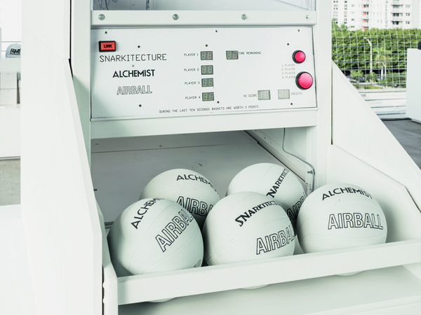 Airball, 2014, Alchemist Miami, USA. Photo by Noah Kalina, courtesy of Snarkitecture
Daniel: We like to work with balls––we love round things!
Alex: We do––and they were such positive, playful projects. They invited people to let their guard down through play and interaction. And what encapsulates the concept of play more than a ball?
Daniel: Both Marble Run and Airball engage with architecture in a different and more meaningful way than other, more prosaic, program-led projects, perhaps because a sphere is an element that very rarely occurs in architecture.
Alex: Do you think that Snarkitecture’s first building will be a sphere?
Daniel: I hope so. It will be like the Boullée Cenotaph!
Alex: The start of the process happens through discussion––like an internal pitch meeting. We’re often just sitting around a table and while we might be sketching at that early phase, we’re also just talking through concepts and possible approaches. The next stage is to get those concepts down on paper. We do a surprising amount of hand-drawing––even if they’re crude sketches to begin with, they’re an important creative tool and it helps us avoid spending unnecessary time 3D modeling too early in the process. Sketching by hand means that we can work through a number of different concepts and iterations before committing to digital development.
Daniel: When we start a project, we meet with the entire studio to think about high level concepts. Once there is a conceptual approach, people who have been in the studio for a while, who understand the ethos of the practice and the kind of visual and spatial language we tend to use, refine the idea. Then Alex, Ben and I critique the development of the idea, as well as its implementation.
Ben: Brainstorming informs future projects as well. We keep a binder of ideas that didn’t work as a reference for other projects which we then refer back to. It helps keeps things fresh without having to reinvent the wheel every time.
Alex: Once we’re through this initial phase, we move into concept design which is a big part of the creative heavy lifting for each project. At this point we’re making a fairly detailed presentation for the client usually involving a combination of plans, architectural drawings, renderings and reference images. After that we follow a fairly traditional architectural process model––even for projects that are not architectural––which is something that we’ve built into the working practices of the studio.
Daniel: In terms of the documentation, even if it’s not an architectural project, we still look at everything we do from an architectural standpoint, which has given us an advantage in, for instance, public art projects, where our practice is able to come in with demonstrable technical resolution that not everyone else is able to offer.
Ben: I would say that it’s the key to the ‘in-between-ness’ of art and architecture. Daniel is able to approach projects without the arguably preconceived limitations of an architect. And then vice versa, an idea that might seem, at first, to be unrealizable, can be brought to life by bringing architectural knowledge to it. You can have the best idea in the world but if you can’t realize it, it’s meaningless. In addition to the tradition of making and creating that has always been central to the practice, is the commitment to considered resolution, of bringing ideas––no matter how non-architectural––to life through our very particular process.
Alex: There’s always been this idea of professionalism running through everything we do. Even though when we started we were very young and didn’t really know what we were doing, this idea about treating the practice as a business was always there. So every project, whether it’s at the art or the architectural end of the spectrum of all the various kinds of projects we do, comes under the same level of project management, structure and organisation as a larger business or office might typically use.
Daniel: We always knew what we were doing!
RELATED ARTICLES
How Ettore Sottsass Brought the Poetics of Painting into Design and Architecture


