It’s no secret that curators and gallerists look to art schools to mine fresh talent. Which is why MFA open studios—an event where students open up their studio spaces to the public and present their best work—are well attended in New York. But for those of us who don’t live in New York with art schools abound (or maybe for those of us who DO live in New York and are overwhelmed by the many, many art events we never seem to have enough time for), the websites of MFA programs let us browse student work from the comfort of our own homes. Great idea, right?
There’s a catch. If there’s one thing that art school web sites have in common, it’s that they’re hard to navigate. In some cases, each department has its very own website, so that you'll need to find the student profiles section in multiple different locations. In other cases, finding what you’re looking for means following a meandering thread of hyperlink after hyperlink... only to find that what you’re looking for doesn’t exist. (About half of the MFA program sites we looked up didn't post student portfolios at all.)
So what's the solution? You’ve guessed it… us. We’ve scoured the websites of some of the top MFA programs in the United States to find the oft-hidden portfolio pages, making it easy for you to find exactly what you’re looking for. (Just click on the school name to be linked directly to the page that hosts student portfolios.) We’ve listed them in order starting with the MFA programs that we’ve found to have the most user-friendly, searchable, comprehensive, and well-populated student portfolios.
Whether you’re a curator or gallerist looking for fresh talent, a patron looking to support a young artist, a potential student researching MFA programs, or simply art-curious and searching for inspiration, bookmark this article and use it as a resource for the years to come, as each MFA program will undoubtedly be updating their students' portfolio pages as new budding artists filter through the program. Good luck with your discoveries!
1. Rhode Island School of Design (RISD)
What makes RISD’s portfolio page stand out from the rest is its searchable database. Users can filter for status (from undergraduate to alumni and faculty), degree program, creative field, and time (meaning how recently it was posted). It also let’s you chose how to filter your results—either by artist, or by image. The database is powered by the social media network Behance—so as you're browsing artists’ work, you can see how many people have seen, “liked,” and commented on an artwork. We aren’t totally sure how this could be useful to you, but we do like that it allows Behance users to discover RISD artists without having to go to the school's website directly. Way to go, RISD.
2. Virginia Commonwealth University—Sculpture and Extended Media
Each department on VCUarts' website has its own page, design, and layout, making it very hard to look at all student work at once. Instead, users must go to each individual department page, which is problematic not only in terms of user experience, but also because many artists don’t consider their work to be categorically defined as belonging to a single medium. This being said, VCUart’s Sculpture and Extended Media departmental site is great. Current MFA students are highlighted on a well-designed, easily navigable page that lists their name, an image of their work, a short artist biography, and links to their personal website as well as their institutional profile page.
VCUarts' other department sites vary. Photography and Film has thumbnail images for each artist, but no contact information or additional links, so good luck getting in touch with them. Painting and Printmaking isn't bad—it has one thumbnail image per artist, but includes a link to their personal websites when you click on them, which is useful as long as you have the patience to check out each of the artists' individual websites. Craft Material Studies is pretty comprehensive, letting users browse by material (clay, fiber, glass, metal, wood) and provides a photo of the artist, their bio, and a link to their personal site.
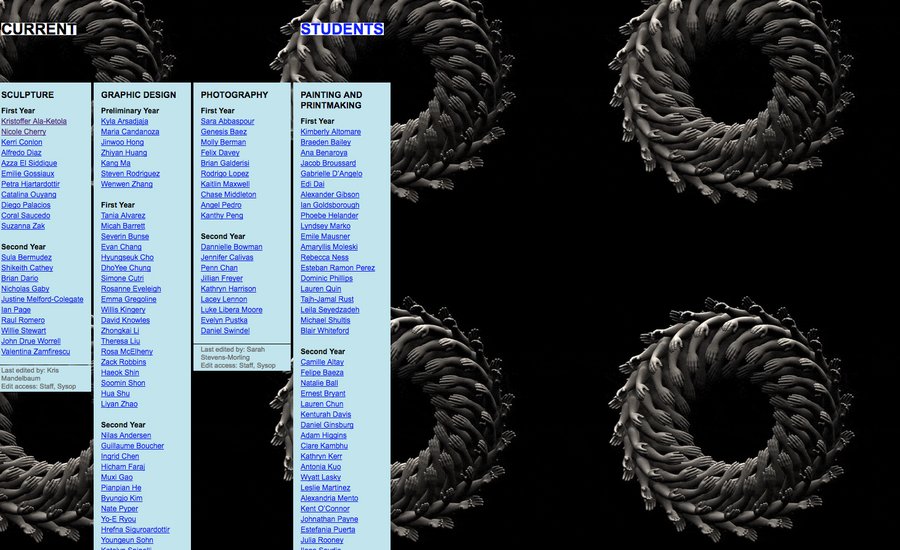
Yale School of Art’s website is a wiki, “meaning that every graduate student, staff person, and faculty member of the School can change [the] website’s content or add to it at any time.” In other words, students can update their profile pages whenever they want, making them more up-to-date (hypothetically) than the others on this list. Meanwhile, gifs and memes proliferate the website, which is either a pro or a con depending on how down you are with internet culture. The Current Student page lists all MFA students by department (sculpture, graphic design, photography, and painting/printmaking) and by year (first or second), and each name is a link directing to the artist’s profile page. Because each student updates their own page, the amount of content varies—some profiles are completely blank, while others are chock-full of images, text, links, and contact information.
4. Arizona State University School of Art
Despite the disclaimer on Arizona State’s Graduate Work page that states the online gallery only features select graduate artists (and that more artists will be added soon), there are quite a few students listed, categorized by department (ceramics, drawing, fibers, intermedia, metals, painting, photography, printmaking, sculpture, and wood.) Clicking on thumbnails of artists’ work leads you to a page of more images, plus a link to the artist’s personal site.
5. Columbia University School of the Arts
Columbia’s site simply lists each student as a link to their personal sites, and doesn't host any images or bio information—so you won’t get a sense of the artists' work until you click on their names. What we do like about this, however, is that we’ve found that artist’s websites tend to give us a better idea of the student's practice than an institutional profile page—so while it takes a bit more time to find artists you like (since you have to go to every single student’s personal website to see even a single image of their work), it’s worth putting in the time if you have the patience.
6. School of the Art Institute of Chicago (SAIC)
SAIC’s profile page is easily navigable, allowing you to filter for department, and for Student, Faculty, and Alumni. Search results show pictures of the artists along with their names, and clicking on their picture brings you to their individual profile page which includes their bio, statement, and a link to their website. The reason why SAIC isn’t higher up on this list, however, is because while the infrastructure is there, the content is thin. While filtering for photography and printmedia produces 28 results combined, we found zero results when we filtered for sculpture, performance, ceramics, painting & drawing, fiber & material studies, and film/video/new media. We wish this site was updated more regularly for a more comprehensive offering.
SVA’s online gallery is similar to RISD’s and SAIC’s, because it uses the same Behance platform that allows users to search using a variety of filters (like RISD’s site), yet most of the filters return no results (like SAIC’s site). The site has potential due to its wide range of disciplines and highly specific categories (they list street art and graffiti; photography, digital photography, and photojournalism.) Again, we wish that students were more encouraged to post their work. SVA students: if you’re listening, we’re looking!
RELATED ARTICLES:
An Insider's Guide to the 7 Best MFA Painting Programs in the United States
Don't Want to Pay for Art School? Here's a Streamlined Syllabus for Getting Your Own DIY MFA at Home


