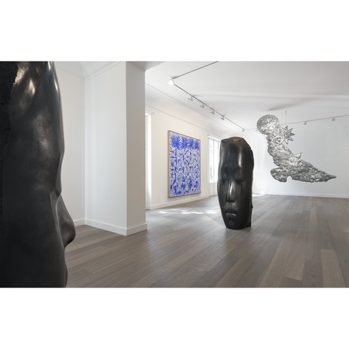
Visitors streaming into the Independent art fair in Chelsea's former Dia building this week have been immediately confronted by a distinct design sensibility, a spare, geometric layout that at once emphasizes the art and accentuates the viewing experience in a manner leagues away from the typical big-box fair experience. That is owed to Christian Wassmann, the architect and designer who brought an avant-garde vision to creating this year's fair architecture—just as he did for last year's edition, which structured the booths along the axial lines of New York City's grid system. The key to Wassmann's approach? He comes at architecture from the position of being an artist.
To understand how Wassmann structured this year's fair layout, Artspace editor-in-chief Andrew M. Goldstein spoke to the architect about his conceptual design, and also about his new show of objects at R 20th Century gallery—and his performance collaboration at The Kitchen with artist Michael Portnoy.
You have quite a few things in the works this week, but perhaps the most ambitious is your design for the layout of the Independent Art Fair in Chelsea's historic former Dia building. What is your concept for the design this year, and how did it come about?
The goal was to create a dynamic space and at the same time give the artworks a calm environment. Sculptures need to be seen from all sides, but they also work well out in a corner as a backdrop. The new wall installations form a series of "Y" configurations that hide all of the structural columns throughout the rectangular former Dia Building. The two directors of Independent, Laura Mitterrand and Jayne Drost, together with Elizabeth Dee and Matthew Higgs, have helped me and my team to place all the galleries, nonprofit organizations, and publishers in their desired place in this year's layout, which is unique for each floor of the building.
What was your biggest design challenge this year?
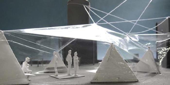
The pavilion on the roof. Our aim was to design and build our own enclosed structure, and not rent a standard tent like everybody else. Our pavilion is suspended from the three highest points of the building: the water tower, the freight elevator, and the passenger elevator shaft. We attached three ropes to each of these points and then connected the bottom ends to wooden tetrahedron structures—a four sided polyhedron, basically a three-sided pyramid—arranged across the roof deck. These tetrahedrons triple-function as seating for the cafe, display shelves for the three publishers, and anchors for the tent. A transparent membrane spans across the ropes to protect the guests from winter weather without obscuring the fantastic views of Manhattan, the Hudson River, New Jersey and the sky. What sounds quite simple was only possible with the calculations of our engineers Tom Reiner and Hauke Jungjohann of Knippers Helbig, the expertise of Chris Starr from Starr Tent and my team of talented architects.
You have said that your design is derived in part from the number three. How so, and why?
Each "Y" consists of three walls meeting at a 120-degree angle. As opposed to the traditional 90 degree corner, this obtuse angle creates a sense of expansiveness and dynamism for both the artworks and the visitors. All three sides of the "Y" offer defined yet open spaces; these spaces can be compared to an open book, only here we present this gesture in an architectural dimension.
Your plan calls for some of the design to "levitate," which sounds like quite a feat. Could you describe that?
Do you mean the suspended tent? I guess we all try to fight gravity since the day we are born.
How does your design take into account the art-market commerce going on at the fair, and, on a more general level, the way people interact with art?
Aside from the few individual works that leave an impression that lasts after visiting an art fair, fairs are are often exhausting experiences that leave a bad taste behind. Galleries present groups of works by artists that go well with others within their own program, but the problem is the context. There is a lot of clashing (and pedestrian traffic jams) from one booth to the other, and this is only heightened with the standard fair layout of a corridors and cubicles on both sides. The art can lose part of its strength if its context and environment does not support a good art viewing experience. Also, in museums I noticed a shift towards a "democratic" hanging of shows, where each piece gets the same amount of space no matter what the piece itself requires. I like when some works hang close together and others are seen by themselves.
What challenges did you encounter in actualizing your vision for the layout?
We are continuing to refine Independent's tradition of a unique and open exhibition layout that both blurs boundaries between the galleries and enhances the art viewing experience. In order to ensure a smooth circulation throughout the spaces, present interesting vistas and perspectives, and take full advantage of the natural light, we decided to minimize all wall lengths without compromising art-hanging space. My layout is also an homage to the original Chelsea gallery building and its architect, Richard Gluckman. When Dia moved into the concrete warehouse they changed almost nothing but at the same time created one of the best places to see contemporary art, even 26 years later.
This week you have also debuted a show of new "platonic" design objects—including a pillow, a table, and a chair—that you have made based on the five unique geometric forms: the circle, the cube, the tetrahedron, the octahedron, the dodecahedron, and the icosahedron. What inspired you to draw on these shapes hard-edged shapes to design furnishings?
These five objects were designed over the last three years. We had no pressure or client, like in a "normal" architecture project. At some point in the middle of the recession we built all the platonic solids out of paper and suspended them from the ceiling of my loft. Through play and various happy accidents these forms turned into functional objects. My work encompasses a philosophy that design and architecture do not necessarily abide by the Modernist ideology of “form follows function”—rather they present how “form performs function.” Intense studies and material research have led to the final products that are now together for the first time at R 20th Century in TriBeCa. The five objects fulfill the basic needs of a person inhabiting a space. Unlike my other work, they are not site-specific and have to be able to stand by themselves in the context people want them to be in. In a way, design is less controlled than architecture, which is a liberating experience.
How do you see your design work corresponding to your architectural practice?
All my work relates to the human scale, so there is no real distinction between a small and a large project. It's always the body experiencing surrounding matter. I'm interested in objects as existential forms that affect a space, and how a desired space will shape a building and what impact that has on the city. My practice grew from small scale to larger scale, but lately with larger projects and a bigger team we often have to solve an urban riddle first and then develop details later.
Lastly, you are collaborating with the performance artist Michael Portnoy for a show at the Kitchen. Could you describe that show, and say how it came about?
Michael and I collaborated on several projects before. As a "director of behavior" he challenges norms in his performances in a way similar to how I question architectural typologies. Performance art does not need a theater or a white cube gallery but a different kind of space. After being invited to last years Documenta to present his game show 27 Gnosis, Michael came to my office with the idea of performing inside a mound of mud in a dark space. Together, we then developed the idea of an unsettling environment where the participating audience is climbing into a cone-shaped space with a spherical floor which is also the stage. While witnessing the show, the audience is comfortably leaning against the 30-degree tilted wall while their feet are in natural standing position. Now at the Kitchen my architecture presents a portable version of this design: this traveling pavilion is composed of 27 segments forming the same performance space inside but leaving the mud behind.
After so much activity, what do you have planned next?
We are designing our first free-floating—that is, not standing—gallery building in Chelsea, waiting for the results of a housing competition in Switzerland, and working on a study of a mixed-use building in China. Also an earlier project, the Curved Wall House in Miami, is also finally under construction.
What was your first significant art experience?
Probably seeing Mark Rothko's Seagram Murals in the original chapel-like space at Tate Britain, before the paintings got moved to the walk-through space at the Tate modern. My earliest memory is Elvis’s death reported on German television.
How has your work changed over the course of your career?
There's evolution but at the same time everything I do for the first time has is something I have been looking to make for a while. There's definitely a method, a language developing, which gets more refined with every project.
How do you get your creative juices flowing?
I play around with ideas, sketch them up, and often accidentally stumble upon something original that gives me the energy to move forward. Deadlines and other forms of pressure help as well to keep creating. A good project also needs a good client who is willing to engage in a dialogue.
Where do you look for inspiration?
In any physical manifestation of original ideas, and in people practicing daily routines or celebrating life.
What do you hope other people get out of your work?
Surprise and pleasure.
What's your favorite thing you've ever built?
East Village Radio and maybe the tent at Independent.
What is indispensable in your studio?
My sketchbook, my library, and my team.
What do you collect yourself?
Books and artworks I like to spend time with—pieces that trigger something but at the same time have a calm core.
Who is your favorite living artist?
Urs Fischer, Gerhard Richter, and Maurizio Cattelan
Who is your favorite historical artist?
Sol Lewitt, Albrecht Dürer, Leonardo da Vinci, Marcel Duchamp, and Andy Warhol
What is your favorite place to see art?
Small museums, well-designed galleries, unexpected places in the city and in nature. Dia: Chelsea was one of my favorite places to discover contemporary art, and I visited many of the exhibitions more than once. I particularly liked that one artist had a whole floor for one year. Good art, contemporary and historic, doesn't need to change—it's more interesting to experience personal changes in relationship to good works and their environment.
What artwork or art destination would you most like to see?
Art and architecture made for a specific place. Luckily there are many I have not visited yet.
What book has had the biggest impact on your work, or life?
The book with the biggest impact is probably my sketchbook, since there is always a next blank page.
What artist or artists do you think should enjoy greater recognition?
Le Corbusier. As an architect he's well respected but his paintings, prints, and textiles deserve a second look. I am interested artists who try to master different medias and contexts and who challenge themselves and their environment, these people should receive greater recognition for their holistic approach.
If you could get any artist to do your portrait, who would you choose?
Photography would be the right media. I love the way Wolfgang Tillmans looks at the world and people—his work extends moments.


