Peter Chadwick credits his interest in brutalist architecture to his 1970s upbringing in the north of England, where the imposing local steelworks and its relentless clatter were the visual and aural backdrop to his adolescence. Chadwick went on to study at the Chelsea School of Art and then work at Creation Records (the most successful independent record label of the '90s), where he designed record sleeves and flyers for some of the most important bands of the time, including Primal Scream and Spiritualized.
Chadwick set up his own studio in 1996, masterminding campaigns for bands such as Groove Armada, Fatboy Slim and Girls Aloud, all the while feeding his interest in the buildings he had grown up around as a boy and had started to seek out and photograph as a burgeoning architecture fan. His twitter feed ThisBrutalHouse was the result, and he has just published with Phaidon the book This Brutal World—a photographic survey of brutalist architecture, with each picture accompanied by seminal song lyrics. Here he picks his favorite works on Artspace.
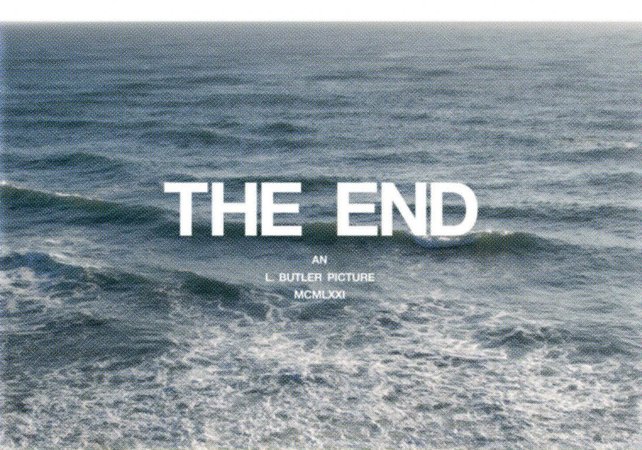
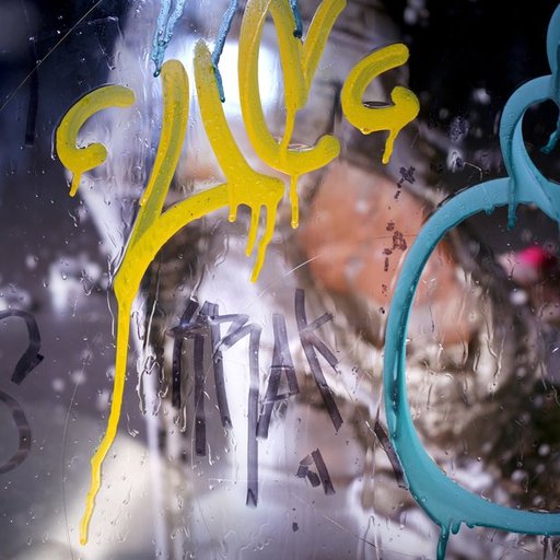
This photograph by Luke Butler is ambiguous. Yet it speaks within a visual language, one with which I identify. The filmic composition of type and image leaves me wondering, what will the ending be?
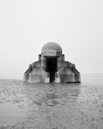
NOEMIE GOUDAL
Obervatoire IX (2013)
I was lucky enough to catch Noemie’s wonderful show in London last year. This desolate image pays homage to the 18th-century cosmic architecture of the Jantar Mantar, in Jaipur, India. Her approach to this image, part of the "Obervatoire" series, is both demanding and serene. The visual aesthetic is in keeping with the one that I champion in my "This Brutal House" twitter feed.
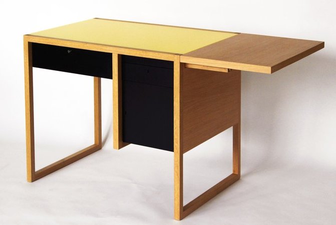
JOSEF ALBERS
Writing Desk (Based on a 1927 design)
Josef Albers has increasingly become more influential to me and my work over the past ten years. His abstract geometric shapes, patterns, and color explorations work seamlessly across a variety of mediums. An amazing use of negative space, form, and color is evident in this writing desk. What I wouldn’t give to have this in my workspace!
GREGORY HALPERN
Playspace Commission: Untitled (2013)
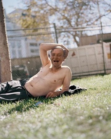
The subject of this photograph is down but certainly not out, and his animated, dirty face looks like it is from a different era. This wonderful photograph by Gregory Halpern captures one of those moments in life when you think: No matter what, everything right now is OK.
BERND AND HILLA BECHER
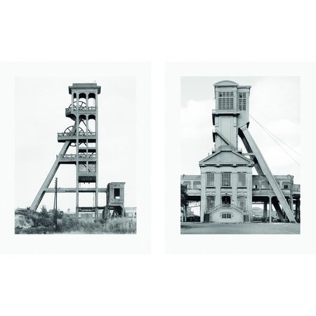
Two Winding Towers (printed in 2004)
Growing up in the steel and chemical town of Middlesbrough, my diet of architecture included regular doses of the industrial landscape that surrounded the town center. Blast furnaces, chemical plants, coke ovens, silos, and such informed my early love of concrete architecture. The formal yet humane grids allied with the industrial landscapes in the photographs of Bernd and Hilla Becher resonate with those scenes of my teenage years and beyond.
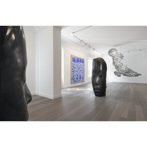
I became aware of Don Brown’s work via the band Spiritualized. Their album "Let It Come Down" (2001) features a Don Brown sculptural head that is debossed into a plastic box. Inside the box is a wallet containing the CD. This wonderful package was the creative vision of the graphic designer Mark Farrow.
REMI THORNTON
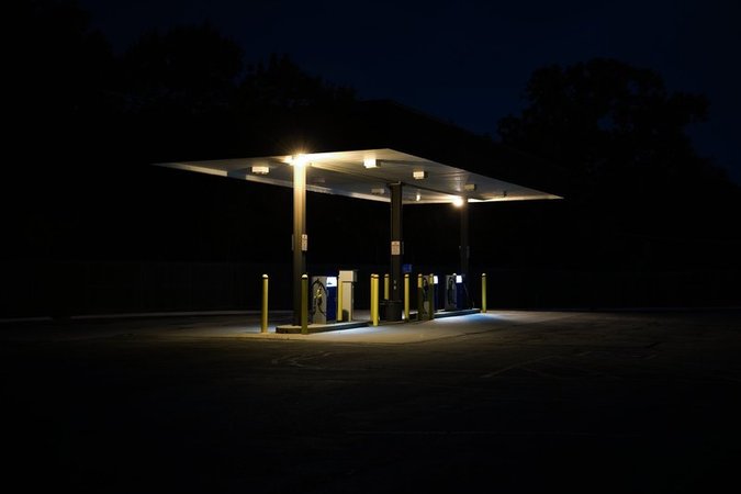
Public Works Station (2008)
This work reminds me of Nighthawks, by Edward Hopper. It's a perfectly still photograph that is both bleak and beautiful. Has something happened? Or are we about to witness something out of the ordinary? That, I suspect, is for me to decide.
ELLSWORTH KELLY
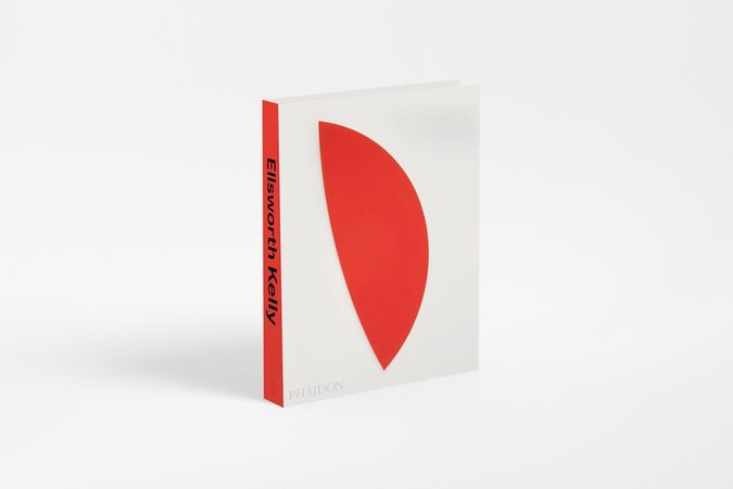
Ellsworth Kelly (monograph, 2015)
Ellsworth Kelly is one of my favorite artists. His use of color, grids, and negative space within his work has always appealed to my graphic-design sensibilities. His use and placement of the colors on the canvas is bold and effortless. There is a space reserved on my bookshelf for this most suitable monograph of this recently deceased artist.
ED RUSCHA
Archi-props (1993-1997)
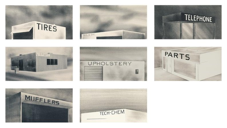
The everyday appears monolithic in this series of prints by Ed Ruscha. These shops have been reduced to stark, featureless concrete boxes. I have always admired his work and the integration of real and imagined typography in his paintings.
TODD HIDO
Khrystyna's World, #10552-c (2011-2015)
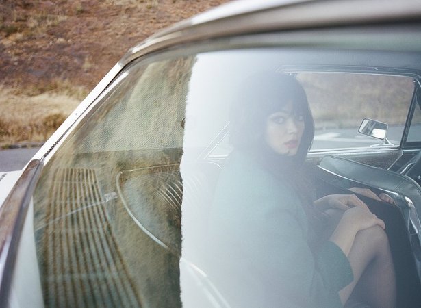
This work suggests a modern-day William Eggleston. The tone, colors, and styling are timeless. A strong, open narrative holds all of this together; is the woman looking over her shoulder a willing passenger or not?


