A phenomenologist of the first order, the artist Spencer Finch is known for his exploration of light and color across an extraordinary range of mediums, using the splendrous effects of natural lighting and precise settings to create environments that immerse the viewer in a cerebral beauty. This summer, Finch has debuted three new major projects: a commissioned installation in Morgan Library & Museum's Renzo Piano-designed Gilbert Court, a monumental artwork in the newly opened 9/11 Memorial Museum, and an art-historical duet at Britain's Turner Contemporary.
To find out the ideas behind these ambitious projects, Artspace spoke to the artist about the way he approaches his work, and the conceptual allures of being a jack of all mediums, and a master of none.
 The installation at the Morgan Library
Your new installation at the Morgan Library is wonderful. What inspired it?
Every summer they’ve had a series of five or so projects in the atrium, and they approached me because they wanted me to do one. I think it’s the last one in the series. I was really excited about working in that Renzo Piano space, and I also wanted to do something that was connected to the collection, to the museum, and to the history of that place. So I spent time there looking at things. You know, it’s a very odd collection—it’s not a typical museum collection. It’s an incredible repository of works on paper and manuscripts and decorative arts and religious icons and so forth.
Among the illuminated manuscripts there are a number of Books of Hours, which are basically the medieval prayer books that were used to structure the order of devotional activities throughout the year. It’s a calendar that I have been interested in employing in my work in other ways, and here I thought of it as an organizing principle for the installation in the atrium—this idea of the Books of Hours being about time and color and the passing of the seasons and the connection of human activity to certain seasons. For certain people it’s all about devotion and prayer, but that didn't interest me as much as how it's a method of recording and organizing time in a way that’s very different from our modern idea of time.
How did you formally bring that idea into the space?
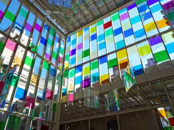
So, what I wanted to do was abstract it—and that’s when I hit on the idea of using the grid of the windows of the Piano atrium as the armature for a calendar. So there are 365 squares of color based on each day of the year on the four sides of the structure, with each side then affiliated with one season: east is spring, south is summer, west is fall, and north is winter. There are more squares on the summer side based on the longer hours of daylight, and fewer in winter. The colors themselves are taken from general colors associated with each season, but also colors either from specific Books of Hours or that are associated with activities in certain seasons or, actually, certain months.
For example, in winter there's feasting and slaughtering and keeping warm, so there’s a blood-red color from the slaughtering and oranges and yellows from keeping warm; then there are also other, more typical winter colors of grays and browns and earth tones. In spring, for example, there’s the making of flower garlands—that’s what you did before the Internet—so colors associated with these activities are there. There's also planting, harvesting, the threshing of the wheat, and other activities that are part of an agrarian society.
Within the center, to pick up on this idea of the calendar—and the solar calendar—there are twelve large panes of 35-percent-reflective glass that hang suspended from the ceiling. They're connected to the idea of the earth orbiting around the sun, and how that creates the seasons and the structure of the year.
Then there are also red squares. Those are “red letter days,” which is a term from the Books of Hours, since feast days—important days of the calendar—would be written in the books in red. So I picked certain days: the birthdays of people who are important to me. Because I’m not a believer, I needed something, and I liked the idea of these special days within the calendar.
It's amazing how immersive the installation is for the people within it. The colors wash over you.
There are all of these changes that happen with the shifting of the sun, and the colors project and appear in all sorts of places—even all the way down in the lower level at certain times of day. They use that space for events in the evenings sometimes, and I was there one day shortly after installation watched this cranky guy bossing people around. All of a sudden his face became covered in green—he looked like the Wicked Witch.
And, of course, the places where these amazing color moments happen will change throughout the season, as the angle of the sun changes. So each day is different. It’s sort of a Stonehenge effect, because even if it doesn’t have that sort of specificity, it does have a range of different surprise illuminations.
You were also very playful in where you put the colors. They’re not just on the grand windows but in unexpected places as well.
It was really fun. My favorite place is on the elevator—they mix when the elevators go up and down, so there’s this crossing over of colors. It’s really nice to have this intervention in this amazing Renzo Piano space but at the same time to have it feel light, not too dominant. It doesn’t feel too oppressive to me.
It's relaxing, in fact—now you can go to the Morgan, have a cup of coffee at the cafe, and watch the light change.
The funny thing about the Morgan is that the average age of the audience is about 85. I’m hoping this will bring the stoners in—people who just go in there stoned to watch it. Not that 85-year-olds couldn’t as well. But I don’t object to it being in that kind of public space. People are sitting there anyway, and they'll experience it in a way they wouldn’t otherwise. They're a captive audience while they’re waiting for their cappuccino to come.
At the Turner contemporary you were also using a very interesting architectural space. Can you talk about that project a bit?
That’s in an amazing David Chipperfield gallery space. It’s much more austere in some ways Piano atrium at the Morgan—less spectacular, but so subtle and beautiful. One thing I was sure of from the beginning was that I didn’t want to cut it up and put walls in it. I wanted all the work to be really considerate of the space and join in a dialogue with it. Pretty much all of the work has to do with light and changing light, whether it’s in the gallery or some other space. It can focus the viewer’s attention to the space itself.
Sometimes it feels in museums that you’re fighting with the architect, and in this case I really feel like I got a boost from the architect. I was lucky to get to work in a space that’s really “pro art” and conducive to the kind of art I make. I would love to leave that space empty and just sit there and watch the light change. But that wasn’t an option. The end result was very collaborative.
You kind of did make it an option with your "Wizard of Oz" work in the show, Back to Kansas.
[Laughing] Yeah.
 A view of the Turner Contemporary show
Tell me about that work—and about the seemingly-unrelated references throughout this exhibition.
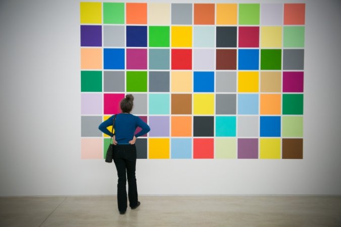
The Back to Kansas piece was really about watching light disappear within the space. The 70 colors—well, 60 and 10 grays, which are controlled—are all taken from "The Wizard of Oz." The idea is that people sit there at dusk, when the light is changing and it’s getting dark, and watch the color disappear and change to gray. They get different wavelengths at different degrees in low light, and the colors disappear at different times. We're able to perceive long wavelengths at lower levels than we can short wavelengths. This means that the blues and purples disappear first and turn to gray as night approaches, and the oranges and red disappear last.
There’s this idea of something that’s in technicolor going to black and white, and that’s where the title Back to Kansas comes from. It’s this total abstraction of "The Wizard of Oz" because it’s just colors, and it’s about this idea of all the color being a fantasy, concluded by the reality of going back to black and white. About the dream versus the reality, and also day versus night, and this play on the cinematic idea of watching something through time—you’re sitting and watching it the way you watch a movie. A bit more boring than a movie, though, obviously.
There are benches in front of it and people congregate to watch—there are pictures of it.
I’m never sure if they’re congregating for the camera. [Laughs] But it’s about our relationship to the world, understanding our own perception. It’s also about understanding how people see things differently, which is why they have these scorecards there so that people can write down the time when the colors disappear.
Then there’s a social aspect to it, too: you can talk about when you can no longer see this orange square and then when your friend can no longer see it. There’s this idea of it being very personal and subjective. Of course the light is changing—that’s really happening—but there's this idea of perception and not being sure if you can see the color anymore and thinking, ”It’s gone. Or is it gone?” This idea of looking really closely at something interests me a lot.
When did you first notice that the perception of color was so subjective? Was it in the studio?
It’s something that’s been interesting to me for a while. I spend a lot of time sitting around and staring at the wall, so it’s something that's really intriguing to me—more than to most people. That’s something good about being an artist: even if you’re not necessarily popular, a handful of people will get into it.
Speaking of light, this is at the Turner Contemporary, and the museum's namesake, J.M.W. Turner, is very much known for how he looked at light. Is it true that you got to spend some time with his sketchbooks?
Part of the project there was to pick some works from the Tate to include in the exhibition. At one point, the Turner works were going to be in the same room as my work, and it was very problematic. I just didn’t know how to deal with it—how structure that calculus to work in my favor, I guess. It seemed like a losing proposition. So the Turner works are actually outside, in another gallery space, but it was a great experience to go to the Tate and go through his watercolors and sketches and select some. I only selected watercolors or pencil drawings—I wasn’t so interested in the oils.
So while he's a touchstone, the works are a little bit removed, so I don’t have to feel like I’m laboring under the heaving shadow of Turner. But the light that Turner was looking at 150 years ago is the same light that I was looking at. The site of the museum is where he lived and worked.
 J.M.W. Turner's A Wreck, Possibly Related to ‘Longships Lighthouse, Land’s End’ (c.1834)
What kinds of watercolors and sketches did you select?
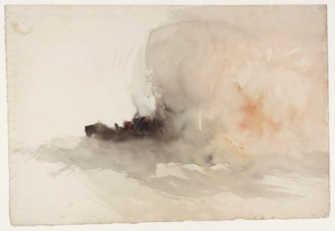
Most of them were watercolor, and they’re mostly beach scenes of Margate. There’s one that has always been my favorite Turner work. It's not a huge watercolor—probably a foot by a foot and a half—and it's a very abstract depiction of a ship on fire offshore. They’re not sure where it was done—it might be Margate. You get a sense of the structure of the boat and of the fire happening. You also see this watercolor blob. It’s a really virtuoso use of the medium for something that's quick and tragic and complex in terms of the elements involved, because it’s about fire and water and smoke and using water to represent all of these things.
It’s a beautiful work, and I feel it’s one of those cases where Turner is so modern, in a way. These are the works that weren’t considered important in his time, but I find the finished oils a little too fussy for my taste. Though some of them—the late abstract ones—are really quite beautiful. His ability to create light out of pigment is nothing short of miraculous. But it’s the watercolors that I really admire, or that I feel I can learn the most from and steal from.
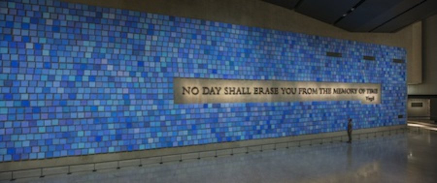 The installation at the 9/11 Museum
Speaking of watercolor, I went to see your work at the 9/11 Museum. You were the only artist commissioned to make a piece for the site. One thing I found lovely is that, while the space is almost oppressively subterranean—completely unlike the Renzo Piano and Chipperfield spaces, there is no light—you created the sky. What made you choose watercolor as the medium for a monumental work, which depicts the famous "severe blue" sky of the day of the attacks?
It’s definitely like a tomb down there. It is pretty grim. The piece was originally proposed as a light projection, but as I worked on it more I felt that it needed to be a work that was more low-tech. So much of the displays down there use projection and video and modern computer technology, and in order for the work to stand separately as artwork rather than as documentation I needed to use a different vocabulary, and a different material.
I have a familiarity with working with watercolor—I suppose I could have done it with oil or acrylic, but I’m not that comfortable with those materials. I feel the fragility of the watercolor serves a purpose. It can be handled clearly—you can see the brushstrokes in the watercolor—so there's the sense that someone made it.
There was a devotional aspect to the project. I really needed to do it for myself, as a New Yorker and as an artist doing something that so serious. It’s a really serious thing, so I felt I needed to do all of those watercolors, especially because it’s from my own memory of the sky that day, not from other people’s memories. The idea is that the work is a sort of screen—a catalyst—for other people to remember their memories of the sky. And, of course, it's about bringing the sky down there. I wanted to bring some lightness down there, because it’s so grim.
And again you incorporated the architecture, which is very complicated in that site.
That I would not consider to be so collaborative. It was more a case of doing the best you can with the hand you’re dealt. But it was also an amazing opportunity.
The museum’s really not for us as much as it is for people coming from other places. It’s a tough and controversial site. The people involved tried to do as good a job as they could, but it’s really a totally thankless task. So much of it was planned right after 9/11, and if we were to think about it now it would be very different. But they were decisions that were made right off the bat, which had a lot of bearing on what happened 10 years later.
To talk a little bit about your studio practice, you are rare as an artist for how many mediums you work in at the same time. What are you working on now?
That comes from a real interest in learning about different materials, and also from a feeling that—because my work is pretty conceptually driven—if I’m trying to present a certain idea, I’m starting from scratch, so I think about what material or technique is most appropriate for a work or a certain environment. But I really do like to learn about new materials and new techniques. I think part of the danger of that, however, is that you never really become good at one technique. There are a few things that I’ve been doing for a while now—watercolor, soft pastel, and oil pastel are materials I use in my drawing practice that I feel I’ve gotten much better at over the years and control over now.
But it goes both ways. One wants to develop a skill with materials, but at the same time the materials have to serve the idea, so you want to use the material that’s the most appropriate to the idea. It’s also a matter of trying and learning new things, and working outside of an established style or the traditions of a particular material. Some of the artists that I admire most are artists who work that way. It’s been a model for me—not feeling limited by a single material, or your knowledge of a single material.
Which artists are you thinking of?
Bruce Nauman, of course. He’s a classic example of someone who is totally idea-driven, and while he has a drawing practice he's also worked in so many different ways. I guess you could usually tell if something's a Nauman work, but there’s sound and there’s video and there’s light and there’s kinetic sculpture and there’s minimal sculpture and there are cast pieces. There’s such a range, and that, for me, is exciting. In his case, it’s an indicator of a restless imagination and curiosity, and I find that inspiring.


