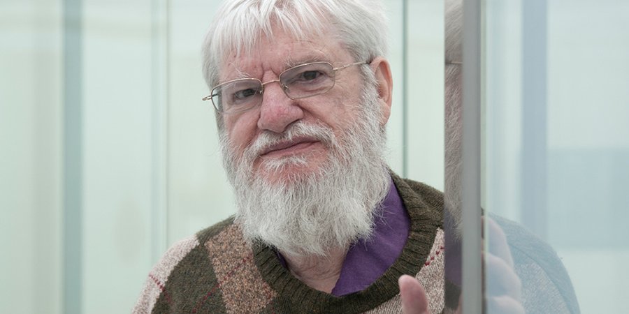
One of the most significant and influential conceptual artists working today, Dan Graham is happy to invoke critical thinkers like Michel Foucault and Walter Benjamin , architectural history, and psychoanalytic theory when discussing the genre-blurring art he's been making since the 1970s. The 75-year-old artist will, however, just as quickly deny that they have anything to do with his art—or even, in some cases, that he's actually read them. Indeterminacy, after all, lies at the very heart of Graham's work—as is most famously exemplified by his sinuous structures of steel, mirrors, and glass, which are neither cleanly architecture nor art.
As an artist, Graham developed his working vocabulary during a period when American art was obsessed with the written word. (His earliest and most well-known work, 1966's
Homes for America
, was a photo-based essay published in
Arts Magazine
, which Graham designed to be totally ephemeral and disposable.) This was the 1970s, after all, the heyday of conceptualism, when critical theory was reinvigorating sculpture as it came up for air from a century of Modernism's ceaseless analyses and radical re-inventions. Perhaps because of the hyperawareness of the nuances of influence, Graham seems at once primed to encourage and eager to exterminate a theoretical reading of his work.
Luckily for us, regardless of whether one grasps all of the somewhat esoteric explanations that Graham offers, in the end, as he will readily admit, his pieces are about resonant universals: presence, light, and time. Graham's latest piece—which may or may not be called a "pavilion," depending on whom you ask—is installed on the roof of the
Metropolitan Museum of Art
, and is the most recent in a series of quasi-functional installations that combine bus shelters, garden pergolas, and references to art history in quasi-functional site-specific installations.
On a sunny day in May, visitors to the museum's rooftop garden certainly had no problem engaging with the work, which consists of a steel armature supporting a pane of curving mirrored glass, box hedges, and astro-turf. Some museumgoers (many on their lunch breaks from work) were sitting on the artificial turf installed by Graham—who made this pavilion in collaboration with the Swiss landscape architect
Günther Vogt
—enjoying the respite the piece offers from the summer sun: no critical interpretation required.
Artspace
met with Graham at his SoHo home and studio to discuss his project at the Met, why he started making pavilions in the first place, and to find out where this art-magazine interventionist turns for quality art reviews these days.
Let's start with the term "pavilion."
I don’t call the piece at the Met a pavilion—I’ve been doing things with landscape since the ’80s that aren't pavilions.
Right, because the Met piece is referred to as a pavilion, but there’s an interview you did a couple years ago where you suggested that you didn’t like that term for describing these works. How did this piece come about?
The current piece is a collaboration with Günther Vogt—the best landscape architect, probably, in the world. But the person I really have to thank Ian Alteveer, the Met’s assistant curator. This piece goes back to the work I was doing in the ’80s in France. In France, the socialist government wanted to regionalize all art, so all the art spaces were historical gardens in Brittany. Out of that, I wrote an article called "Museum as Garden, Garden as Museum," which, by the way, was an attack on Daniel Buren . See, Buren believes the museum is fixed, whereas I think every 10 years it changes. It began with dOCUMENTA, at Münster. You had chateaus and parks and gardens. And it was a family situation—people take their family car, camp out, on Saturday and Sunday and look at the art.
The Met, of course, is in the center of the city, but it's also perched right on the edge of Central Park. If the museum’s role changes every decade, what would you say is the current situation, for the Met or for museums in the United States in general?
Unfortunately this decade is dedicated to overblown spectacle. It’s very different in Europe. I’m dependent upon European socialism, which only works on a very local level now. All my great pieces are in very remote areas, like Norway. Norway is socialist; they give all their money to education programs, and small townships commission individual artworks. The other place where I work is for socialist mayors in France. I have a piece at the Port de Versailles. The last mayor built this tramway around the edge of the city, and it’s at a reduced fare, so it’s for working-class people, and poor people, and every station has a work of art.
At the Met, I kept the hedges they have, which are rectilinear. The pavilion part of the work is baroque, like the piece I did on the roof of the Dia Art Foundation in 1992. I think it’s a combination of George Seurat, who’s a hero of mine—because people lie down inside it—and Bruce Nauman . It’s pleasure and designed for people who have just gotten off work. And the orientation of the piece on the roof comes from Russian Constructivism. In other words, it’s kind of an off-diagonal.
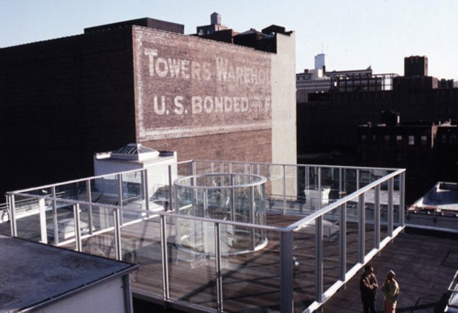 Rooftop Urban Park Project
, 1981-1991 at Dia Art Foundation
The first thing I noticed when I saw the piece is that you have the grid of Manhattan laid out before you, but the piece has a curve so it actually sort of breaks that axis of the city.
Well, that’s the same as the Dia rooftop piece, except the Dia piece was functional. The Dia piece was trying to combine ’70s alternative space with the ’80s corporate atriums. It was about combining the ’70s and the ’80s, a slum roof and a penthouse roof. In the '70s everyone was doing things in tiny little alternative spaces, which were basically music spaces. So the ’70s scene was very informative for me. I don’t like the fact that I’m doing such large, corporate things, that are expensive, but in fact people want that now. All my work has to do with city planning. It began when I showed Sol LeWitt ’s work when I was running John Daniels Gallery, and Sol LeWitt’s favorite artist was de Chirico, who, in paintings, is depicted as the city planner of Turino. And I hated the idea of the white cube—it’s a dumb idea.
And you said that the pavilion at Dia was in part countering the white cube of Dia’s gallery space. How was the Dia pavilion different than the one at the Met?
It was a better piece because it was more functional. The tool shed had videos by artists from the ’70s. It also had a coffee bar, which was like the IBM atrium on Madison Avenue. The flooring was boardwalk material because I thought Battery Park City would be creeping up the Hudson. I left the water tower where it was. In a way, I think the Met was more of a challenge. It’s a very ugly space. I was asked by the Met's contemporary curator Sheena Wagstaff to do something so that people could relate to the tree tops of Central Park. So it’s very much for European tourists, who love to see New York City.
You said the Dia piece was functional whereas this one is not, but I noticed that people were using it in numerous ways—sitting under it, taking pictures with it, fixing their hair in the reflection, and so on. It also has that grass turf, which makes people want to lie down on it.
The artificial grass was my idea. You obviously can’t put normal grass up there, because it would be muddy. And using ivy, instead of boxhedge, was the landscape architect’s solution. You probably don’t know this, but in America, ivy is only used on university buildings. In Europe it’s used for residential hedges. But there were a lot of technical problems, like the middle of the Met’s roof is slightly elevated, so the landscape architect gave me many options as to the tilt of the turf, and we rounded it off.
What about the actual construction of the piece?
I have two architects who are based in Europe, but they don’t deal with construction. I simply send the fax. We had a site visit with the landscape architect when we decided to make it rectilinear rather than square, but I had nothing to do with building it. I didn’t supervise anything, basically it was Ian Alteveer who put all the elements together.
Had you worked with Günther Vogt before?
Only on this one project, but I’d admired his work for years. I know a lot about landscape architecture, and I thought he was brilliant. He works with a lot of corporate architects—you know the Birches, at the entrance to the Tate Modern , he did that. I’d always wanted to work with him because I think he’s more brilliant than I am.
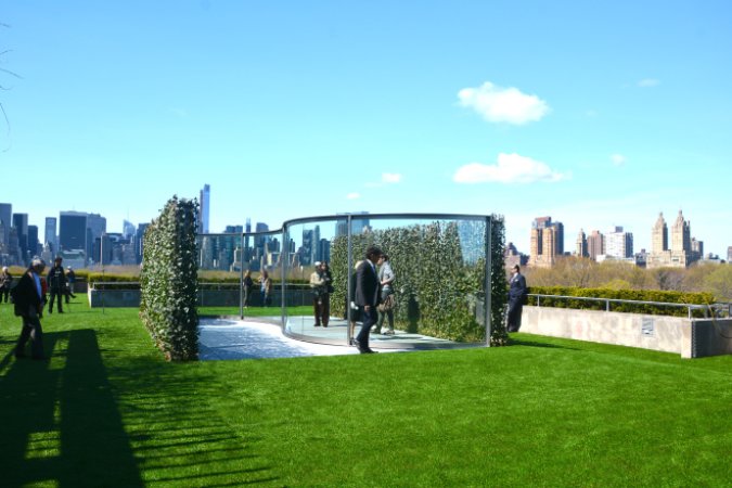 Hedge Two-Way Mirror Walkabout
, 2014
I want to talk more about the materials of the work, because this piece includes two-way mirror, which is something of a signature material for you—that is, you’ve been using mirrors since the ’70s.
The reason I originally used mirror was that Jimmy Carter wanted to be ecologically friendly, and decided that using one way mirror on big office buildings would cut down on air conditioning costs. It only actually worked in Los Angeles, where there’s a hot climate. But it’s also an alibi for the corporation, because they can identify the surface of their massive buildings with the landscape.
Because they’re reflective?
Right, they reflect the sky. But then it becomes surveillance, as well—you can see out, but you can’t see in. So I use both transparent and reflective glass. I didn’t want to make the piece large because my work is usually human-scale. Also it’s very important that you walk around the work, because the work is about time. Minimal art is static. My work has always been intersubjective.
You’ve talked about these works in regards to the “mirror stage,” an idea from Jacques Lacan.
Well, yeah, it was actually Sartre, from Being and Nothingness . Lacan ripped him off. It’s the idea that if you’re a small child, you look at somebody who sees you, and you see them at the same time that you’re being seen. People gaze at each other as they’re gazing like spectacles, and you know who did that in art? Georges Seurat. He painted people at the circus, looking at the spectacle, and looking at each other. It’s a play of mirrors.
I think these works are pretty much against Minimalism. Minimalism was static, you couldn’t lie down. There was a vague relationship to architecture. For the Dia piece, I used the cube oriented towards the grid of the city. I used hedges because the center of the city is always two-way-mirrored office buildings, and the edges of the city are kind of hedge boundaries, for suburban houses. It’s a historical overlay of different park periods. My work is historical. Minimal art was about the present time, and had no sense of history. This is totally against Minimal art.
Well, talking about the work in terms of time makes me think of Robert Morris ’s show at Green Gallery in 1964, an early show of Minimalist sculpture, which was about time, in a way, because it was about how the viewer moved around and through the sculptures in the gallery.
Well, you know Morris was married to Simone Forti, and he took all that from her. When I was at Nova Scotia college of art, Richard Serra told me that all his work came from Simone Forti. I think dance—not as something being watched, but the idea of being the spectators, experiencing their bodies and experiencing other people’s bodies in a relaxed situation—is very much part of my work too. I never saw Simone’s work, but I took that cue from Serra.
Yeah that’s what I was thinking of when I was talking about how the piece breaks the grid, because you can’t actually walk through it. Instead, it leads you into a kind of funnel that' s ultimately closed.
And people can see each other on either side, and it makes for more complex reflections.
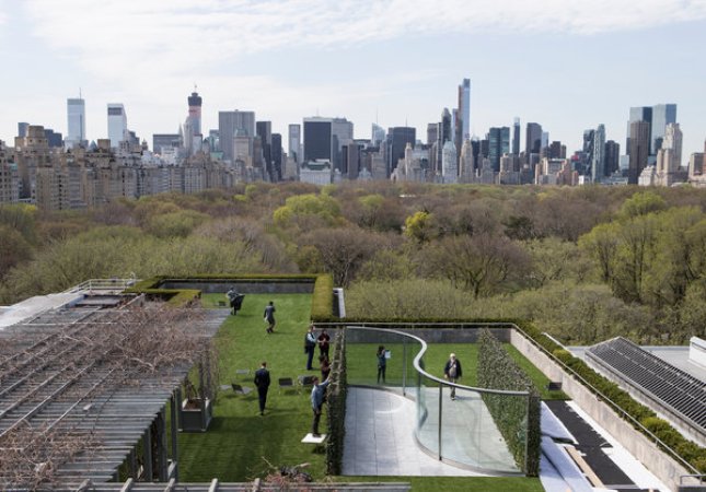 Hedge Two-Way Mirror Walkabout
, 2014
And of course you also have the reflection of the cityscape behind you.
Well, that was also true of the Dia piece. Basically my work has always been about the city plan.
I think the question of the photo opportunity is also interesting, because, while plenty of people seem to be posing for photos or taking selfies in front of the work at the Met, it must be difficult to really document the effect of these works in photographs.
Well, I made beautiful videos of them. I make videos of all my pieces myself, with people in them, so when I do lectures I can show them. I walk around them with my cheap little video camera and with people lying down, people seeing each other, time changing—and with the clouds changing, the reflectivity and transference is always shifting. So the key thing is, the work is time-based. It’s about duration. This comes from listening to La Monte Young, and the influence of Steve Reich, who was my best friend. In La Monte Young's work, you can actually hear the acoustics of your own brain—it’s inside-brain time.
So obviously it comes from the idea of the arcades, from Walter Benjamin, and also it comes from the idea of the nineteenth-century botanical garden. But this is all documented in the 40 minute video that they’re showing downstairs at the Met, which was actually the catalogue for the Dia foundation show.
When did your interest in architecture start?
From the very beginning— Homes for America was about the city plan. But most of all, it comes from the idea of light. I’m an Aries; I think all Aries’ work is about light. And of course the sun is very important in the Met piece.
Most of my pavilions are pure landscape, and they’re usually in very remote parts of the world. Like near the North Pole, in Norway, where I do pieces in very small townships. When I first went to Scandinavia, to the Louisiana Museum there, there was a sunken floor for children where they could lie down and interact with the art above them. My mother was an educational psychologist—she was head of Head Start in Newark. So children’s way of using space for education and entertainment was quite important for me.
On the other hand, I still incorporate aspects of Minimal art, because I love Minimal art—most of all Dan Flavin . When I was running John Daniels Gallery, I did a group show with Flavin. People stepped on his sculpture, one of his fluorescent light pieces, and broke it—and he liked it. He sent all the parts back to the hardware store. That’s why I did my magazine pieces, including Homes for America —I wanted to do things that were disposable. I have problems with big pieces, like the rooftop piece. Homes for America was done with the cheapest equipment possible. I really have doubts about doing large things, like the rooftop piece. But I think it fits the situation.
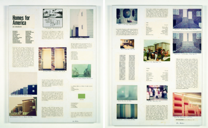 Homes for America
, 1966
Could you talk about how the pavilions developed out of your earlier work?
I got into pavilions for two reasons. Mies van der Rohe’s Barcelona Pavilion was one. You walk around it, and it’s landscaped, and I think the whole thing is an allegory for the Weimar Republic. It had hedges outside, the hedges were reflected onto green marble, and the thick glass was actually green, and that was reflected onto images of people looking into it—it’s like a showcase window—and there’s a reflecting pond. What you saw was a luxury product of Germany, which was very poor at the time.
I combined that with bus shelters, other urban furniture, and telephone booths, which still existed then. So it’s really street furniture and temporary pavilions like the Barcelona Pavilion that inspired me. Everything Mies did in Europe was landscaped. In fact, his last project in Germany was a country club golf course.
And the idea of the pavilion also has other connotations. It makes me think of the Worlds’ Fair and the national pavilions at the Venice Biennale.
Well, that’s a good observation, because when I had my gallery, the World’s Fair in Queens was happening, and Brion O’Doherty had the American Express Pavilion and he took all the artists from my gallery, including Smithson. So yes, that was formative. And of course, my children’s pavilion was supposed to be like a World’s Fair. I’ll be showing that at my upcoming show at Greene Naftali Gallery in September.
In school, a lot of what the ’60s suppressed was the fake utopia. It was a very complex time. Speaking of which, I actually hated the Grateful Dead. My favorite groups are Love, the Birds, and the Seeds. They’re all from Los Angeles. I’m still playing all that music.
Where do you go nowadays to find new music and art?
I read the Village Voice . The Village Voice has the best movie reviews and the best art reviews. The New Yorker trashes everything—they’re quite dumb. But the Voice still has the best writers. And I think you’ll love the new Seth Rogen film, "Neighbors."
Are you a Seth Rogen fan?
Well, I’m Jewish. He’s the greatest Jewish comedian. And he’s getting better and better.


