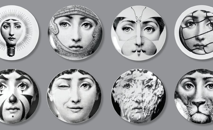
The difference between a throwaway ad and a lasting cultural touchstone is often the wit and creativity of graphic designers; these 10 images, excerpted from Phaidon’s newly revised compendium A Smile in the Mind: Witty Thinking in Graphic Design, show some of the best and most recognizable examples of design classics.
THE MICHELIN MAN
O’Galop
France, 1898
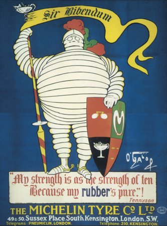
Michelin man in the early years. Monsieur Bib still has the same bounce today, showing the power of graphic wit to last a hundred years.
PIERO FORNASETTI'S PLATES
Piero Fornasetti
Italy, c. 1946–88
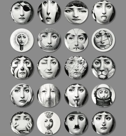
Themes and Variations: a collection of over 350 porcelain plates reinterpreting a single found portrait.
ESQUIRE MAGAZINE
Henry Wolf
USA, 1955
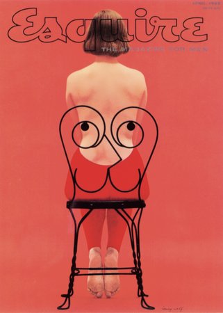
Cover for Esquire. The ogling playboy was Esquire’s symbol for nearly thirty years.
"FREEDOM FROM HUNGER" CAMPAIGN
Abram Games
UK, 1960.
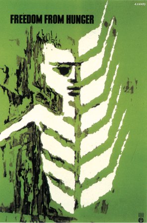
Poster for the United Nations Freedom from Hunger campaign. The designer finds a similarity and executes a haunting transformation.
CHARLES BUKOWSKI'S NOTES OF A DIRTY OLD MAN
Mendell & Oberer
Germany, 1979
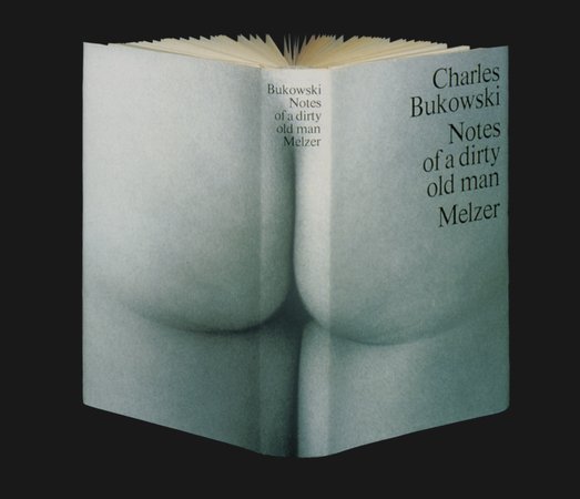
Book jacket for Notes of a Dirty Old Man published by Melzer. More than just a spine.
RADIO TIMES "WORLD AROUND US" CAT & MOUSE
Peter Brookes
UK, 1979
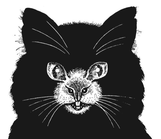
Illustrations in the Radio Times promoting a "World Around Us" program on cats. Not less of a cat for being more than a mouse.
IBM
Paul Rand
USA, 1981
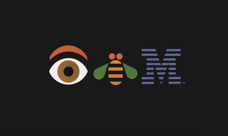
Detail from a poster for IBM. A classic identity smiles at itself. The designer spotted that nature was on his side, putting bees in stripes.
HERBERT READ'S THE MEANING OF ART
Pentagram
UK, 1982
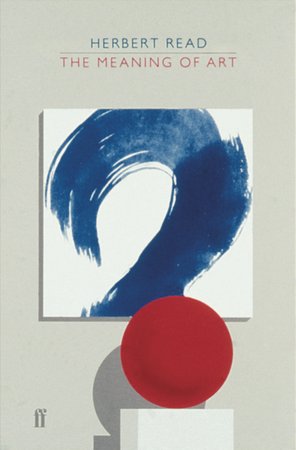
The classic expression of wit is the single image, where the idea reaches its entire culmination. Paperback cover for Faber.
FED EX HIDDEN ARROW
Landor Associates
USA, 1994
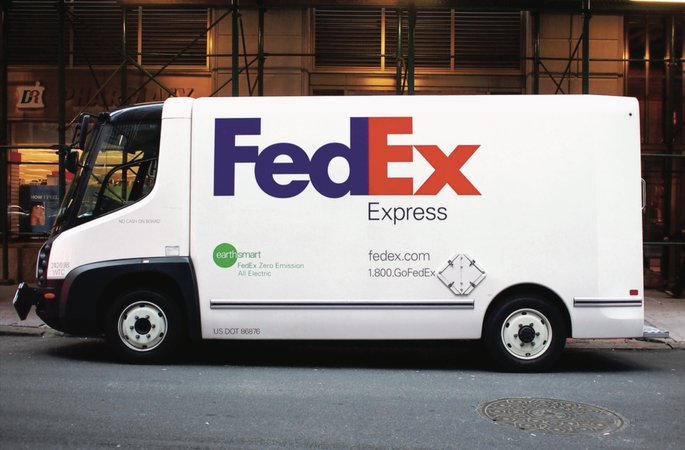
A big brand with a little secret. Between the E and the X lies the most famous negative space in logo design.
THE GOOGLE DOODLE
Google
USA, 1998–present
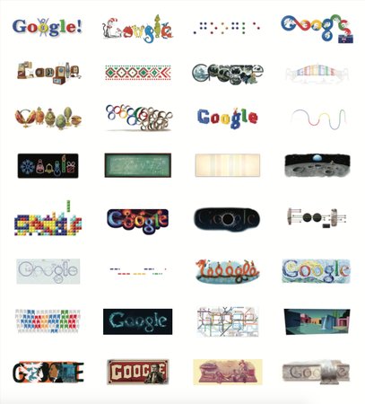
Google doodles: a never-ending series of logo variations to mark cultural moments.


