Why do artists always seem to have the blues? Since time immemorial, blue has held a special place in art history, evoking the loftiest sentiments, the most aristocratic pedigrees, and the profoundest spirituality. As a material, blue pigment has itself been a fetishized commodity, serving as everything from a prized color for Medieval monks to the point of obsession for the painter
Yves Klein
. Many artists have tried to explain the hue's allure—Fauvist painter Raoul Dufy once said, “the only color which maintains its own character in all its tones,” for instance—but, in fact, blue has had a wide spectrum of meanings over time. Here are five ways the color has been used throughout art history.
ROYAL BLUE
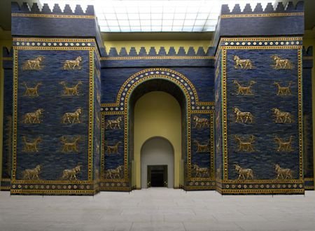 The Ishtar Gate
In the ancient world, ultramarine was the most desired color because of the inaccessibility of the pigment used to make it. Made from lapis lazuli—an expensive stone of rich color—ultramarine was only affordable for the wealthiest, highest-status patrons, and as a result came to symbolize royalty. In the Middle East, it decorated Tutankhamen's funeral mask and colored the Ishtar Gate’s famous glazed bricks. In medieval Europe, it was employed in illuminated manuscripts to symbolize the exalted station of Jesus Christ and the Virgin Mary, with blue ink used both to color their garments and to underline passages about them. The tradition of blue as a regal color then continued from the Renaissance through the Age of Absolutism in the 16
th
, 17
th
, and 18
th
centuries, eventually evolving into a more generalized mark of the aristocracy in the portraits of artists like Thomas Gainsborough, famed for his
Blue Boy
.
THE BLUE HEREAFTER
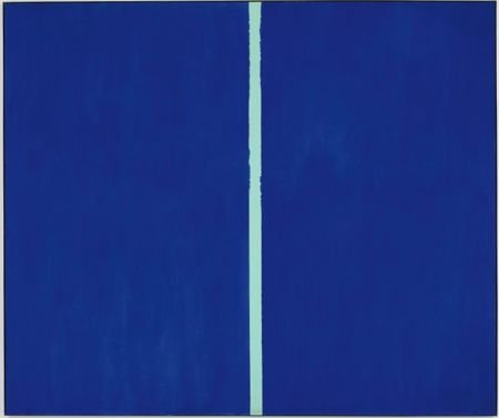 Barnett Newman's
Onement VI
(1953)
While the afterlife is often depicted as a magnificent, gleaming-white realm, Wassily Kandinsky, a founding member of Germany's Der Blaue Reiter (aka “The Blue Rider”) art movement in the years prior to World War I, believed heaven to be blue. The painter is hardly alone in associating blue with transcendence. The Abstract Expressionist artist Barnett Newman, for instance, painted massive blue canvases meant to be viewed at close range so as to engulf their viewers, creating an almost religious experience. More recently,
Tomás Saraceno
’s
Cloud City
used mirrors to reflect the clouds and blue of the sky so as to create a disorienting, heavenly feel, and James Turrell filled the Guggenheim's rotunda with light that memorably phased into a beautiful blue.
SKIES OF BLUE
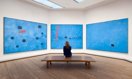 Joan Miró's
Bleu
Triptych (1961)
Talking about his
Bleu
paintings, the Surrealist painter
Joan Miró
once said, "The spectacle of the sky overwhelms me." He was determined to reproduce this overwhelming transcendence in his
Bleu
triptych, a set of three paintings that evokes a dreamlike state using blue as a symbol of the night sky. Miró was by far the first artist to be awed by the blue of the sky, and he was certainly not the last. James Turrell's
Skyscapes
, rectangular cuts into the ceilings of spaces that frame a patch of the sky moving above, encourage viewers to meditate on the beauty of the heavens and use light from to provide insight into changing natural forces, while
Ólafur Elíasson
uses blue to probe the phenomenological effects of the sky, for instance enveloping entire gallery spaces in blue.
BLUE IS BLUE
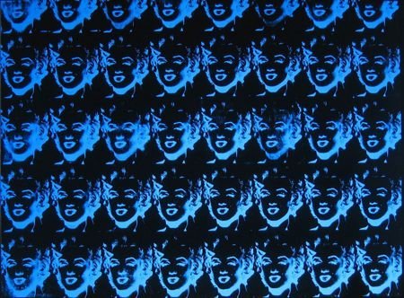 Andy Warhol's
Forty Blue Marilyns (Reversal Series)
(1979-80)
Michael Riedel
’s
Untitled (color) blue
dramatically confronts its viewer by announcing blue’s status as a mere color. Riedel’s conceptual work is part of a larger trend within blue art lately: the idea that blue really is just blue, and nothing more. Riedel’s approach isn’t one that is new. Yves Klein engineered his own shade of blue—International Klein Blue (abbreviated IKB)—that he then repeatedly used to make monochromes. Klein’s work finds a lack of meaning in the color blue, seeing it more as a void or an absence rather than something that has content.
Josef Albers
performed something similar with his paintings of squares that used blue as nothing more than a formal property, and
Andy Warhol
continued this in his
Marilyn
paintings and other serially reproduced works, which use blue as just another color with which to mutate the actress’s image, interchangeable with yellow, red, or any other hue of the spectrum.
LIVING IN A BLUE WORLD
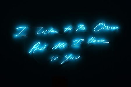 Tracey Emin's
I Listen to the Ocean and All I Hear Is You
(2011)
The title of Vincent van Gogh's painting
Old Man in Sorrow (On the Threshold of Eternity)
(1890) depicts an elderly man bent over in grief—evidently contemplating death—while clad entirely in blue clothing, with the color echoing his anguished sadness. It's not for nothing that the lamenting American musical form is called "the blues," and van Gogh and many other artists have likewise used blue as a evocation of pain and suffering—no one more notably than
Pablo Picasso
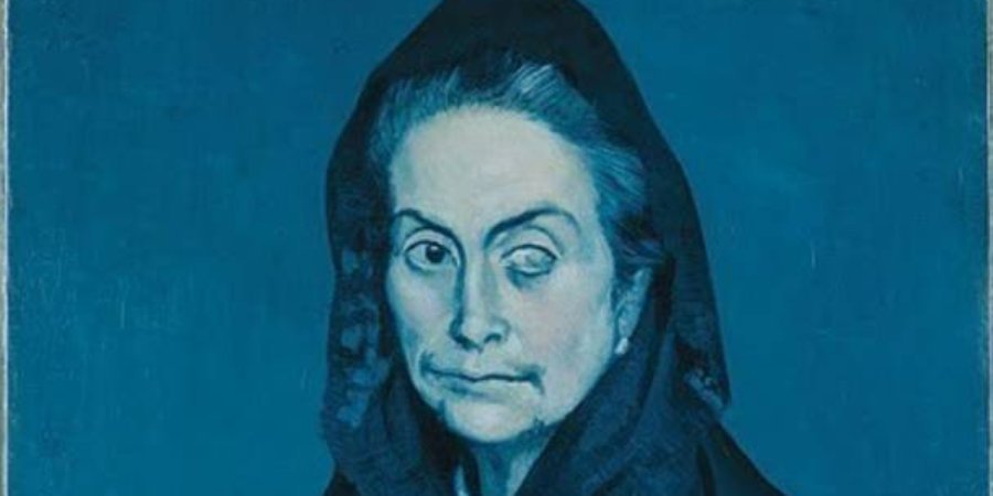
, whose three-year Blue Period, inspired by the suicide of his friend Casemagas, bathed every canvas in dark shades of blue. Picasso's subjects—prostitutes and beggars, mostly—were bathed in various intensities of the color, conveying both their desolate lives and the depression that had engulfed the artist. Since Picasso, no artist has seized upon the sorrowful aspects of blue as extensively, but many continue to use blue to symbolize sadness. Felix Gonzalez-Torres, for instance, uses piles of blue candy and installations of blue lights to mourn those fallen to AIDS, while
YBA
Tracey Emin
often employs a rich blue to create her tragic, erotic drawings and light sculptures that speak confessionally about romantic failures.


