Most contemporary art gallery websites opt for a fairly standard approach to site design: buttons on the top or left side of the screen (never on the right) that proclaim portals into artists, upcoming/current/past shows, contact information, and perhaps that most nebulous of Internet pages: the “about” section. For these galleries, this is more than enough. For some youthful upstarts, however, this is just the beginning. As the aesthetics of Net Art continue to shift into something we can call Post-Internet, website design has revealed itself as a fertile site (pun unintended, but welcome) for showing off a space’s alternative street cred. Read on for some of our favorite examples of galleries whose experimental approaches to the art business don't stop with their exhibitions.
MARLBOROUGH CONTEMPORARY
London
The main page for this London gallery’s site is a fairly typical scroll of installation shots and exhibition announcement posters (or are they just image macros now?) with one big twist: a zig-zag Tetris block floats ominously in the middle of the screen, obscuring your view and daring you to click into its depths. Doing so brings you to the gallery’s otherwise standard-issue site, but the specter of the staircase continues to haunt the site, an illustration of the spooky side of branding.
KNOW MORE GAMES
Brooklyn
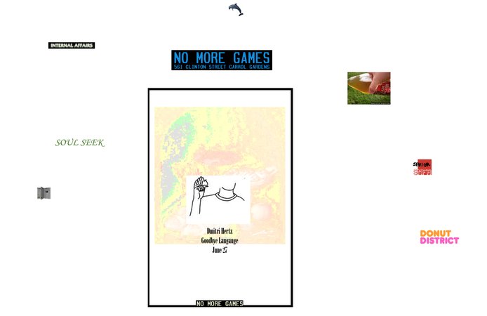
This Carroll Gardens “Donut District” gallery is perhaps the best example of a functional gallery site that still takes the visual idiom of the Internet seriously. The top of their homepage is populated by GIFs and clip art leading to pages repping some of their favorite things (the directors’ alma matter the School of the Museum of Fine Arts, Boston, the Gowanus dolphin, selected press, etc.). The links to exhibitions open up neat little windows with a mix of text and photos, not all of which are directly related to the artworks at hand. Next-level!
GALERIE GABRIELLE MAUBRIE
Paris
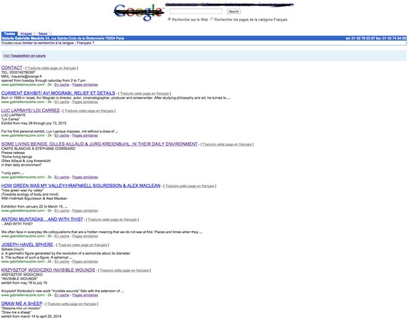
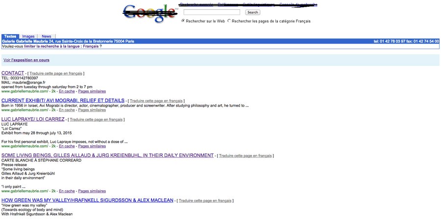
This site gets the award for the best inexplicable home page—a super slow 8-bit GIF of a dolphin (weirdly, an ongoing theme with some of these sites) leaping into a pixelated sea. This would have been enough for us to say, “This is an unusual and cool gallery site!” but the fun doesn’t stop there. When the friendly mammal finally reenters the ocean, you’re rerouted to what appears to be a hacked Google search page from five years ago that is in fact the gallery’s homepage, with the search results leading to press releases. Détournement never looked so good.
MOIETY
Brooklyn
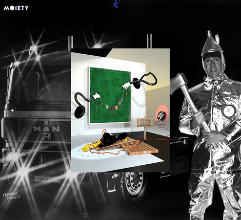
Moiety’s site has it all—a mysterious opening page, a strange background image from taken from their latest show (photographs by Thomas Mailaender), and some cool graphic design touches like the swinging-figure button on the top of the screen. The best part, though, is the navigation, which allows you to move both between projects (an up-down movement) and between installation images (left-right), with minimal text. This easy-to-grasp, image-based system should really be less novel than it comes across. Take note, countless cookie-cutter gallery sites!
CHIN'S PUSH
Los Angeles
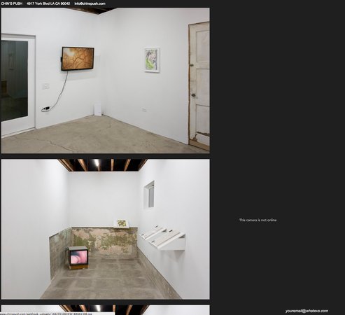
This uber-hip Los Angeles gallery is known for its alternative programming (think Pokémon themed exhibitions complete with fan art and Gameboy-clutching 10-year-olds—it doesn’t get much more alt than that), and their website lives up to their reputation. They’re currently teaming up with Conduit, “a curatorial proposition by Jade Novarino and Eli Coplan” that takes the form of a webcam that acts “in lieu of exhibition documentation.” The site also tells us that “This camera is not online” and also that they’re “off to Maine”—we’ll check back in later to see how this proposition is coming along.
CABINET
London
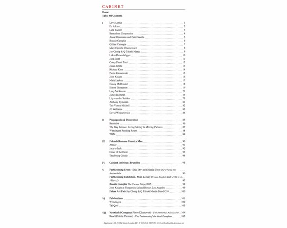
London’s Cabinet gallery’s site has layers: first, a slick video from digital auteur Ed Atkins, then a list of forthcoming exhibitions, and then a table of contents-style listing of the gallery’s artists, projects, publications, and friends. The page numbers on this page are especially interesting. What do they correspond to? Why does Richard Kern only get one page (14) while James Richards gets 29 (44-72), and why do both artists in fact only have one (web)page with a handful of images? Sometimes, we must be content living with uncertainty.


