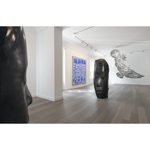
Shawn Henderson’s first steps into reimagining interior space came when, as a young man, he took an interest in rearranging the living room furniture in his own home. From these humble beginnings Henderson – a native New Yorker and graduate of the Rochester Institute of Technology – has founded and led a highly acclaimed Manhattan studio, overseeing interior-design projects for such notable figures as Glenn Close, NASCAR champion Jimmie Johnson, and Will Ferrell and Viveca Paulin-Ferrell.
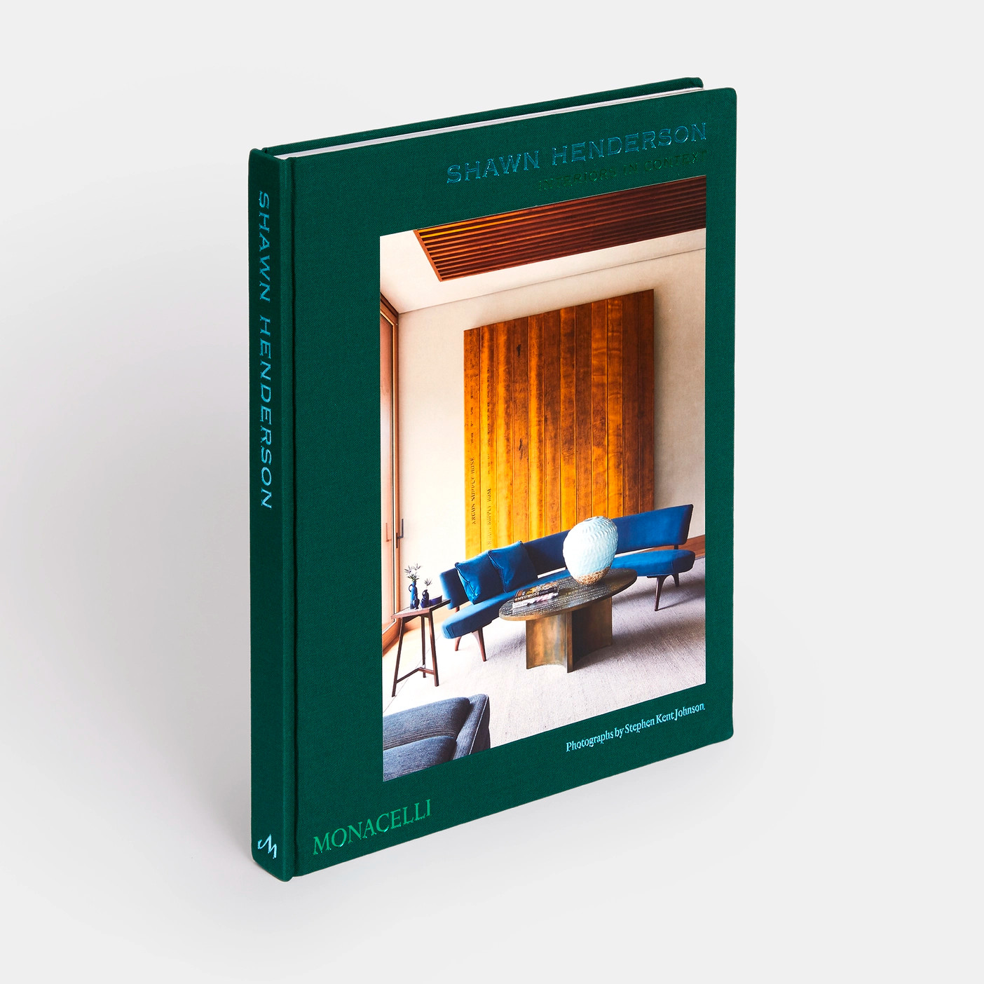
His work has appeared in Architectural Digest, Veranda, Elle Decor, Luxe, House Beautiful, Galerie, and New York Times, and many of most notable works have been collected together in a new Monacelli Press title, Shawn Henderson: Interiors in Context.
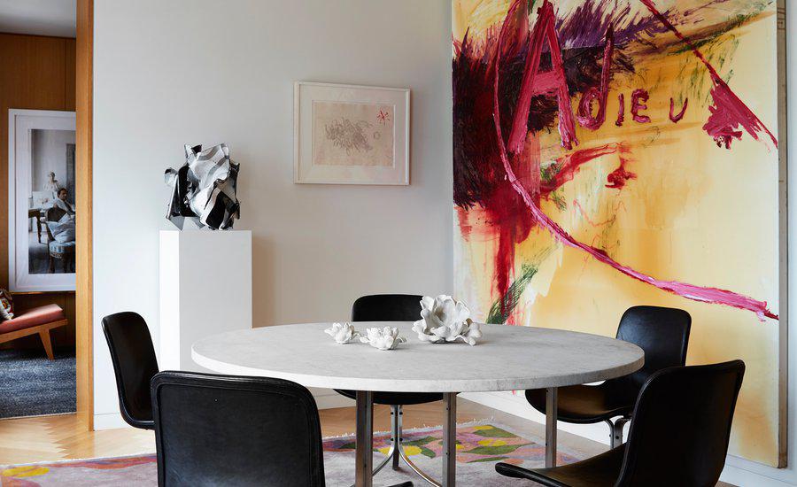
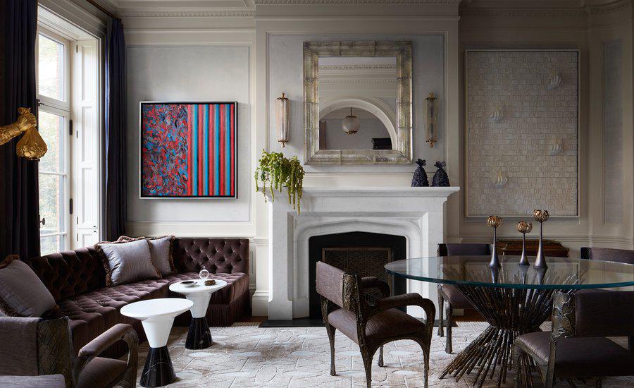
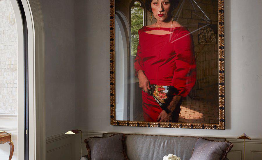
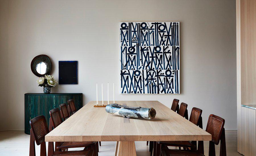
As you'd expect, art plays a huge role in the interiors Henderson creates - whether it is art his clients have chosen themselves or art he has helped them choose.
"I think a certain portion of my clients have their own experience and choose art themselves, but quite often I'm asked to help. It always starts with a conversation around their likes and dislikes. And then I go off and do a wide shop. Then we do basic elevations that will detail what size artwork we are looking for. Whether it’s a large piece or a grid of something. So that then dictates exactly what we are shopping for. Then when we find stuff and present it to them then we take that elevation that we’ve done and drop the pieces into elevations – two dimensionally – so that they can visualise it."
"I learn a lot from my clients. And to me it is important to understand and get inside their head. So, by and large, I think everything that I present to them are pieces that I respond to, and that ideally would work in their home and within the feeling that we’re trying to create in their home. So if there’s a very soothing den, then to have a super aggressive piece of artwork in there would throw it off balance.
"I don’t believe in buying artwork to decorate, the art doesn’t need to match the interiors, but I think it has to have a similar feeling or energy. That said, ultimately it’s their home and they need to be surrounded by things that they love. That, to me, is the most important thing.
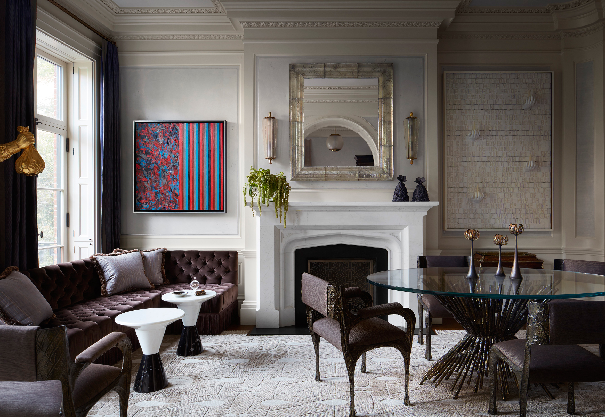 Greenwich Village Townhouse - photo Stephen Kent Johnson
"I never really lead with where art is going to go until I have figured out the furniture placement in a house; and that is dictated of course by the architecture but almost more by how clients want to live and use their home and then layering in moments where art can then add yet another dimension to the space and enhance the experience. Art is super important in adding personality to a home and enhancing the experience of living in the space."
Shawn Henderson: Interiors in Context features many of Henderson’s greatest projects – warm, intimate and harmonious city townhouses and lofts, historic farmhouses and country estates, and modern mountain and beach retreats which combine custom and vintage furniture with statement lighting and exceptional art.
You’ll have to turn to the print publication to see those furniture and lighting choices, but, to celebrate the release of his new book, the designer chose just a few of his favorite contemporary art works from the Artspace trove that he would have in his own home or that he would bring to the attention of his clients.
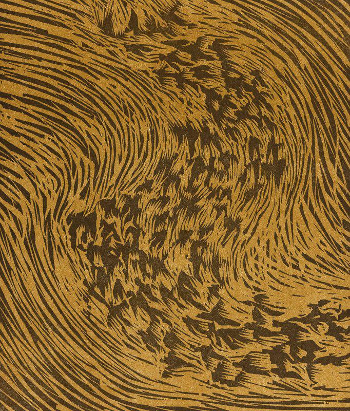
JAMES NARES – Starling (From artist book A Bestiary by Bradford Morrow), 1990
We actually buy a lot of her work for clients – Nares is now known as Jamie Nares, since transitioning in 2019. Her work is all about process and for 900 bucks this is super affordable, and the movement in it and the work itself is so beautiful. When working with a client I am usually the first step in presenting the art and then hopefully their interest is piqued. Then we look at the piece in person but quite often it’s done virtually, looking at images and videos. And with Nares it’s a process of seeing the works and that’s very interesting and enticing to most of my clients. And lots of them eventually fall in love with it. It’s not too dissimilar from what we do decoratively when we’re buying designer furniture - not just a regular sofa, but say an amazing investment piece by someone like Vincenzo De Cotiis. It’s fun getting to understand the artist’s process, and it tells a story about the piece. People want to tell a story about what they own. It’s more meaningful and that’s what life’s about. Unless you’re a Buddhist and don’t want to have anything!
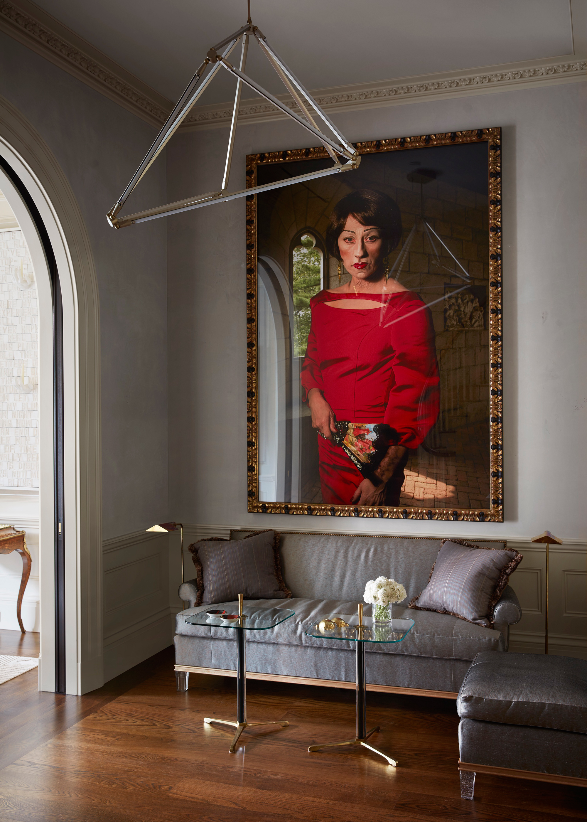 Greenwich Village Townhouse - photo Stephen Kent Johnson
Actually, I always joke to people that I want to live like a monk. There will be a certain point in my life when I have nothing. And as long as John Pawson can design my nothing then I don’t need anything! I remember learning about the mid-century case study homes in the mid-to- late-nineties and I just became a fan immediately. It was just the simplicity of them that I admired. So I say it jokingly but I will have a home one day where I have built in furniture so that I don’t have to worry about it - just calm.
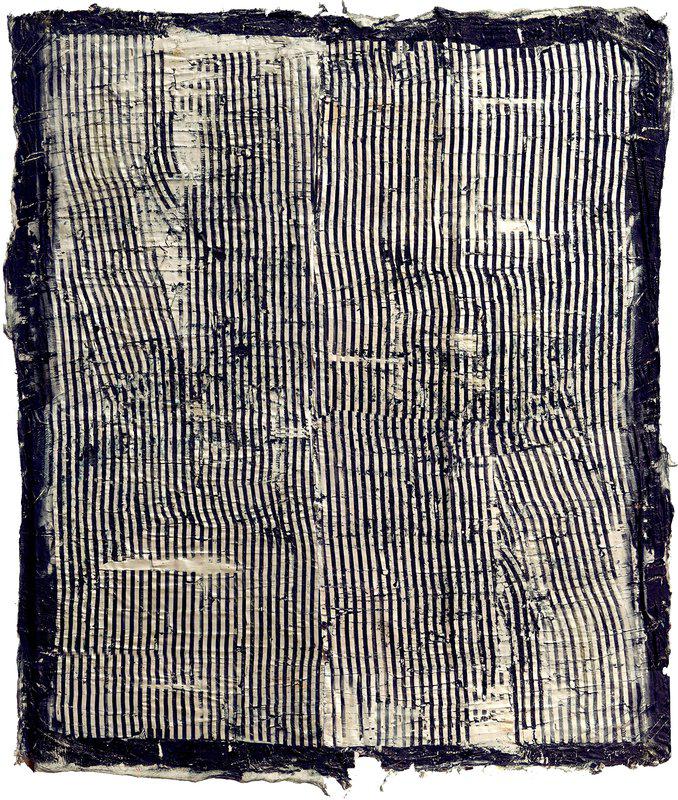
JEFFREY TERRESON – Indigo Silver
The Terreson is probably my favorite of all the pieces I’ve chosen here. What hopefully people can discern if they look at it closely is the real depth to the painting. I am really drawn to pieces that show a strong hand and a clever use of material. It looks like a textile to me and there’s such depth to it all I find it so intriguing and it just draws me in. Having a stripe to it makes it super active. I was lucky enough to get a client to buy one of his pieces. It’s very similar to this but it’s a red and white stripe, not black and white. I love this black and white one so much though. It reminds me a little of a book of aerial photographs I have, this could be a ploughed field from above. I love thinking about all the things it could be.
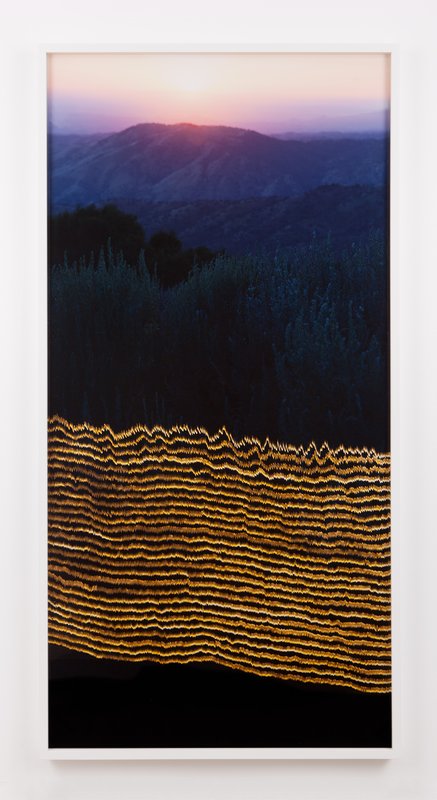
EVAN WHALE – Sunset Overlooking White Wolf, 06/02/2016, 08:21pm , 2016
It’s funny, because I think there’s consistency in all my choices here. If you look at this one and the James ‘Jamie’ Nares and the Terreson, there’s a sort of linear thing happening. I personally love photography. I’m so drawn to the medium. When I look at this it’s almost obscured, right? And that to me is even more interesting. I’m a huge fan of Yosi Milo Gallery which represents a lot of photographers who use photography in a very different way. That said, this is straight up photography - well, it’s a seismogram - but I still think it’s super interesting, in terms of the whole movement of it, and I like the moodiness of it. And once again it’s got that textural element to it.
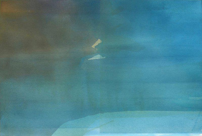
DANIEL BRICE – Water - Turquoise, 2020
Just as a point of comparison this is very different from what we’ve been looking at, though again, it’s landscape. I was not aware of him before seeing this on Artspace. To me this is stunning, I think it’s really beautiful it’s a great price and there is a really great depth of color to this. It actually reminds me of a holiday I took in Mexico and so, to me, it evokes those memories of being on a beach and having a nice happy time.
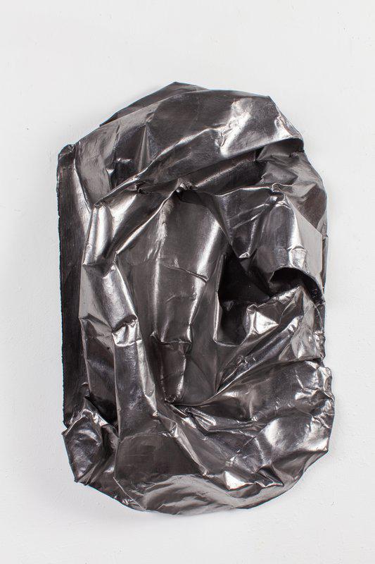
LAUREN SEIDEN – Shield Wrap Loop, 2021
I just discovered her on Artspace and I just love the depth of this piece. And it’s so interesting to me because it’s aggressive but sensual at the same time. It reminds me of Anthony Pearson - he’s at Marianne Boesky, New York - he does these amazing paintings that look like plaster and amazing sculptures that almost look resiny. So he’s one of my favorite artists and this to me looks like a metallic version of that which is why I was really drawn to it. Plus I think it’s a really nice scale. This of course is a drawing but it feels sculptural to me. And that realism is what is so cool about it.
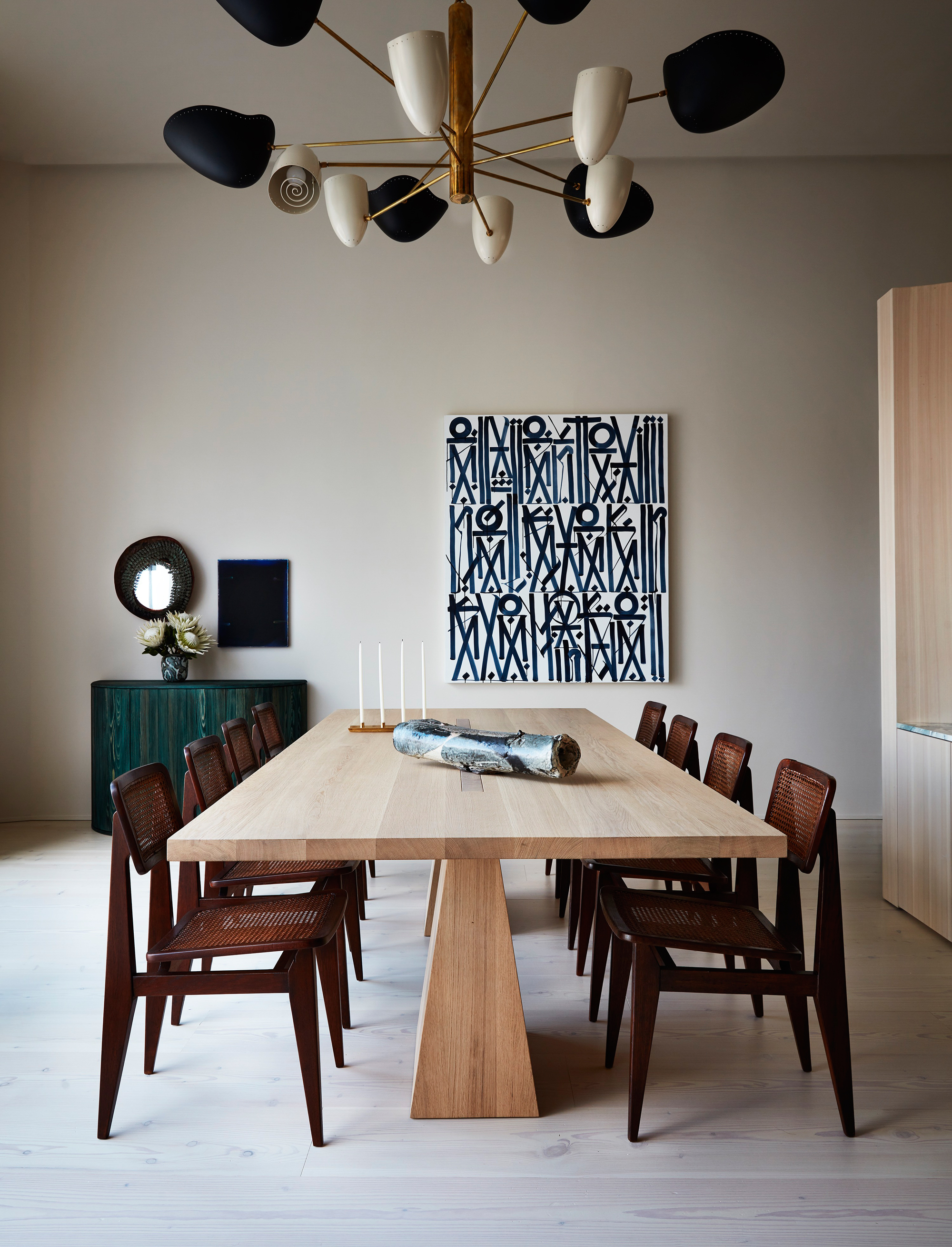 West Village Residence - photo Stephen Kent Johnson
What’s interesting to me is having a nice mix of mediums in a home. I try to push for that as much as I can. This is really sculptural. This would probably be the second piece I would buy for myself after the Terreson. I love it so much. I think it would work anywhere but I think I would hang it over my bed. I actually have a sculpture in my apartment that’s very large that’s not too dissimilar from this. It’s a diptych and it’s undulating metal.
GINERVA SHAY – The Room Bends Back , 2021
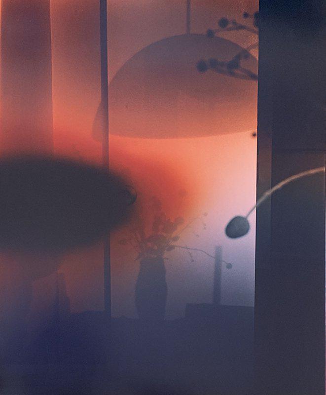
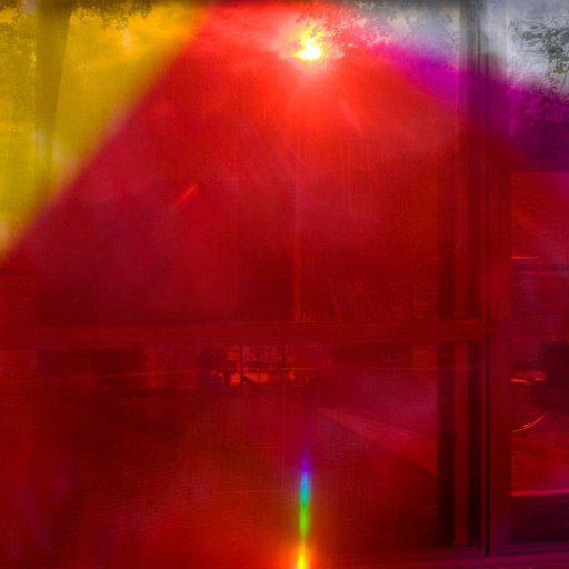
Again it’s obscure landscape imagery that just feels super moody. There are so many things going on in there. It looks like a picture of a skyline from an interior of a home with the flower arrangement in the foreground during a red sandstorm or something. But to me it’s mysterious looking but super-sexy. I also think it’s a great price point. When I’m working with clients it’s nice to have a mix of things that are different price points in a home. To me I think that’s why it’s important if you love something and you respond to it you should go with it. This is like 1700 bucks and can have such an impact.
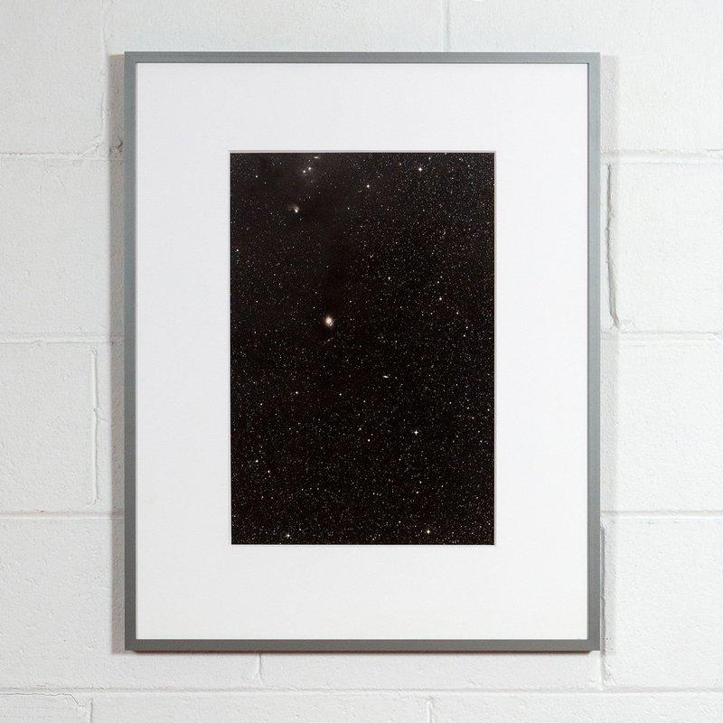
THOMAS RUFF – Constellation , 1990
He’s always been such a favorite of mine. A lot of my clients have collected him over the years. And I think his work is great. I wasn’t aware of this image. It’s very different from what he usually does. It’s probably a little more palatable than his blurred out pornography images - which I would really like to have. But I think for what it is it’s a solid investment. The stars and the universe - it’s a very powerful thing for us, right? It’s very easy to live with. For me personally I think that images like this are soothing and I would group this into a landscape concept. I think it’s beautiful. It reminds me of a photographer called Chris McCaw, who uses military grade lenses to expose these beautiful landscapes. What often happens is that the sun often burns a hole in the actual film as it’s exposing the image and so you see this burned into the paper. This makes me feel like that.
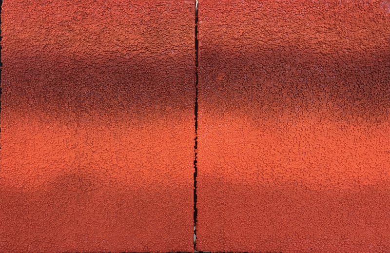
ANTONIO PURI – Tantric View , 2020
So beautiful right? This reminds me of Lucio Fontana, the artist who slices the canvas. I love the geometry of it, it’s so super cool. And because it’s made with beads to reflect light in a beautiful way it has the textural thing going on that I tend to love. I just find this very seductive and very warm. People often ask how I put it all together. How I work with specific pieces of art. I think it starts with the piece itself and then I think it’s feeling it’s trying to see how it fits into the home. To me it’s an energy thing. To me some rooms are stronger than others and can carry more dynamic pieces of artwork.
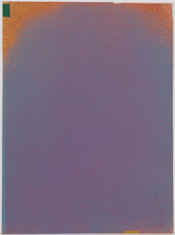
JULES OLITSKI – Graphic Suite Number I (Mauve/blue with green and yellow), 1970
I just think this is super dreamy, right? It was like if you took a Rothko and zoomed in on a certain part of it, or a Frankenthaler and just took a little study of the bleeding of color and the saturation of color. It’s so interesting to me. I think this in a bedroom would be beautiful. It’s almost meditative, the balance of color and composition. It would look good over a fire in the bedroom. The color of it is a big part of it for me. There are certain things I love but wouldn’t be able to live with but I’m a big fan of pieces that have this sort of energy. I think I tend to be drawn to color first.
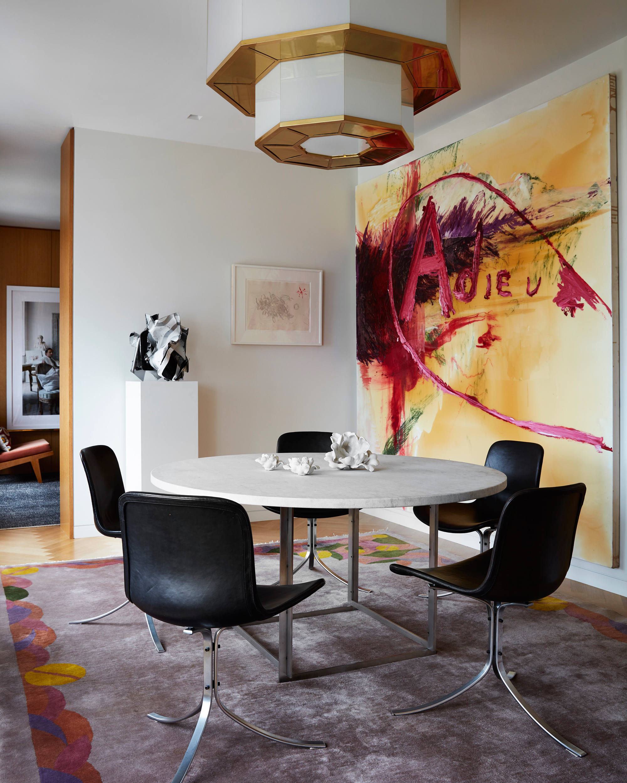 River View Apartment - photo Stephen Kent Johnson
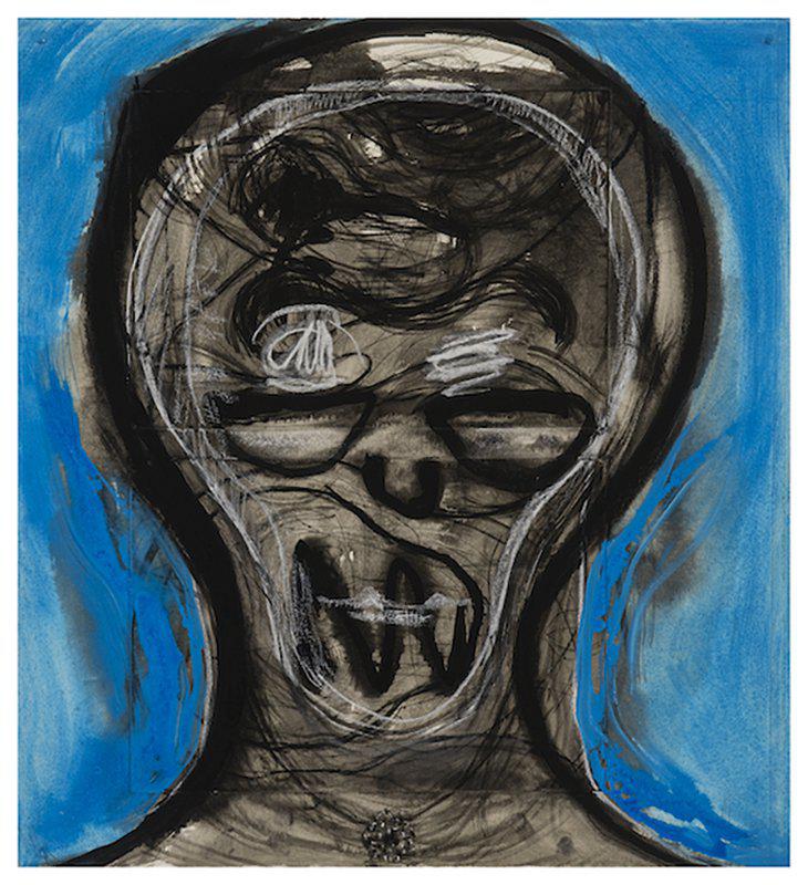
This kind of abstract, kind of portrait, work is new for me. It’s intense and a little shocking. I actually have a piece similar to this, it’s huge and I put it in my powder room in my house upstate. I love it, but people get freaked out by it! This is more of an intimate size and maybe the size controls it but it does the same thing. Using this in a space where you can force people to be confronted with it could be very interesting. I’m responding to the energy of this piece. I think, looking through my choices, a lot of them are subdued so I think it is nice to have an energy shift like this as a counterpoint to everything else. A powder room is an amazing spot for an artwork because everybody uses it and it’s super highly visible; so using this in a space like that would ensure a talking point.
For more from this brilliant contemporary interiors practitioner, consider buying a copy of Shawn Henderson: Interiors in Context . This is an inspiring new publication, which collects together fourteen stunning projects by the acclaimed interior designer into a beautifully conceived monograph, which illustrates how Henderson crafts spaces that reflect the lifestyles of his clients, while embodying the serenity and sophistication that have become synonymous with his work.
Shawn Henderson: Interiors in Context
Presenting his designs for city townhouses and lofts, historic farmhouses and country estates, and modern mountain and beach retreats—including his own West Village apartment and upstate New York country home—this new book shows how he creates comforting, contemporary homes, all set against a refined palette of clean neutrals and moody grays, alongside clever pops of color. Find out more about it here.


