A Creative Time trustee and prominent patron of contemporary art, Amy Phelan splits her time between New York and Aspen, where her lavishly art-filled home plays a central role in the annual festivities surrounding Aspen ArtCrush, the so-called "Davos of the art world" that she chairs . Every summer, her residence becomes a vibrant social hub, with acclaimed artists and gallerists alike being drawn together by her magnetic personality and distinctive taste.
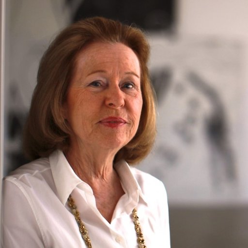
 A portrait of Amy Phelan by Roe Ethridge
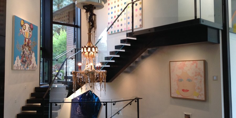
In a new recurring feature on those intimate zones in collectors' homes where art, architecture, and the minutiae of daily life come together to express their personalities—we spoke to Amy Phelan about this curatorial core of her Aspen home: the Stonefox Architects-designed stairwell that greets visitors when they enter the front door, displaying new acquisitions that she and her husband, John Phelan , are debuting for the Artcrush crowds alongside old favorites. At the moment, the space has been transformed into a showcase connecting exuberant Pop paintings such as Warhol's Dolly Parton (1985) and Murakami's Panda Family—Happiness (2014) to dreamier, deep-blue sculptures and reliefs by Jim Hodges , Ron Mueck , and Jeff Koons . What follows is a tour through this art nexus in Phelan's own words.
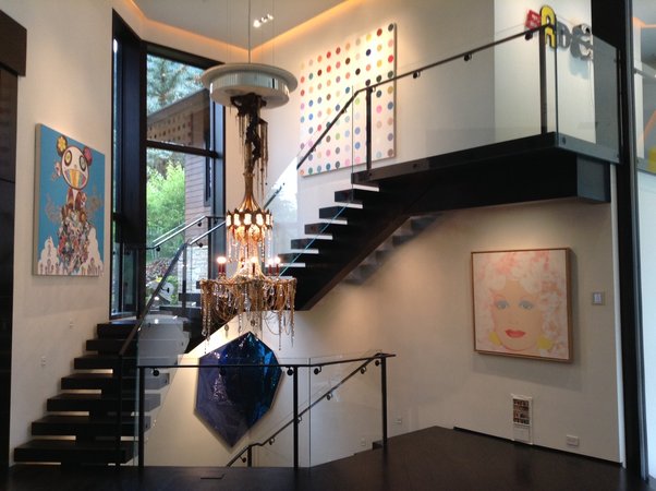 A view of the mid-level, with works by Hirst, Warhol, Murakami, DZINE, Todd Knopke, Jack Pierson, and Jim Hodges. Courtesy of Amy Phelan.
The staircase is the center of the house, the connection between all points of the home, and it's the first thing you see in the house after entering. It's usually the first area we think about when re-hanging the entire upstairs. It has a lot of natural light—there are two large windows that start on the first level and continue down to the second level, and two structural glass panels on the mid-level floor that allow light through to the lower level. There are three large walls on the main level that are all different in size and shape. We love to consider really special pieces for the staircase, given the challenges of how to install the works in that area. The DZINE chandelier [ Ethiopian Mistress , 2011] is such a fun conversation piece, as was the Juan Muñoz that was hanging there before.
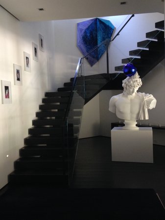
We made a model of the house and a scaled version of each work in the collection so we could see what the works looked like together before we brought them in from storage. After trying several works in various places in the model, the Koons and the Hodges had the best connection.
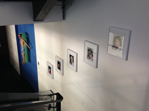
We also like to hang a series of works on the wall that leads down to the lower level—the Delia Brown collage pieces look amazing in this space.
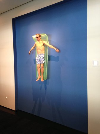 Ron Mueck's
Drift
(2009). Courtesy of Amy Phelan.
We wanted to keep the Ron Mueck sculpture installed where it is, so that's the piece we worked around. The Mueck, Hodges, and Koons have a very literal connection in that they evoke blue water, which leads you to the pool room, although they were not purchased specifically for that reason. There is always an unintentional theme that surfaces midway through the re-hang.
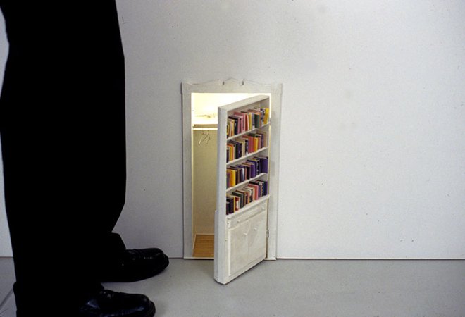 Todd Knopke's
Closet
(2002). Courtesy of the artist.
I do love having little surprises, like the Todd Knopke closet.
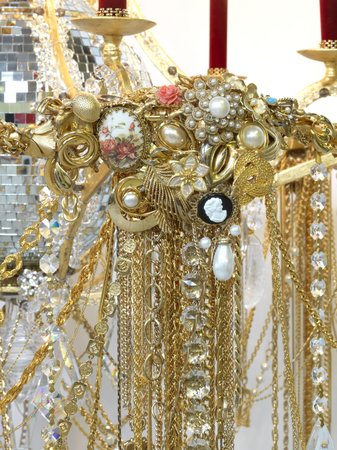 A detail view of Carlos Rolon’s
Ethiopian Mistress
(2011) (Courtesy of the artist and Salon 94)
To me, it is more about an overall feeling rather than a linear narrative. We wanted to emphasize bright and bold colors, positive and strong themes. We were really excited to celebrate the opening of the new Aspen Art Museum last summer, and we wanted the collection to represent that.


