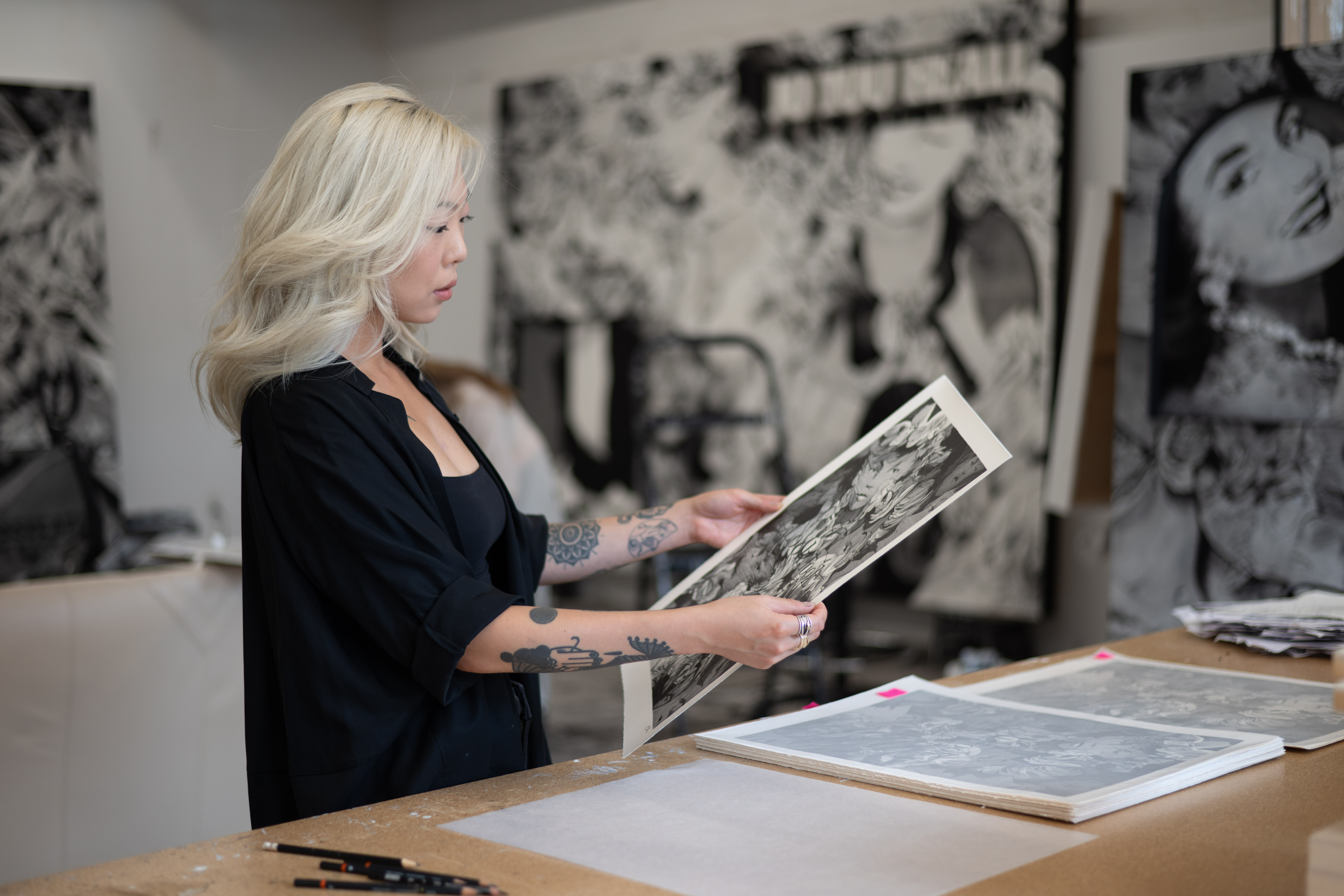
As a young girl growing up in South Korea, Anna Park was always drawing. “I was a weird, awkward kid and it brought me a lot of peace to do something that was alone and quiet,” the artist tells Artspace from her Brooklyn studio. Initially it was a lot of copying illustrations from book covers and the comic strips in Sunday newspapers.
“I knew the drawing styles I liked looking at. But I wasn’t really thinking that deeply about it as a kid. It was a more a case of I like that, so I’ll draw this.”
Although she never really knew what it all meant her mom was always very encouraging. It was only in grad school she says that she realised there “might be the possibility of becoming a full time artist.” Today, her intricate charcoal and ink drawings, often characterized by faces turned inward, outward - every which way in fact - have led to her being called “a major new figure in drawing today.”
KAWS and Billie Eilish are just two prominent collectors of her work, and critics have spoken warmly about how she “remixes elements from various art movements and styles”. These include Pop art from Andy Warhol to Ed Ruscha, comic artists such as R. Crumb and Ralph Steadman, as well as the graphic collages of Barbara Kruger.
However, welcome though these art historical comparisons are, Park’s work is thoroughly based in the now, inspired partly by being what she calls “chronically online”. Park’s minutely detailed works on paper perch on the edge of figuration and expressive abstraction. In her work she addresses the cultural construction and perception of identity, sexuality, and power within a social media-saturated environment and how that environment impacts on both her own perception of herself, and on wider presentational aspects of femininity and female identity.
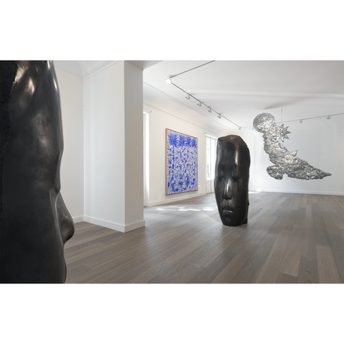
Latterly, her charcoal images have incorporated text overlays, often comprising examples from a collection of words and phrases from ads, movies or conversations with friends she keeps on her phone notes app. This new amalgamation of text and image was the impetus behind her first institutional show outside the US, Look, look. at the Art Gallery of Western Australia, Perth. It was the curator of that show, Rachel Ciesla, who called Park “a major new figure in drawing today.”
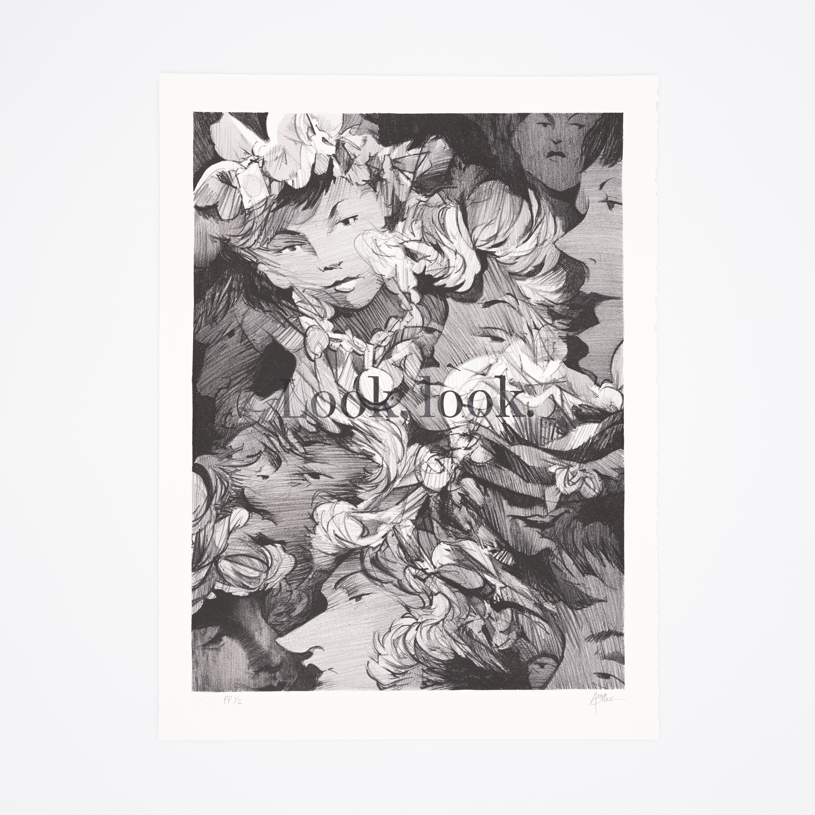
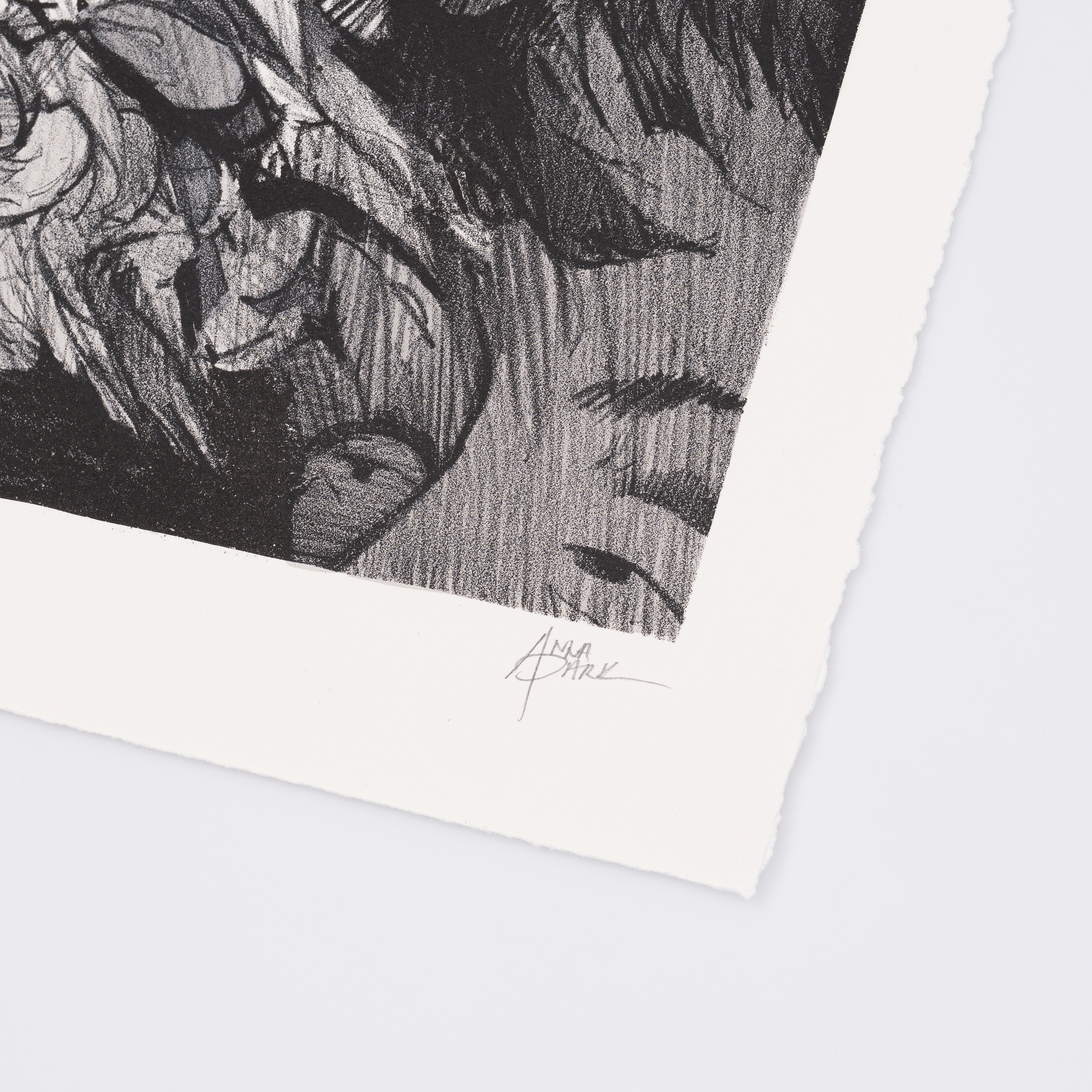
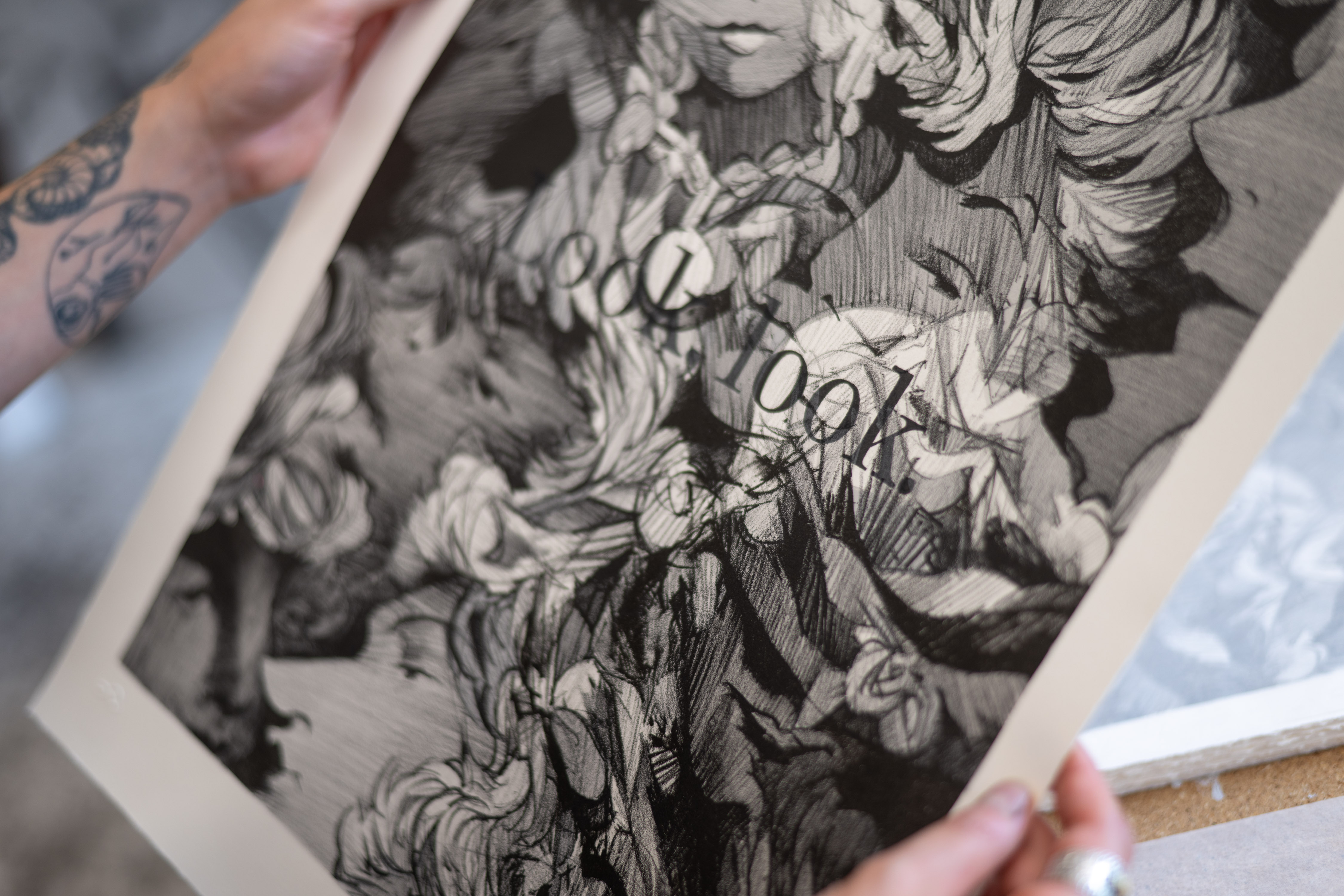
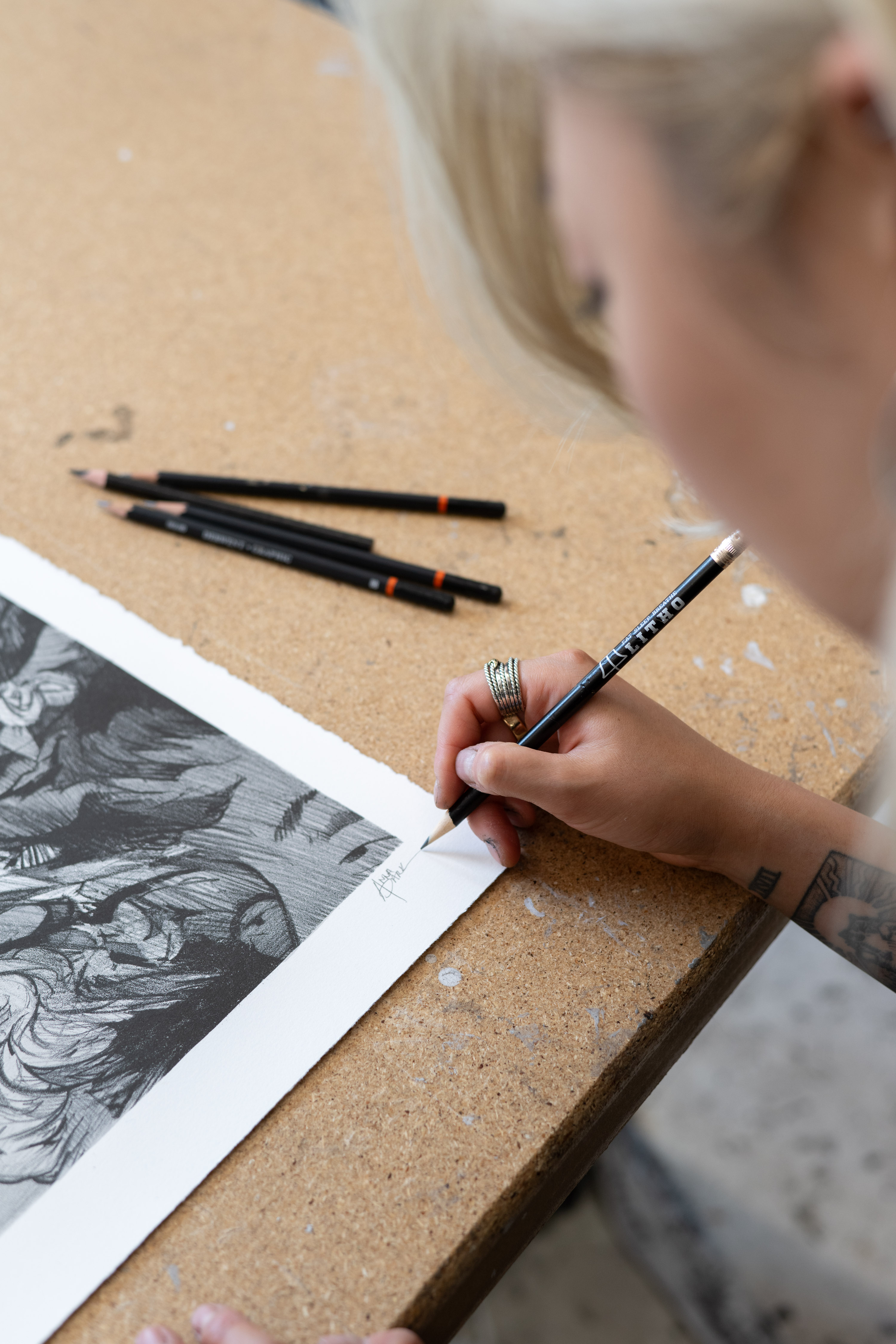
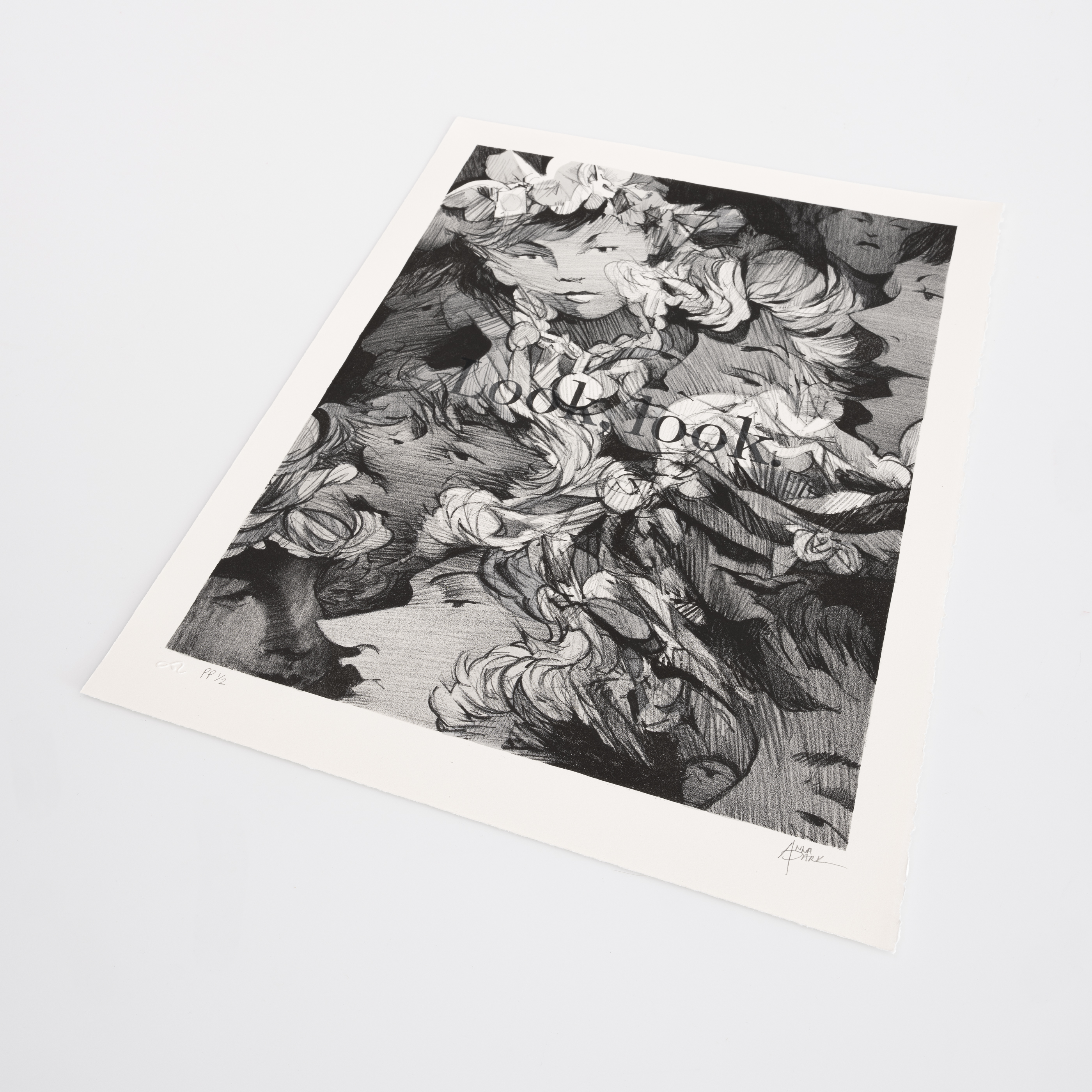
Now, to mark the importance of that show in her career progression, she is releasing an Artspace edition inspired by it, her first ever lithograph, entitled Look, look., 2024. It’s an edition of 30 + 4 artist proofs on stone lithography on BFK off white paper. The paper size is 20 x 15" and the image size is 17 1/2 x 13”. Proceeds from the sale of Look, look., 2024 will benefit Public Art Fund and their mission to bring dynamic contemporary art to a broad audience in New York City and beyond.
Park’s work has been featured in the group exhibitions 52 Artists: A Feminist Milestone, Aldrich Museum of Contemporary Art, Ridgefield, CT (2022); 100 Drawings from Now, The Drawing Center, New York, NY (2020); Art on the Grid, Public Art Fund, New York, NY (2020); among others. She received her BA from Pratt Institute, Brooklyn, NY and her MFA from New York Academy of Art, New York, NY. We asked her about Look, look., 2024 and her wider practice.
Tell us about Look, look., 2024 It’s a completely new image. I wanted to cap off the work in my recent show in Australia with an edition. The show partly deals with the same kind of concept as the edition - our lack of attention from being pulled in so many different directions.
There are all these faces in there and the type says Look, look. But no one’s actually looking. The work poses the question are we paying attention, while also being me just yelling, look at this! It has multiple meanings to it.
This is your first ever lithograph, correct? Yes! I dipped my toes into lithography because it works hand in hand with drawing – it literally is drawing on the stone. So I felt the work would translate well into this medium. There was a lot of learning as I went, as so much of the process is new to me.
We’re including text on top of the work. For the longest time I was pretty wary of including text because I feel words bring their own narrative, and when combined with an image I was worried that they would be competing with one another. But I actually like the fact that you can bring them both intentionally to a point where they totally switch the narrative, or the context, of the image or the phrase.
I was also looking at typeface itself. I got really nerdy about the character of certain fonts and if you really key into those, how beautiful they can be. From talking to my friends who work in advertising and graphic design, I learned how everything is so intentional. We don’t realise that behind that advert there was a whole team that chose a specific type for, say, the letter ‘E’, in order to instigate an emotion in us to buy whatever.
The studies and stats and testing they go through to learn what does this kind of ad do for people is fascinating, and kind of scary. So a lot of it was me trying to bridge that world of advertising and art and working out how to present this.
Aside from how advertising has influenced the new work what were the artistic influences that fed into it? The Ed Ruscha show at MoMA (Now Then) was an incredibly big influence in kickstarting my Australian show. I love his work and I hadn’t seen that breadth of his practice and how much it spanned. I was dipping my toe into text but after I saw that I thought I’m definitely going to do it. He describes how the texts vibrate, and I thought wow, that’s exactly how I think about it, but I wasn’t able to articulate it.
There’s so much movement in the image itself – it’s almost illustrative, dreamlike, and yet, at the same time, instant. It’s a really interesting mix. In my mind when I was younger I always wanted to be an animator. I wanted to work for DreamWorks but I’m terrible with technology! This is maybe my way of creating moving images but in drawing form. It’s about how do you activate energy, or movement, or ‘frenetic-ness’.
We all dream and when you see a person in your dreams, you know who the person is. A lot of times in my dreams they’re not really discernible but there are features that pop in and out. So sometimes I try to really capture that feeling in my work. I don’t like it if it’s too polished. I like a little bit of something that’s a little fucked up and not quite what it seems. It’s hard to explain the feeling. It’s abstracting but pulling out enough features so there’s something recognisable.
How did the idea to focus on distraction come to you? I think it came from realising how much of my own attention has dwindled from being pulled everywhere all the time. Everyone says, ‘you have to be more present in the moment,’ and I think, ‘what the fuck does that mean?’
There are so many things in the day to day - the news cycle, social media - pulling on us for attention. And even when big things happen it only pulls our attention for a moment until the next thing comes about. That was just constantly on my mind as it is with a lot of people’s. And it was also nice to be able to work on more straightforward drawing. For the Australia show I had to pre-make foam foundations and papier mache elements, so it felt like a treat for me to sit and do a straightforward thing. To connect with it again for the edition.
How have the themes you explore evolved over the years? They are fairly similar themes that I touch on but it’s now more about building on different things within those themes. When I look back on when I first moved to New York, a lot of the work was a response to my experience of being in such a new environment. Coming from Utah it was such a complete shift in my surroundings, and I think I was overly stimulated. That’s when my dense, crowd drawings came about.
Now that I’ve got accustomed to living here it’s almost like I’m keying into human moments and what I notice in human behavior. How do people react in certain situations? Where does that come from? And, once again, is it because we’re spread so thin? Again it’s about attention and being pulled every which way.
So you’re maybe going from something that could have been described as voyeuristic and now is perhaps more documentarian? That’s actually a good way to put it. I completely agree. Before, I was just looking out on to the crowd but now, especially in this most recent show, it’s more looking inward. A lot of it is me relating it to childhood experiences and becoming a woman.
Womanhood is a big thing in my work, how I deal with certain subject matters around being a woman but doing so with how my adolescence has shaped the way I view what being feminine means. It definitely feels a bit more vulnerable. It’s very interesting because I feel I learned a lot about myself by making this show. After I finish any body of work and sit with it I’m like, Oh OK, there are some things that I didn’t realise were buried in the deep of my consciousness.
Do you work every day? It depends. I try to go every day because it’s also my happy place and I live so close to my studio - a ten minute walk - so there’s no excuse! I’ll try to go in around noon and leave around one in the morning. But it’s not like I’m working all the time. A lot of the time I’m sitting thinking. I also block out time for my crises, my crying time etc.. It just depends on the day. If I’m really in the zone I don’t notice the time.
You work predominantly in charcoal, do you plan before you begin? I don’t want to do a very resolved sketch before approaching the piece. I think it removes the spontaneity and exploration that I love doing on the piece itself. I also have no patience for pre-planning.
So I’ll make fairly crude sketch thumbnails. I’ll have a general idea where I want certain big key features or figures in the piece, and I’ll loosely plan that out. Then, once I’m with the panel or the big paper, there’s this constant moving back and forth. I have a lot of source images laid out around me that feed into the work. It’s fairly loose.
Does charcoal feel instinctive for you? Yeah! I think why I gravitate to it is because it’s so immediate. It’s messy and it gets everywhere, and you breathe it in. But it always leaves a memory in the paper. So even when you try to erase it, it embeds itself into the fibers of the paper. I enjoy it. I was taught with charcoal, so my hand just always gravitates to it. And, if I have an idea, it’s the fastest way I can execute it.
I think when I was in undergrad or grad school, drawing and charcoal was deemed secondary and preparatory. So in my own ‘fuck you’ kind of way I wanted to fully embrace it as the medium and material itself.
What did you draw as a kid, how did you get going? Initially it was a lot of copying illustrations and book covers. I was a weird, awkward kid and it brought me a lot of peace to do something that was alone and quiet. I knew the drawing styles I liked looking at. But I wasn’t really thinking that deeply about it as a kid, more a case of I like that, so I’ll draw this.
I think initially my mom was happy that I enjoyed it. But it wasn’t until high school, and she said, ‘so what do you now really want to do?’ And I said, ‘er, this drawing thing.’ I was very lucky that she believed in me. She was just very supportive from the get-go.
As was KAWS – he bought one of your early works didn’t he? Do you know what he saw in your work? We never really got into that. We didn’t talk until about a year or so later. I met him at a show. He was so sweet. Initially I was like, are you also an artist?’ Because I didn’t know what he looked like. It was so embarrassing! He’s so under the radar. But I appreciate that. He could easily be like, ‘do you know who I am?’ The conversation wasn’t very specific. I know he likes drawing as a medium, and he collects a lot of drawings, and he was kind enough to buy that work of mine.
Take a closer look and buy Look, look., 2024 here.


