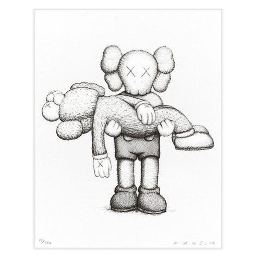
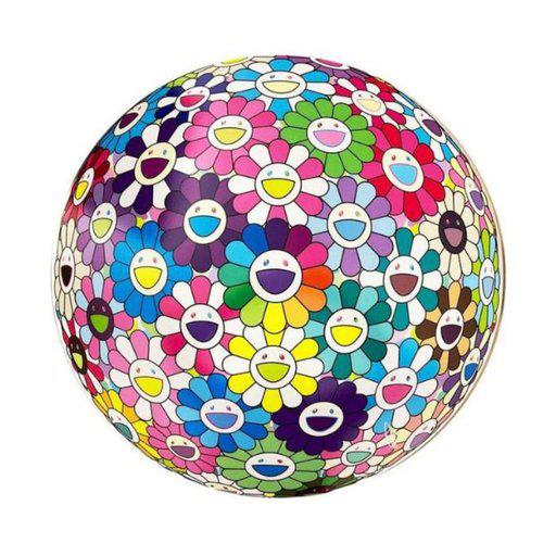
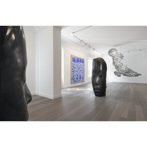
If you’re anything like us you’ve probably spent a considerable portion of lockdown life staring at the art on your walls, pondering on what’s not working for you anymore, what might work just that little bit better and why on earth that crazy coupling that really shouldn’t be seen in public together just looks better and better every time you look at it.
So why do seemingly unrelated genres, styles, eras and mediums work so well when, in theory they seem to have nothing in common? Why do these artistic opposites attract?
Can different mediums happily exist side by side (hint: yes!) and if so, how do we get the best out of both? What is the brain unconsciously doing when it makes the giant leap between two mediums to find that all important element of equilibrium?
As always it takes an expert eye to focus and inform our gaze. So we asked our resident genius Amanda Knuppel, former gallerist and head of private sales at Artspace, about the relationships between opposite mediums and why we may be unconsciously drawn to them.
So if you’re looking to bring some edgy, exciting and dynamic additions to your wall bring it on! Or, as they say in France: Vive La Différence!
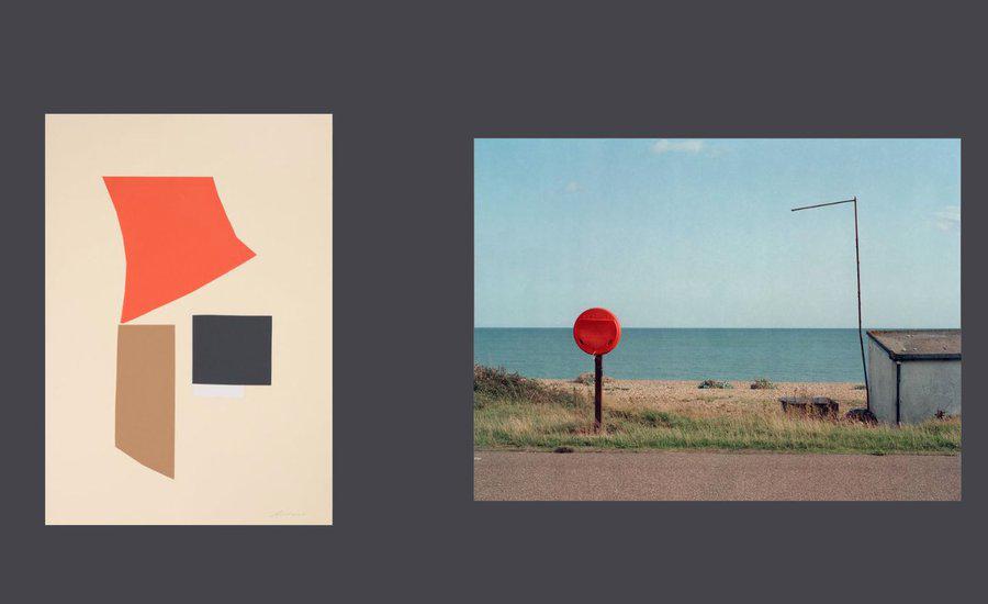
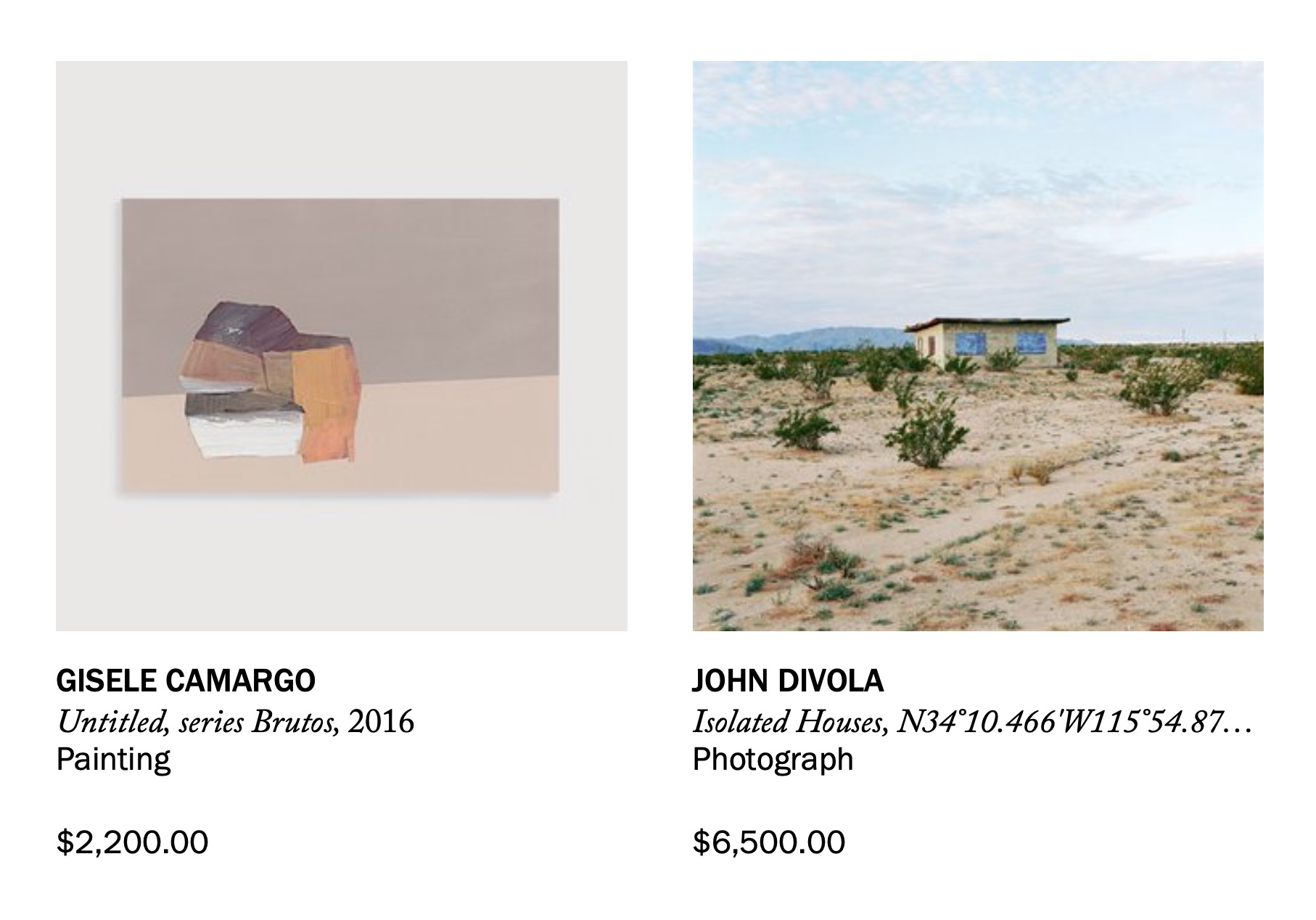
"The underlying idea for all of these opposites is the way that artists treat space and the relationship between how an artist thinks about abstraction - in the way that space is represented - and the way the brain perceives landscape, the body, and the built environment.
"At the core of it all, successful abstraction appeals to the nascent apprehension of geometry in the brain and the way the mind recognizes the contours of a figure, or a body, or a building in mathematical terms. So, when it’s successful—even though your eye has seen something non-representational—your brain perceives it to be something familiar, something it’s seen before. "
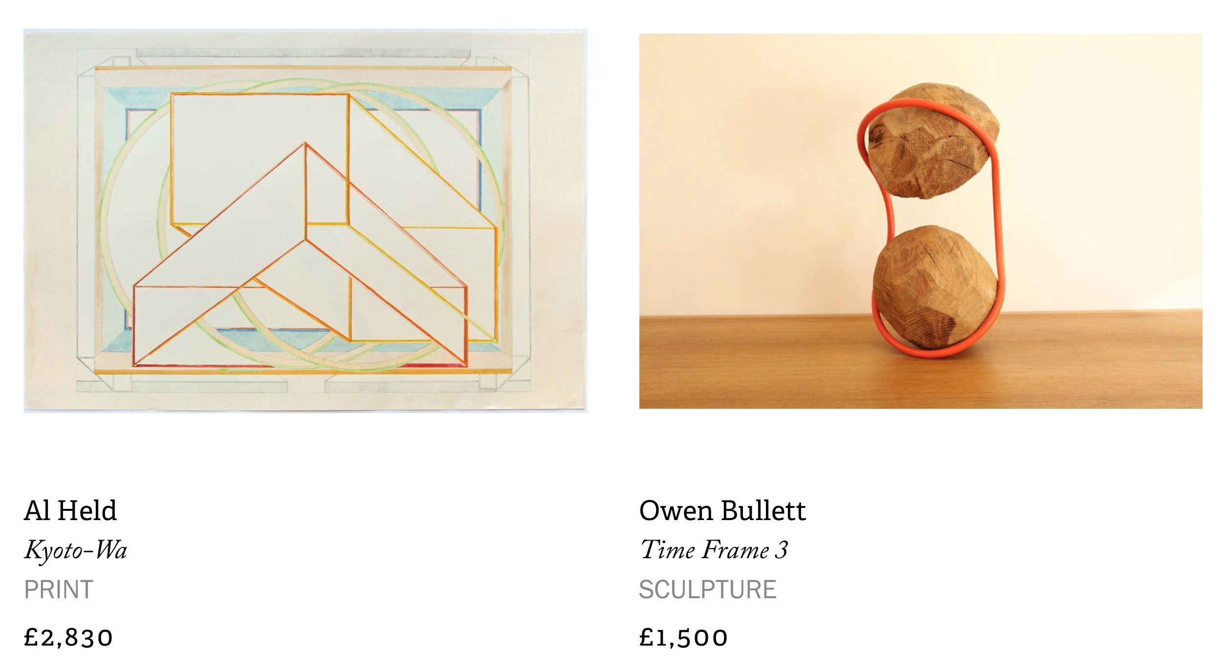
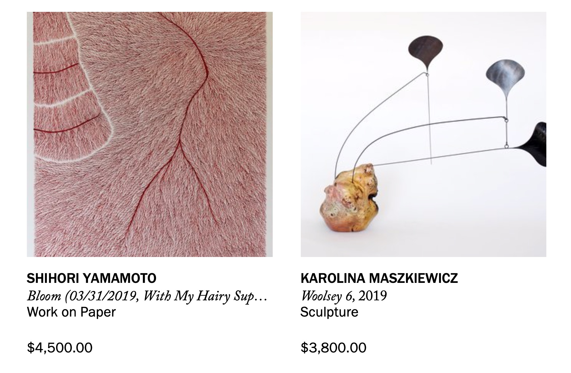
"This coupling is a little bit different and perhaps less expected—especially because the stereotypical sculptor persona emphasizes the ego and desire to conquer material and space, while we generally think of drawings as less assertive gestures. But some of my favorite drawings have been made by sculptors: Ken Price, Richard Serra, Rachel Whiteread.
"I often think a great drawing is the ultimate example of visual economy: rendering a convincing illusion of dimensionality while employing only a small fraction of visual information. It’s about whittling down a form to its essential points, lines, planes.
"Sculpture, on the other hand, is the bringing forth of the immaterial into the material - from an abstract idea into a three-dimensional object that physically enters (and often dominates) space. In this way, it’s really the exact opposite of drawing -- it occupies your perception whether or not you intend to see it. Drawing is the minimisation of a form and sculpture is the maximization of it."
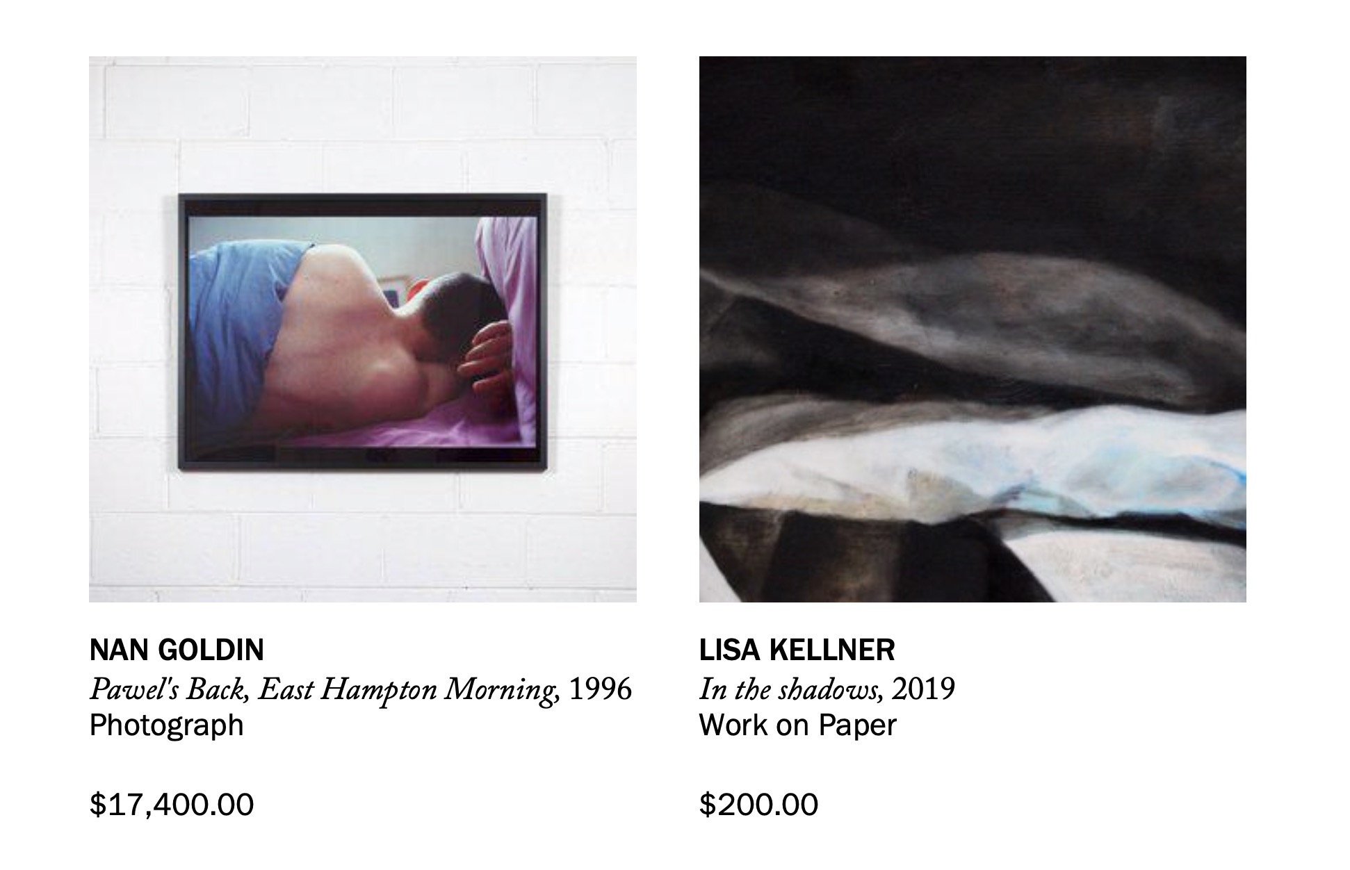
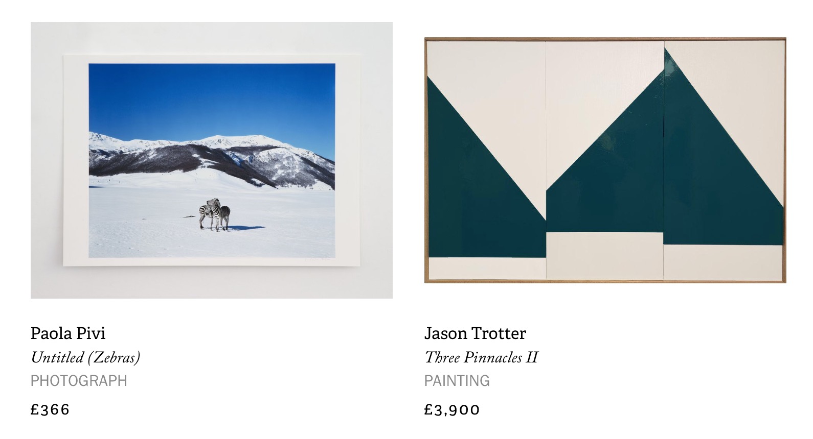
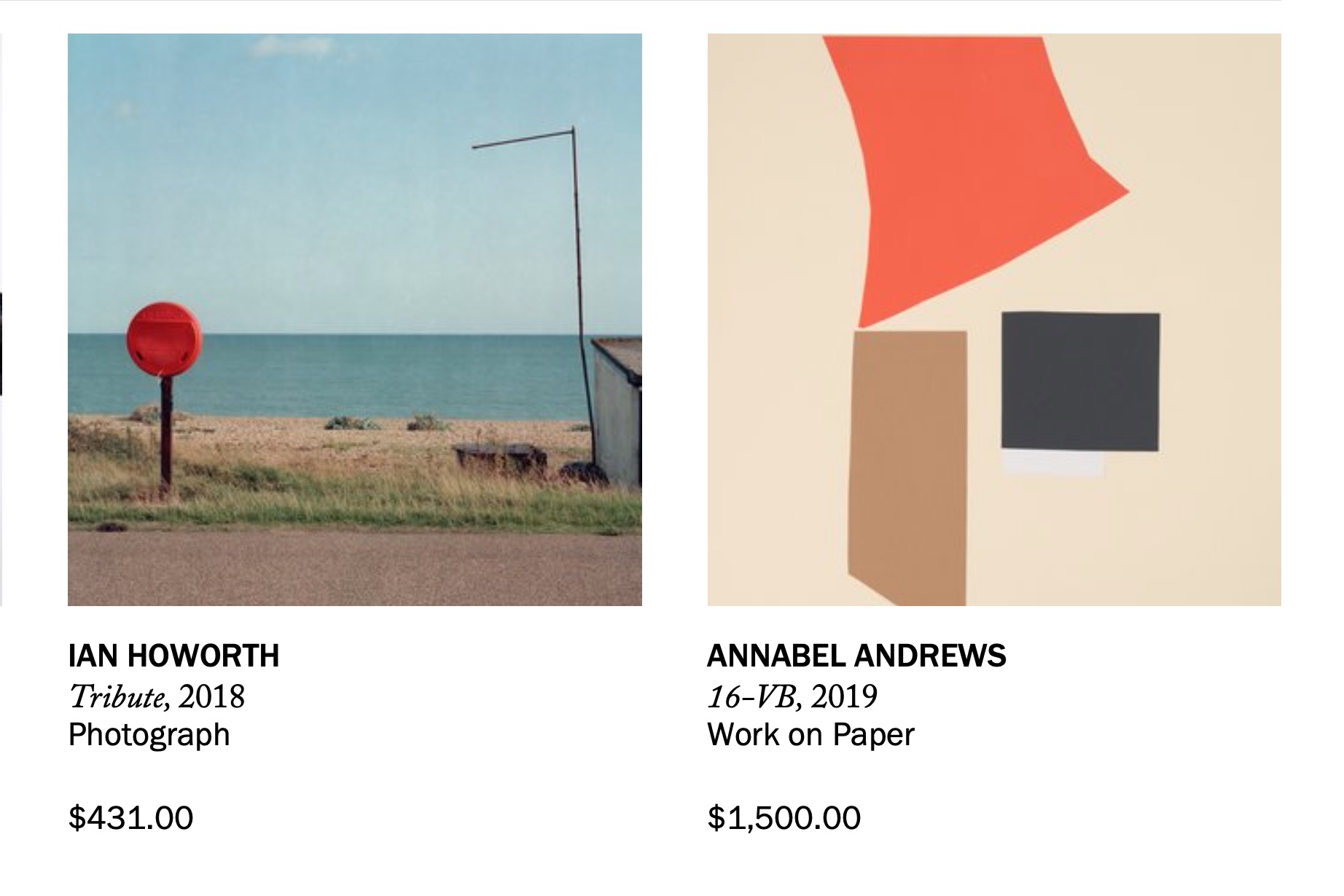
"In (overly) simple terms, photography is the documentation of space through light, and painting is the approximation of light to represent space. Traditional photography forms an image from its negative, and harnesses light as a tool to create an image of dimension and form. It's an index of what already exists. Painting makes light out of color, and creates an illusion of depth by recreating light. Take away the light from a photographer, there's no photograph*; take away light from a painter, there’s no space. (* there are, of course, notable exceptions in contemporary practices, but we'll not get into that here)."
As always with any hang there are 3 simple rules to fall back on if you’re unsure of how to hang what you’re pairing.
1) It's best to hang a single artwork at eye level - 60 inches from center to the floor is the magic number.
2) When hanging two art pieces, treat them as one and still hang them 60 inches from the floor to the center of the grouping.
3) If the art is going above your sofa or a console, the piece should be approximately two thirds the width of the furniture.


