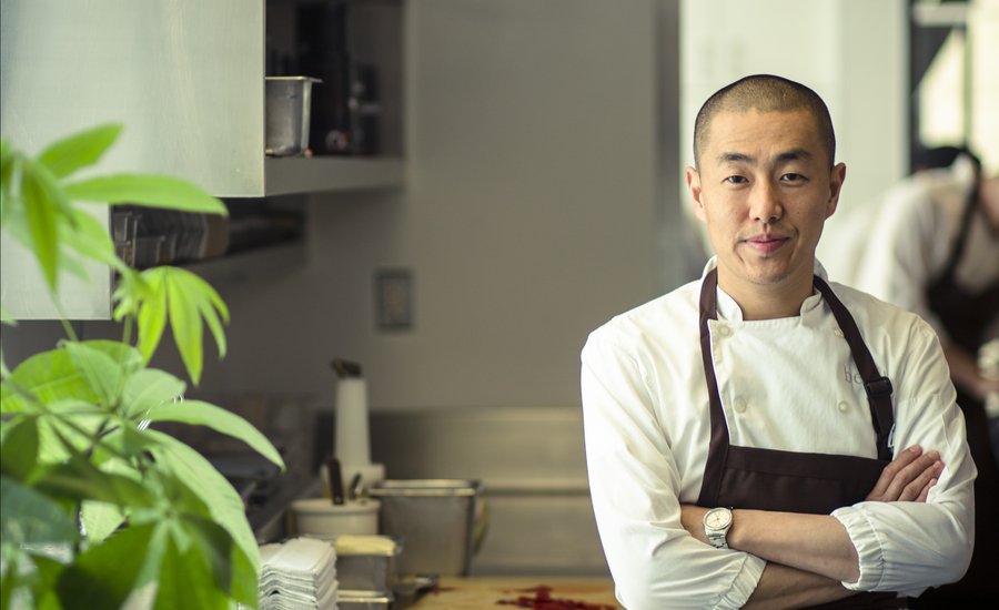
Known to be one of the greatest chefs in the world, the Korean-born perfectionist Corey Lee is as adamant about the aesthetic contours of his cuisine as he is uncompromising about its flavor. It shows: at Benu, his three-Michelin-star restaurant in San Francisco, his food arrives at the table in compositions that dazzle the eye, served on porcelain dishware that he has crafted to his own exacting designs by KwangJuYo, the famed South Korean manufacturer. This genre-spanning quest for excellence should be no surprise, considering his previous background running Lespinasse, Per Se, and French Laundry.
Lee also hones his eye by collecting contemporary art. Here, the chef and subject of Phaidon’s mouthwatering new monograph Benu selects and comments on his favorite works on Artspace.
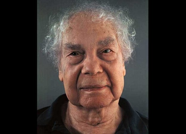
CHUCK CLOSE
Merce Cunningham, 2004
Chuck Close's portraits, whether photographed or painted, always seem to be incredibly rich in detail. That level of information forces me see the subject in a new and previously unthought of way. I chose this particular one because it depicts dancer/choreographer Merce Cunningham in such a fragile, almost innocent light. The revealing details of Cunningham's face are in stark contrast to how I view him through his work—a bold, pioneering artist that explores otherwordly bodily movements. The very human and aged qualities of Cunningham's face are visible in sharp detail and makes me wonder even more about the imaginative and mysterious mind that lies behind those piercing, beady eyes.
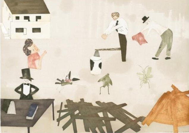
JOCKUM NORDSTRÖM
House and Bugs, 2008
I have a personal attachment to this piece, House and Bugs, which hung at Benu when we first opened. Over the years we've had several pieces from Jockum Nordström (and his wife Mamma Andersson) on our walls. I think this particular piece is a classic representation of his work in its use of collage-like folk art that at first glance appears simple but is deceptively intricate and evocative. There's a storytelling quality to his work that I enjoy, and often I find that the kind of response it elicits is more revealing about the viewer as the artist or work itself.
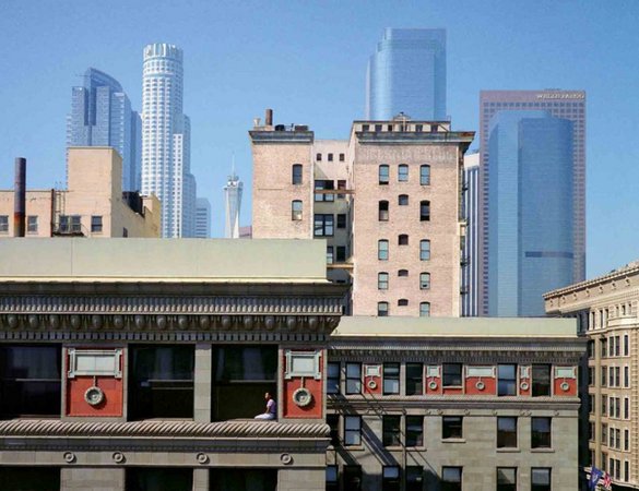
WIM WENDERS
Girl in Window, 1999
I chose this because I like the use of the hazy Los Angeles sky that adds layering and a slight dreamlike quality to the photo. While the buildings in the foreground are sharp and heavy, the subtle opacity of the sky imparts a soft, almost watercolor-like quality to the urban landscape behind them. There's a beautiful melancholy about this piece that reminds me why I like Wender's works.
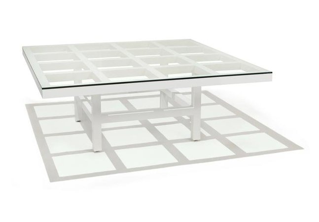
SOL LEWITT
Coffee Table (White), 1981
This is a dream table for me. I saw this table many years ago and I've wanted it ever since. I like this table because of the way it interacts with light—both in its shadow and its reflection—that changes depending on the time and direction of natural light. One of my favorite pieces I own is LeWitt's Arcs From Four Corners. Though it's a color woodcut, both that print and this table are distinctly LeWitt and explores how geometric lines and simple shapes can evoke powerful emotion.
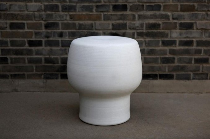
HERZOG & DE MEURON AND AI WEIWEI
Stool, 2012
The first time I visited Beijing many years ago, I was amazed by its contemporary art scene. It seemed so relevant, provocative, and was bursting with energy—with a future just as exciting and unpredictable. It felt like a movement. There was also something that felt very inclusive about what was emerging, that it was art meant for everyone, or at least a new generation. And while the more surreal works from artists like Yue Minjun and Zhang Xiaogang remind me of that time in a specific place, what I remember most was Ai Weiwei's work which seemed more timeless and universal. I like this because it is at once avant-garde and traditional; craft and art; Chinese and European.


