On the heels of our favorite spaces from the art world's top architects, Selldorf Architects, we take a closer look to understand the firm's philosophy that frames its ranging portfolio from top art galleries to civic recycling centers, public art museums to private homes of art collectors. Excerpted from Phaidon's recently released monograph, Selldorf Architects, here's a primer by architecture critic Ian Volner on why these non-style-subscribing architects are moving mountains beyond their own discipline.
ESSENTIAL ARCHITECTURE
Selldorf Architects is a firm unlike any other in the design world today, and writing about it means tossing out some of the typical gear in the critical toolbox.
For starters, the office’s work is uniquely resistant to easy visual metaphors or expository prose. The probing, seeking nature of its approach—of which more to follow—makes each building more and more itself, adhering to its own internal logic; what connects the projects is precisely that they do not impose, upon the end user, the kind of rhetorical program easily elaborated upon by the critic. Many observers have commented on the primacy of personal experience as a prerequisite to truly understanding a work of architecture, and that goes double in this instance: the impulse is to want to place the reader in one of the firm’s buildings and simply say, “Look.”
Likewise, the office’s position in the field of contemporary architecture, which also defies simple categorization. Clients have turned to the firm for architectural statements whose subtlety is their strength. Even among designers operating in a more outré vein, Selldorf Architects commands considerable respect, and it reflects it back again in its thoughtful, deferential buildings. There is a critical aspect embedded in the practice—more on that subject as well—but it’s a form of critique that begins by renouncing polemics almost completely. The near silence of Selldorf Architects’ buildings speaks volumes.
Indeed, it’s precisely in its seeming quietude that Selldorf Architects does find a language, a communicative mode that responds to one of architecture’s most daunting problems.
To put it bluntly, many people, even otherwise culturally attuned ones, don’t get architecture. The poetics of space; the romance of materials both organic and synthetic; “the correct and magnificent play of masses brought together in light,” as Le Corbusier put it—the basic phenomenological constituents of modern architecture often fail, and fail badly, to translate into a generally understood idiom. The most impressive, expressive architectural assemblages often elicit merely a kind of stumped incredulity, while the most polished and platonically reductive ones provoke, at best, a bored shrug. Somehow, this most essential of arts—the one type of cultural production that is a predicate to almost all the others, and which provides housing and offices and recreational spaces to the entire developed world—has come, in our time, to seem a bit of a cipher.
This is the condition that Selldorf Architects has inherited, and that it seems determined to challenge. Architecture, the orphan of the arts. Designers trapped between the banality of gesture and the banality of the service profession. Where is the line of flight?
TIME LIFE
The house opens up like a book. Immediately there is the broad vista, the billiard-baize lawn, and the suggestion of a sea that almost appears to be the subject of an exhibition—which, in a sense, it is. For this is a house for art, and the rooms at the rear are arranged in a symmetrical sequence as if, in a grand palais, some American genie had ripped off a wall to let in the summer. The upper floors mirror the lower, only halved and enclosed, and with a deferential attitude to the landscape that seems to compose a pastoral essay on the virtue of unseasonable cloud cover as a chastened version of the Good Life. The disposition of space in every sense: a system with a mood. “The heart,” Pascal wrote, “has its reasons which reason knows nothing of.” But reason, it turns out, is also a heart.
“SI DISCORDA TUTTA QUELLA MUSICA”
In the twenty-seven years that she’s been in practice, Annabelle Selldorf hasn’t been the only one trying to reconnect architecture to its audience. But the way she’s threaded that particular needle, as well as her results, have set her apart.
Selldorf’s uniquely varied formation as an architect has made her well suited to the task. Born in Cologne, Selldorf came of age in a country still recovering from the ravages of World War II; Mies and the Bauhaus represented, for her generation, a way forward, an escape from the mistakes of the past. Moving to New York in the late 1970s to study at Pratt, she encountered a very different architectural milieu. Under the tutelage of teachers such as Colin Rowe and Raimund Abraham, Selldorf found architecture in a state of flux, with Modernism as it had been practiced theretofore undergoing a radical reconsideration.
The reasons for this had precisely to do with the long-standing language barrier between design and its audience. The clean lines and unadorned surfaces of the dominant International Style had come, on these shores at least, to be perceived by many as confining, sterile, even authoritarian; their delicate pleasures had always been a bit obscure to nonspecialists, prompting Tom Wolfe, in his 1981 polemic From Bauhaus to Our House, to wonder why “so many people of wealth and power have paid for and put up with so much architecture they detested.”
Selldorf’s arrival coincided almost precisely with the advent of what Jean-Louis Cohen has called “that hesitation in practice,” the Postmodernist movement, which had as its explicit goal the recovery of an architectural vocabulary rooted in history and popular culture. Its effects were salutary in many ways, but ultimately it couldn’t sustain its early momentum and fell into critical and popular disfavor.
The formal tendency that was announced in the late 1980s, and that assumed its present ascendancy beginning with Frank Gehry’sGuggenheim Bilbao in 1997, attempted to break through the discursive static by amplifying the language of Modernism, stretching materials and forms almost to the breaking point. This trend has produced some of the true architectural masterworks of our time—but just like Modernism (and then Postmodernism), it too has produced a feeling of fatigue in some quarters, especially among that large segment of the public that feels intimidated or bewildered by capital-D Design. Once again comes the feeling of alienation. Less may not always be more. But then again, neither is more.
Selldorf Architects, however, has managed to turn this double bind into a generative constraint. For the last three decades, it has played its own, ingeniously improvised riff over and against the dominant strains of the profession. The firm’s keynote could be described as an objectivity of affect: a reflexive attitude, calm and assured and agnostic, that underwrites its carefully focused design process, enabling it to step back to evaluate its products.
It’s a procedure that unfolds as a steady winnowing away of uncertainties and externalities. Contrary to the highly finished, resolved quality of the completed projects, the Selldorf team does not as a general rule begin with firm convictions about the materials, the detailing, or the overall envelope of their projects; these, which would appear to be the most eminent aspects of any building, are developed only after a long consideration of a host of factors—not just functional but financial, urbanistic, even infrastructural—to arrive at a general sense of the objectives of the project.
Naturally, this makes for a heavy reliance on collaboration, drawing on input and expertise from clients and consultants, and it’s no coincidence that Selldorf Architects has become a go-to firm for sensitive commissions requiring a special kind of architectural diplomacy.
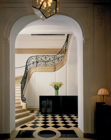 The Neue Galerie
Whether it be the renovation of a beloved historical landmark (such as the Neue Galerie), the construction of an apartment complex cheek by jowl with its neighbors (such as 10 Bond Street), or the creation of living spaces for creative clients with their own pronounced sense of taste (as in the homes for prominent art-world figures), the studio’s highly deliberative process allows for a degree of flexibility to ensure that the result reflects all the competing interests that informed it.
As adaptable as it is, however, Selldorf Architects’ process is remarkable for how few real variations or digressions it seems to entail. This, again, attests to the affective approach that guides the studio’s method from the beginning and—still more important—at the end. In the final design phase, as the necessary decisions about basic aesthetic considerations are being made, purely analytical criteria are set aside to some degree; an innate sense of rational order takes over from rigorous rational practice, and the ultimate design choices are guided almost by a feeling of inevitability. Proceeding from logic to intuition, the designer declines the role of all-commanding demiurge, and the end user profits by having the conviction that the space truly belongs to him or her.
An architecture of the door handle, of the precisely articulated lintel, of the finely turned brass banister and well-tempered steel trellis—change anything, Alberti warned, and “throw all that music into discord”! But walk away from it, turn around, and go on with the day: the music recedes into ambience. The devil is in the details. Why not leave him there.
CITY LIFE
"This muck heaves and palpitates. It is multi-directional and has a mayor." —Donald Barthelme, City Life, 1970
There is a copper-colored vessel in the middle of town. It arrived quite suddenly one day, less as though it had been placed there than as though the city had simply yielded it, like a fruit. At first, there was lively debate as to the copper-ness—was it raw copper, or burnt? Was it carmine? Ancient sunset, umber, Tuscan hillside in September.... Some moved to call it sienna, but this is rank provocation. No, it’s definitely copper-colored. And it’s definitely a vessel, though this too causes some confusion, for it appears to billow; the edges are diaphanous; it is decked out in unfamiliar padding. Ribbands, perhaps. Or bolstered, as a chaise in a European hotel. Yes, bolstered.
In the middle of town, the copper-colored vessel, as we call it, composes itself with democratic ease: cars and candy wrappers, restaurant equipment, children with plastic bats—all the willful dejecta of the metropolis—these it gathers up only to roll them out again, giving them back to themselves. They accept it in the spirit of the gift, and this is tremendous, the effect being that we are almost unaware of it. For that is all we want, we put-upon citizens: buffeted by bicyclists and conventioneers, all we want is something that is like the city itself, red and invaluable, a vessel, so that we may walk past it and be reminded of nothing except that we are where we always meant to be. It is one of us, this new entity. The city coalesces around it, and it creates a wild civility.
THE MACHINE IN THE GARDEN OF THE MACHINE
Though frequently Minimalistic, Annabelle Selldorf is emphatically not a Minimalist. This conceptual distinction is essential to understanding her studio’s work, in particular its buildings for the viewing of art, which have been central to Selldorf Architects’ portfolio since the firm’s early Manhattan gallery projects.
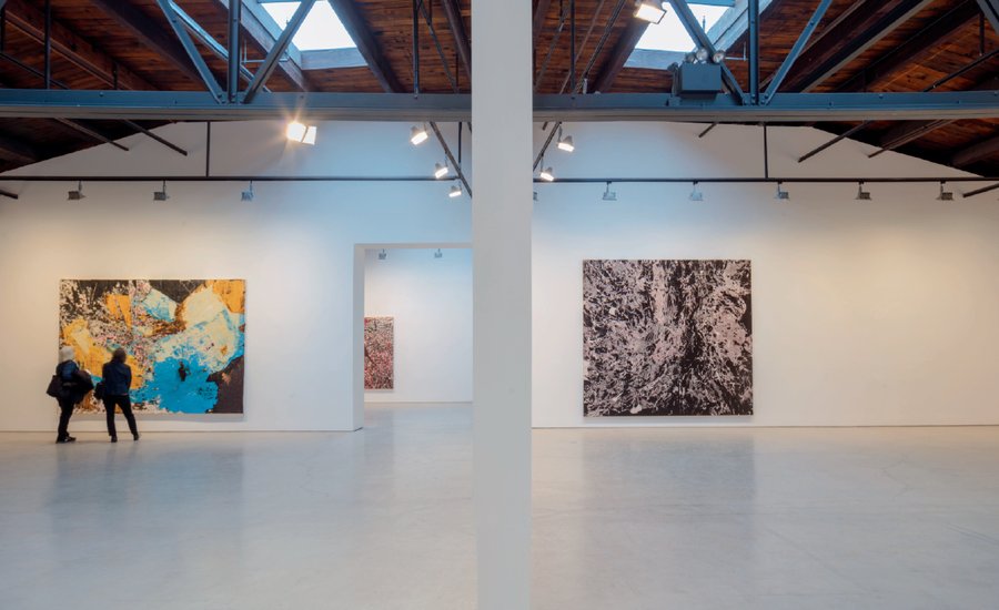
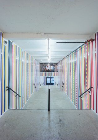
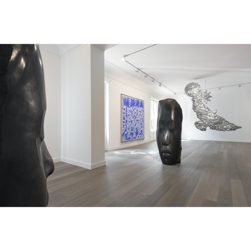
The David Zwirner gallery on West 20th Street in Manhattan is a perfect case study. The necessarily neutral character of the interior is quietly undermined by the superbly grained concrete, the wood finishes, and, of course, the dim and perilously tall-seeming staircase winding among the floors (staircases being, in the Selldorf oeuvre, a frequent moment of drama). Given the range of contemporary artistic practice, which tends increasingly toward large-scale installations, the requirements for displaying it involve a unique resistance to theatricality—including the theatricality of restraint. The gallery’s inaugural exhibition in 2013, featuring the work of Donald Judd alongside that of Dan Flavin, made lucid just how much Selldorf’s work differs from full-blown artistic Minimalism: the artworks on view seemed to stand out all the more for being in a space that does not attempt to vie with them for evocative asceticism.
A similar tactic is deployed in the Clark Art Institute, a project that also shows Selldorf Architects engaged in what has become one of its core competencies: the renovation and transformation of preexisting structures. Again, as in its domestic work, the organization of space is highly rationalized, the architectural promenade unfolding with an almost classical rigor; again, as in its urban projects, the response to context—in this case, the original Neo-Classical structure, the adjacent new building by Tadao Ando, and the orderly pastoralism of Reed Hilderbrand’s landscape design—alternates between mediation and deflection, becoming part of the whole while still maintaining a logic of its own. More than any other typology, the museum has become the favored repository of designers’ most ambitious attempts to establish architecture’s disciplinary autonomy. Selldorf Architects’ prudent ambivalence on that subject is what gives its museum and gallery work its sense of candor, its unfussy charm.
None of this is to diminish the amount of attention that the studio invests in its work, or the attention that the work rewards. Certainly, we are invited to consider at length the exquisite surface treatments and carefully calibrated spaces of buildings such as the Walden House, the Gladstone Gallery, and even the Sims Sunset Park Material Recovery Facility. But the untempered enthusiasm for form that underlies both architectural maximalism and minimalism is alien to Selldorf Architects’ measured cool. The essence of its casual refinement is that it becomes the object of contemplation only when we choose for it to be so. In an age of skepticism, the firm’s is an architecture of circumspect beauty. A formalism against formalism: the lyrical giving way to the logical, or vice versa. Within the factory, the mansion: inside the mansion, the factory. Or vice versa. Or both simultaneously, or mise en abyme. . . . Or neither.
PAST PREDICATE
"The representation of history . . . requires a falsification of perspective." —W. G. Sebald, The Rings of Saturn, 1995
In the middle of an otherwise normal 2001, someone has placed a spectacular dresser studded in shimmering 1914. Downstairs, the shadows are lengthening in the gathering late-Romanticism, and the chef is serving a large Vienna to a group of appreciative fall collection (definitely pre-Revolution); the visitors ascend a tightly packed Information Age, then enter into the Tiergarten on a sunny afternoon, the height of the hurricane season, and the air charged with a distinct Diaghilev. Yes, there it is before them—an enormous purple folk music, ringed in plaster, inlaid with gold, the work of a prominent Gothic engraver turned Jewish sex symbol and occasional picture postcard.
How did all this come about? Like this: the past has to recede from itself in order to be understood. The guiding hand is that of a European of the classic downtown post-punk scene, so there is little doubt that history isn’t being so much “used” here as held in abeyance, invited to stay, laughed at with good-natured opprobrium, and then asked back for a subsequent interview. The vestibule is still a vestibule, but the robber baron has been replaced by a coat rack. Bottle after bottle of 1926.
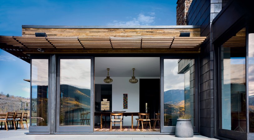 Walden House
EVERYTHING NEW IS OLD AGAIN
For all her comfort with history, Annabelle Selldorf obviously maintains a staunch affiliation with the project of modernity. But not an uncritical one, nor one uninflected by other varieties of experience, other modalities.
The Sims Sunset Park Material Recovery Facility, simply by dint of its industrial character, instantly puts one in mind of some of the great monuments of early architectural Modernism—Gropius’s Fagus-Werk springs to mind. The project, as New York Times architecture critic Michael Kimmelman said, is “an architectural keeper,” one that adds “an improbable grace note to a gritty stretch of Brooklyn.”
But look again: as such notes go, this one has a most gritty grace, and from the catwalks surrounding the main processing floor the visitor is treated to a spectacle of raw function that is miles from Gropius’s tranquil ensemble. Selldorf is quite content to let the building be both composed and messy, its delicate massing juxtaposed with its rough-and-ready, off-the-shelf materiality. The civic value that Kimmelman rightly praises isn’t so much celebrated by the building as frankly assumed by it. Monumentality, except of the most subdued sort, is not in the Selldorf playbook.
Functionalism, of course, has always been a central theme in modernism, and certainly Selldorf may be called a functionalist. But the elevation or brash expression of function is no more to her liking than the preciousness of the more rarified variety of Minimalism, or the extravagance of highly personalized “signature” tropes. Alongside the latter, there has appeared in recent architectural discourse a resurgent and occasionally salutary interest in hyper-functionality—a conviction that new building technologies and advances in energy efficiency, married with a fevered approach to data analysis, can produce a design of almost limitless social potential. About this, too, Selldorf is skeptical, and the lack of messianism evident in her work is part of its critical edge.
Certainly her adherence to Modernism is not a question of (and here we use the dirty word) “style.” If anything, the sheer variety of typologies and formal solutions that have proceeded from the office in just the last fifteen years can make it difficult to discern any sort of “Selldorf style,” an instantly recognizable aesthetic. This is a reflection of the firm’s rather deliberative process: the process, to some degree, is the style. But what I mean to suggest here is that there is something else that makes the firm’s projects identifiably its own—that there is a style behind the process.
The kind of creative irreverence that marks Selldorf Architects’ objective, measured assessment of the prevailing design methodologies of our time, be they formal or functional, seems an extension of Annabelle Selldorf’s own character—a convinced urbanite, cosmopolitan in outlook, with a background in the European tradition and a taste for the freewheeling vitality of America. Admittedly, this treads dangerously upon the terrain of the personal—a problematic issue since, as noted, the office goes to great pains not to indulge strictly personal statements. But that’s just another one of the intrigues of the practice: its pragmatism and self-effacing cool only underscore the chief commitments of its founder, and the buildings never bear the imprimatur of their creator so clearly as when they are trying their hardest not to.
Even setting aside the question of authorship, the firm’s ability to work in so many different registers and to create such a rare breadth of work—without ever manipulating the outward appearance of a building solely to distinguish it from its predecessors—has become itself a kind of calling card. The understated glamour of the Skarstedt Residence, the metropolitan stateliness of 200 Eleventh Avenue, the hip domesticity of the firm’s Manhattan apartments: more than just the name on the cover, a sensibility unites the projects cataloged here, and if it takes a moment to recognize it, just keep looking. Out of the aesthetic equilibrium, the almost-offhanded-yet-accomplished handling of every feature and fixture, there emerges a sensation, a feeling of ease strengthened by a critical intelligence.
Several times now I have called Selldorf’s practice “critical,” and I must be careful to qualify the word. Using it is perhaps inevitable, since so much of this inquiry into the office’s work seems to trace a series of negations: not-quite-Minimalist, not-quite-Expressionist; not-formalist, not-functionalist; thoroughly urbanistic, yet never overtly contextual—and, of course, not exclusively poetic, yet somehow inaccessible to analytical methodologies alone.
Any practice that weaves so deftly among these dialectical relations has to be called critical, at least provisionally. But the last negation has to be this: that the work of Selldorf Architects, although it is in many ways an “architect’s architecture,” is not aimed at the profession alone. The diversity of its solutions proves that the firm’s real intent is to provide real human service, specific to real human conditions, and to speak to people on their own terms without pandering or pedantry. Rather than the autonomy of architecture, the firm insists on the autonomy of end users, and the restraint that it imposes on itself is the index of the freedom it grants everyone who enters its buildings.
The firm’s upcoming projects will find Selldorf Architects operating in more public settings than ever before: the enormous volume of work yet to come ranges from large residential condominiums in New York, to institutional buildings, such as the Museum of Contemporary Art San Diego, to high-end hospitality commissions, such as the Mesa at Amangiri in Utah.
It’s difficult to reconcile this decidedly modest practice with the scale of work it is now taking on; but to create buildings of every type, for as many people as possible, is part of the Modernist’s remit, and Selldorf Architects is not shying away from it. To that mandate the designers are adding the element that makes their work so innovative—the rare quality that promises to bridge the gap, creating an architecture natural to its time and its audience—that improbable mixture of informality and precision that is the firm’s own, and that can make its work so forthright and unpresumptuous one moment, yet so absolute and numinous the next.


