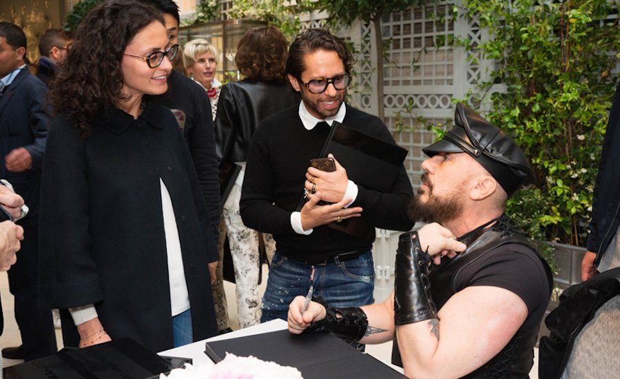
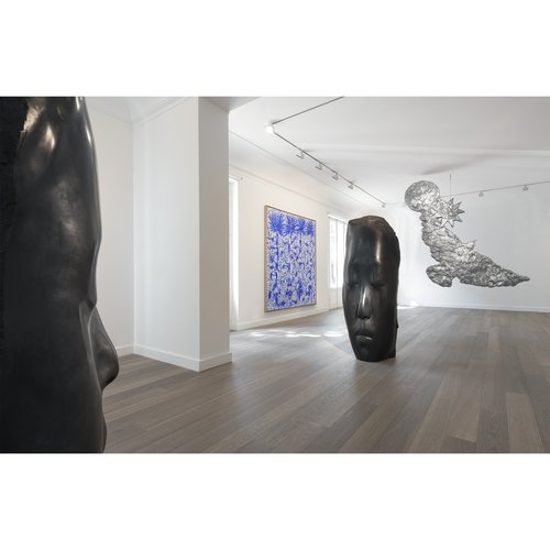
You could say that Peter Marino knows a thing or two about style. From his signature head-to-toe leather outfits to his boundary-bashing architectural projects for luxury brands like Christian Dior and Louis Vuitton , Marino has long understood that a beautiful, high-quality works are the key to making a lasting impression. Naturally, the world of fine art is nothing if not amenable to this idea, and Marino’s career is in part defined by his continuing comissions from with equally iconoclastic artists of all stripes.
In these excerpts from the just-released Phaidon monograph Peter Marino: Art Architecture , we take a look at some of the starcitect’s coolest collaborations over the course of his colorful career.
READ PART OUR TWO-PART INTERVIEW WITH PETER MARINO:
“Art Architect” Peter Marino on How He Became the Dark Prince of Luxury
Peter Marino on What Contemporary Art Can Do for Fashion's Bottom Line
SOL LEWITT
Wall Drawing #1025
Private Residence, Palm Beach, FL, USA
2002
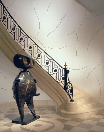
In the early 2000s, Peter Marino began designing a new residence in Palm Beach, Florida. Given the homeowners’ extensive collection of Impressionist art and eighteenth-century French furniture, one of his principal challenges was to create an environment suitable to these pieces that would still feel light and contemporary. One immediate way he saw to do this was through the art, notably a wall drawing he commissioned for the stairwell—a nod to the classic French custom of wallpapering this area. By working with a living artist, Marino was able to strike a balance between traditional and modern.
The decision to commission the work from Sol LeWitt, the Minimalist painter, was a logical one, as he’s perhaps best known for his colorful, geometric wall paintings. Here, however, the artist suggested something different: a series of Matisse-like brushstrokes rendered in black paint against a clean, white wall. The approach was in keeping with Marino’s goals for the residence, so with his blessing—and after sketches were approved by the client—the artist and his assistant proceeded with the transfer of the work to the wall. Though one of the principal pleasures of the piece is its free-form, almost lyrical quality, in fact the placement of every line had been meticulously worked out in advance, meaning the installation required several weeks of painstaking work.
Of course, one might wonder whether there was any concern on the part of the homeowners over what they would do with the piece if they ever decided to move: how could they take it with them? The answer lies in the artist’s revolutionary notion that “the idea becomes a machine that makes the art.” LeWitt was famous for putting as much importance on the instructions for how to produce a piece as on the work itself—an approach that meant his wall drawings were never truly tethered to the structure on which they were placed, or even dependent on the artist who created it (LeWitt died in 2007). Own the instructions to a work and it could travel as easily as any framed painting.
JAMES TURRELL
First Blush
Louis Vuitton, Avenue des Champs-Elysées, Paris, France
2005
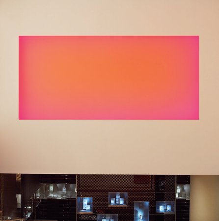
In 2005, Peter Marino was asked by Louis Vuitton to freshen up their iconic Champs-Elysées address, among the brand’s oldest outposts (it opened in 1903). The flagship is one Marino already knew well, as his long relationship with the house originated with an overhaul of the iconic Paris address in 1995. This time, however, the architect was given the freedom to take things in an even more transformative direction. “We decided to do some super cool art projects,” Marino recalls. “Instead of just putting works here and there, we decided to commission pieces that would really enhance the customer experience.”
Principal among these was a rectangular light sculpture created by the American artist James Turrell and hung on a tall wall in the area devoted to leather goods—among the most heavily trafficked in the store. (The work was later moved to the Louis Vuitton boutique in Las Vegas.) “The Champs-Elysées store gets something like 2.6 million visitors a year,” says Marino. “So the average wait for a transaction can be long. We wanted to give clients something they could watch for a while.” To that end, Turrell—an artist long known for his work with a focus on light and space—created a modular installation that presents viewers with a color field that over the course of two hours gradually evolves from red, to yellow, to everything in between. “You might see what you assume is a beautiful yellow canvas and two hours later it’s bright blue,” says Marino of the computer-programmed light show. “You almost never see the same thing twice.”
It’s an interactive experience that Turrell was only able to create after visiting the actual site—key to his understanding of how it would function in its intended environment. “For me, visualizing the setting is a fundamental part of the creative process for commissioned works,” the artist was quoted soon after the unveiling of his piece for the Champs-Elysées store. Adds Marino, “The piece was just what we needed there.”
JOHN ARMLEDER
Untitled
Hublot, Place Vendôme, Paris, France
2010
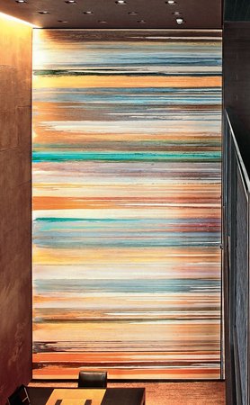
In 2010, Peter Marino reached out to John Armleder about a project he was working on for the Swiss watchmaker, Hublot. Hired to design two flagships—one on the storied Place Vendôme in Paris, the other along New York’s bustling 57th Street—Marino was interested in having the artist create examples of his iconic Pour Paintings for each of the shops. It was a project that immediately appealed to Armleder, in part because of the scale of the proposed works (both would be oversized, with the piece for the Paris boutique filling an entire wall of the double-height space), but also because he sensed in the architect someone with a real appreciation for contemporary art. “The first time I met Peter [in his office], I noticed he had a lot of work displayed by other artists I know,” says Armleder. “That’s not the norm in an architectural or design firm.”
As with all of the works in his Pour Paintings series, Armleder begins by freely spilling a range of paints (both water and alcohol-based) and lacquers down the surface of a vertically positioned canvas, allowing them to mix and respond naturally as they fill the expanse. “The reactions of the paints are completely unpredictable,” says the artist. “So it’s impossible to know exactly how the painting will turn out.” Once the process is complete he sometimes also adds spray paint and glitter to the surface of the canvas, underscoring the work’s organic quality.
Typically, these paintings are displayed just as they’re created, with the lines of paint running vertically downward from the top of the canvas. But given the dimensions of the Hublot commissions and the fact that once created, the paintings cannot be safely unstretched, the artist had no choice but to turn the pieces on their sides, with the lines running horizontally, and with three separate panels comprising the whole of the work. “I like that I was forced to hang the paintings in a way I wouldn’t normally,” Armleder confesses. “It adds something to the work.”
VIK MUNIZ
Detail of Swiss Landscape
Private Residence, Gstaad, Switzerland
2010
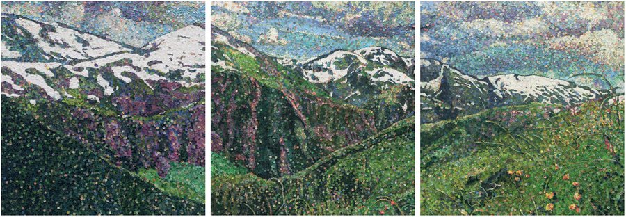
Brazilian-born visual artist Vik Muniz is someone with whom Peter Marino has had a long relationship—as a friend, as a collaborator, and as someone whose work he collects. Over the years the two have teamed up on a variety of retail-related commissions (including for Chanel, where Muniz famously fashioned a portrait of Coco Chanel in fake diamonds), but it’s a work Muniz conceived for a private residence that’s perhaps his most memorable.
The piece—an expansive, three-paneled photo of a collage depicting a verdant Alpine landscape—hangs in the recreation area of a vacation home in Gstaad, Switzerland. “Vik is great at creating these huge panels,” says Marino of the work, the largest the artist has ever done. Moreover, the panels are fully functional and can be opened to reveal a dining room—and another commissioned work by artist Rémy Markowitsch.
The collage is astonishing both for the degree of detail achieved by its multitude of tiny colored circles (which number in the hundreds of thousands), and for the fact that those circles were culled from the world’s currencies—i.e., real money. The material is one Muniz was able to access only because the homeowner is the supplier for much of the ink and technology used to produce paper money around the globe. “The variety of currency we had coming into the studio [was astounding],” says Muniz. “Some from nations I didn’t even know existed.”
To create the work, Muniz and his team first cut the essential parts from each bill, then organized the material by color, pasting each penny-sized piece to form the landscape. The resulting image was subsequently photographed, enlarged, and laminated. This last step is not one typically associated with Muniz’s work, but was deemed necessary here given the image’s proximity to an indoor swimming pool—a feature that also played into the choice of subject. “Since most people use these sorts of places in the winter,” explains the artist, “we wanted to offer a memory of the land when it’s warm.”
WIM DELVOYE
Detail of Untitled
Private residence, San Francisco, CA, USA
2014
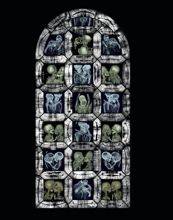
Belgian artist Wim Delvoye is known for an array of iconic pieces, ranging from a giant machine mimicking the human digestive system, to stained-glass windows featuring human X-rays—many of them sexually suggestive. It’s the sort of work that gets the attention of the press, not to mention serious collectors. Among the latter group is Peter Marino, who immediately thought of the artist for a project he was working on in San Francisco. A private residence belonging to longtime clients (and major contemporary art collectors), the home was undergoing a total overhaul, including a prominently placed stained-glass window. It presented a unique opportunity not just to commission one of Delvoye’s extraordinary windows, but also to integrate an original artwork into the architectural fabric of the home.
Although the window was smaller than any Delvoye had done before, and despite the fact that he typically declines private commissions, he was happy to make an exception here—in large part because of his trust for Marino. “Peter is someone I’d call an A-leader,” explains Delvoye. “He organizes everything but makes himself seem unnecessary. And he’s very authentic—his practice somehow stays this laboratory.” At the clients’ request (they have three young children), Delvoye avoided any sexually suggestive imagery, instead using a variety of X-rays of two people cuddling and kissing—as always, a process overseen by a professional radiologist. “You can see something romantic but you have no idea of their feelings,” explains the artist. And for the borders he used dental X-rays. “Of all the [image] framing I’ve done, this is one of my favorites,” he adds.
Once the X-rays are complete, with only minor adjustments made for shading and coloration, they are sandwiched between sheets of silk-screened glass and then sent to a manufacturer to be assembled. The final results are at once deeply human and otherworldly—an effect heightened at the San Francisco project by a Marino-designed backlighting system that ensures the window’s luminosity, day or night. “The work presents two opposing themes,” says Delvoye. “One is very materialist, the other religious or romantic.” What’s more, he adds, “The X-ray devalues contrasts, so everyone is equal.”
READ PART OUR TWO-PART INTERVIEW WITH PETER MARINO:
“Art Architect” Peter Marino on How He Became the Dark Prince of Luxury
Peter Marino on What Contemporary Art Can Do for Fashion's Bottom Line


