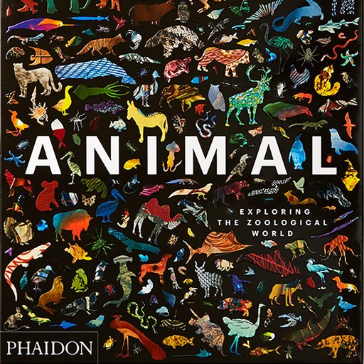
Throughout history, right up to the present day, architectural drawings have been the means through which architects initiated and developed their ideas and, in turn, they reveal the design processes whereby architectural projects—both real and imaginary—reach fruition. The diversity of the examples collected in Phaidon’s new book Drawing Architecture shows that the definition of an architectural drawing encompasses many and varied approaches: some that have developed systematically over time, and some that have been invented spontaneously to suit specific purposes—from images conceived in the mind’s eye to details worked on collaboratively by different members of a team. Polished presentation drawings made to seduce clients, or for publication, sit alongside instructive diagrams and impromptu sketches communicating intense emotions.
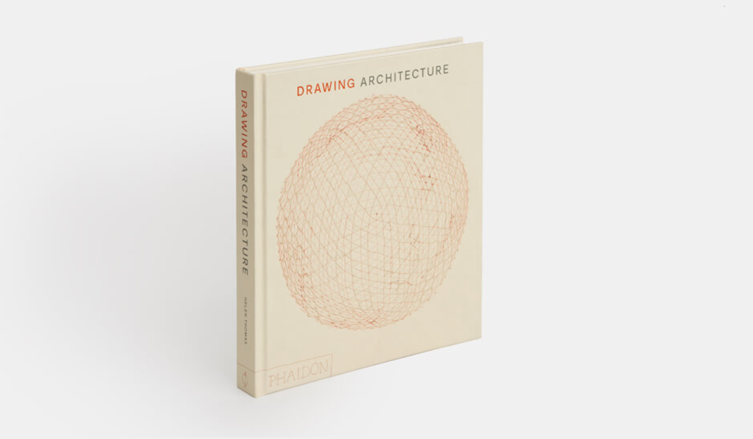 Phaidon's
Drawing Architecture
is available on Artspace for $79
Below, we’ve excerpted seven works from the book to show the breadth and beauty of architectural drawing.
MADELON VRIESENDORP
Flagrant Délit
, 1975
Watercolor and gouache on paper
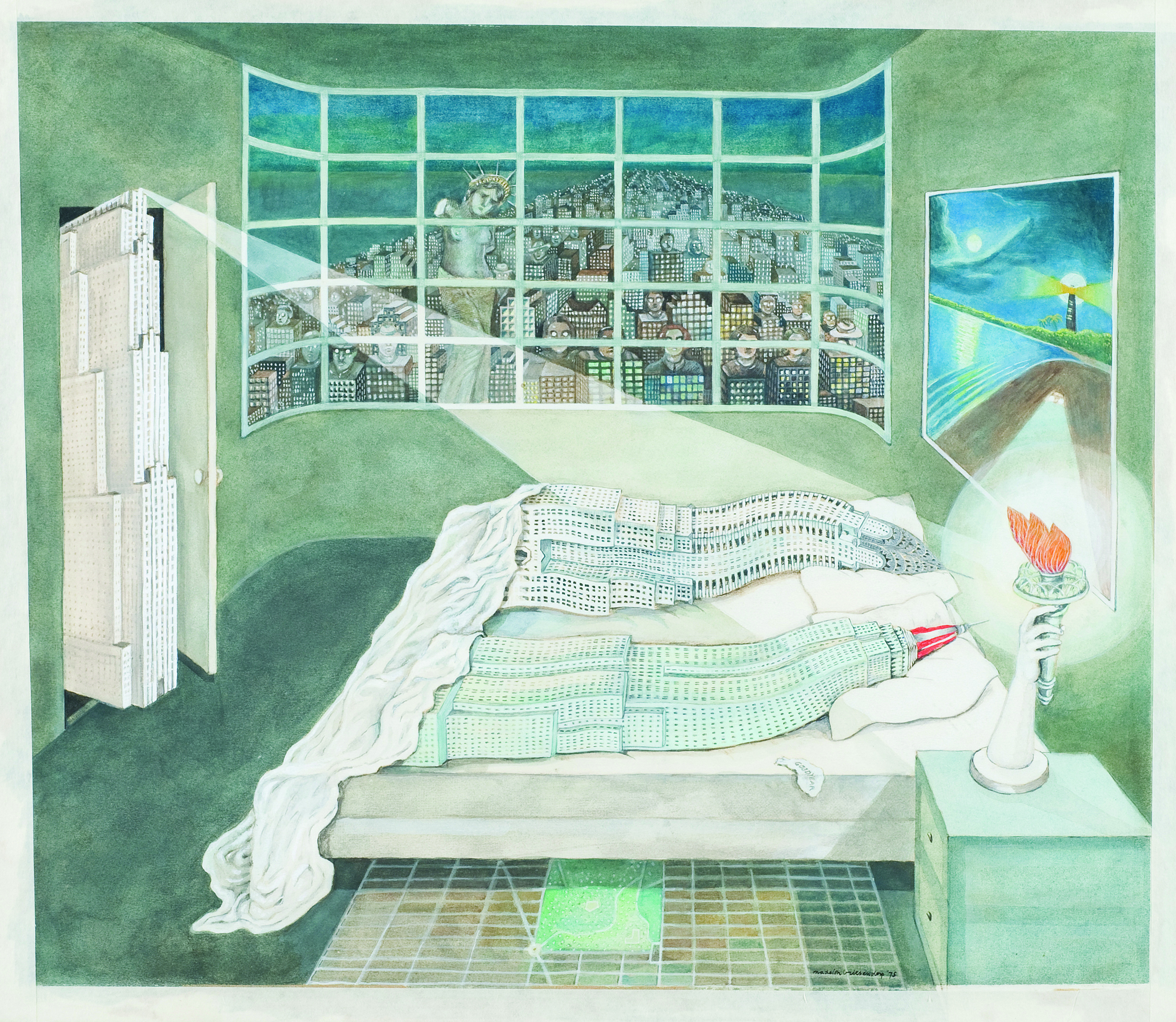 Image courtesy of Collection Frac Centre-Val de Loire, Photographer: Olivier Martin-Gambier © Madelon Vriesendorp
A fragment of a longer, fantastical narrative, Flagrant Délit is one of a series of paintings collectively called Manhattan made by artist Madelon Vriesendorp, who was a founding member of the Dutch practice Office for Metropolitan Architecture. This image was used on the cover of Rem Koolhaas’ book Delirious New York: A Retroactive Manifesto for Manhattan in 1978, and depicts two anthropomorphized skyscrapers, the Empire State and Chrysler buildings, post coitus. Other New York landmarks shown include the Statue of Liberty who, armless and accompanied by a vast crowd of serried onlookers, gazes bereft through the grid of the window, for her torch is the bedside lamp. Below the bed, the Manhattan grid is laid out as a carpet, and a Goodyear Blimp mimics a Salvador Dalí clock in its role as a discarded condom. The Rockefeller Building glares from the door, its searching beam of light panning the bed echoed in the lighthouse and headlights on the shore of the painting behind. The image presents a critique of Manhattan as the epitome of the twentieth-century city, in the form of a surrealist dream. Often attributed as an influence is Dalí’s paranoid-critical method. Through the invoking of a paranoid state—in this image, enacted through the mass overservation of a private act intensified as a moment of discovery—the intention is to dismantle the seeming reality and identity of the subject—here, the city of Manhattan with its principal characters—so that it can be understood on subjective terms, as an experience. This was in contradiction to the objectivity of modernity as it emerged from the Enlightenment, represented in the searching and obtrusive beams of light in the darkness, and the relentless logic of the grid that comprised the city—here made humans.
LOUISE BOURGEOIS
Femme Maison
, 1947
Line block
 © 2018. Digital image, The Museum of Modern Art, New York/Scala, Florence. © The Easton Foundation/DACS, London/ VAGA, NY
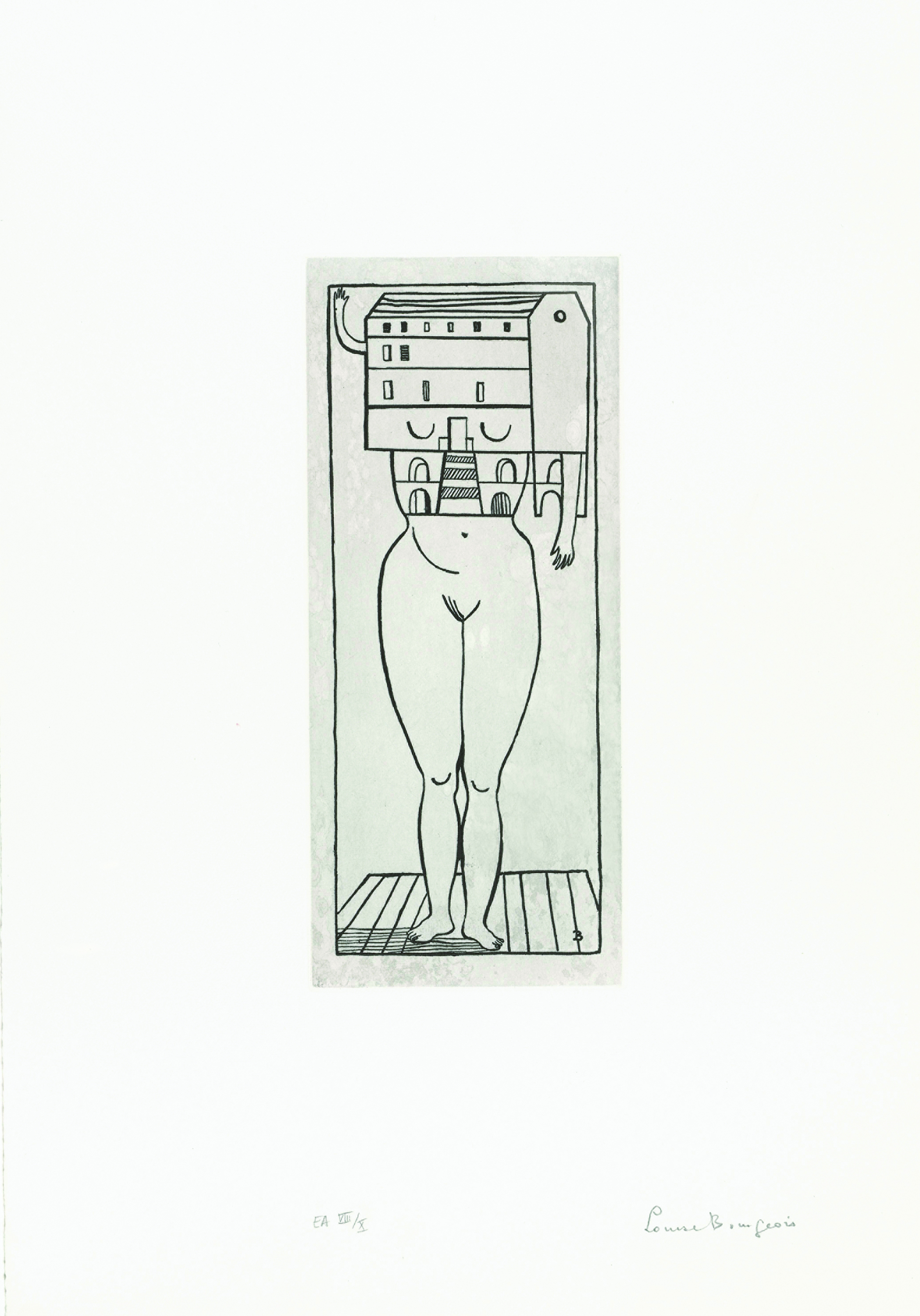
During the 1940s, when American-French artist Louise Bourgeois made this drawing as part of a group of works called Femme Maison , she was bringing up three sons. This activity can keep a woman housebound unless she has the means to replace herself, and the house is suffocating the female figure depicted here. The woman is standing upright on a small wooden platform, or perhaps confined within the walls of a tiny room. The simple line drawing, with no shading or spatial modeling, uses the floorboards upon which she stands to create a basic perspective motif. The house itself shows two of its facades, but they are flattened into a single plane. The title is a pun, for Femme Maison can translate as housewife , or literally as woman house . The building replaces the head of the woman so that she becomes a woman house, and even her breasts appear as drooping eyelids or shuttered windows looking demurely downwards. Her small arms poke out of the sides, one waves hopefully and the other hangs passively. Bourgeois characterized this figure as someone who does not know that she is half naked and exposed within her domestic prison, and she does not know that she is trying to hide. When she made this drawing, Bourgeois herself would have been struggling with the mutually exclusive roles and realms of time and space necessary to the mother and the artist, which somehow had to be reconciled. These separate places that had to be compressed together would have been located within her domestic environment, and she used architecture as a motif in her work to symbolize her feelings, and as a repository of memory for those emotions and the circumstances that produced them. Architectural structures, like the structures of memory, were a refuge—an invention that could also be a trap.
ZAHA HADID (1950-2016)
Leisure Club
, 1982
Colored pencil and paint on paper
 © 2018 Zaha Hadid. Digital image, Photo Scala, Florence
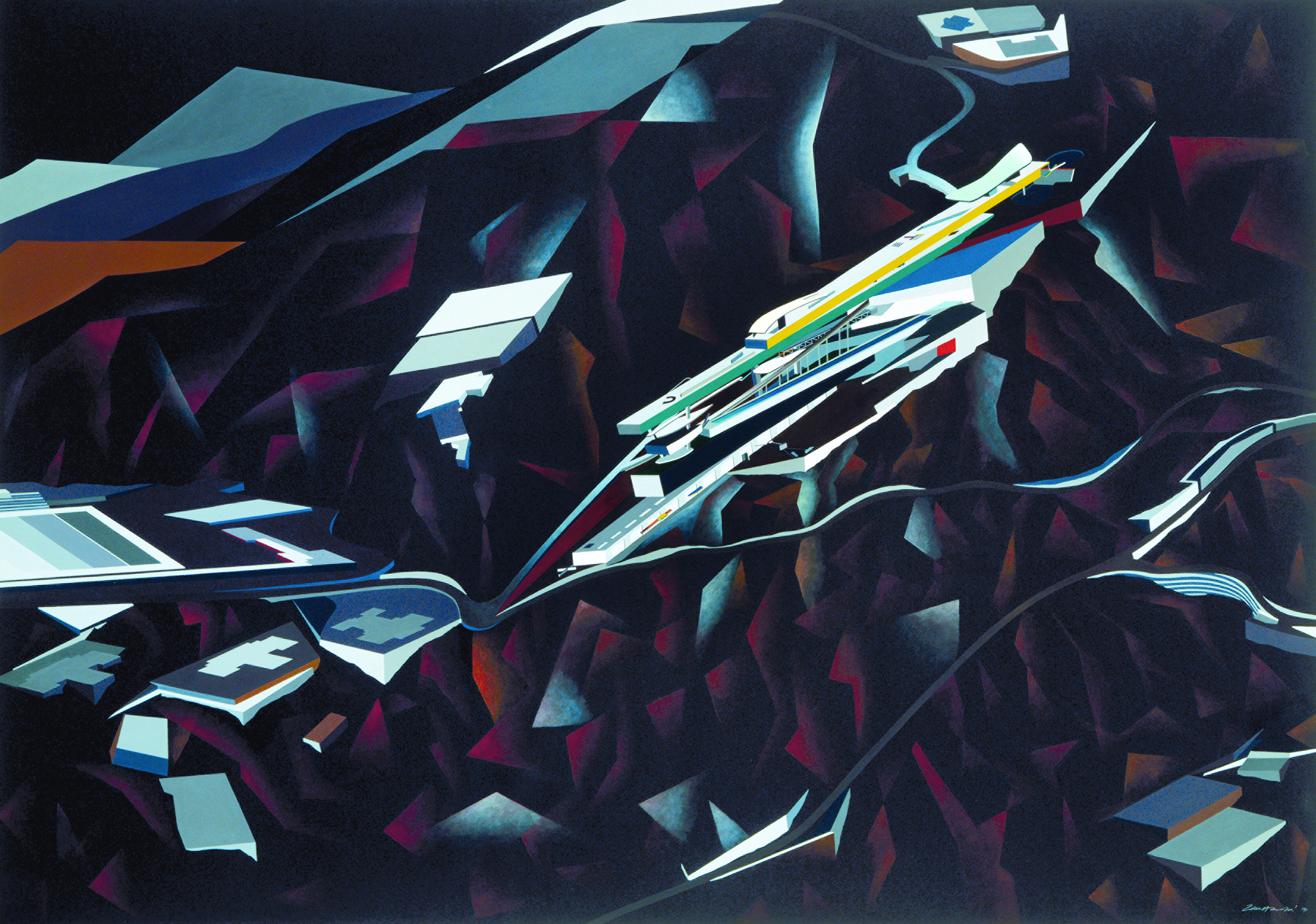
Zaha Hadid was famous for her drawings and paintings long before she built her first structure. Her immediately recognizable and original approach to constructing an architectural image was developed during her student days, when she immersed herself in the imagery of Russian Constructivist painting—especially that of Malevich, El Lissitzky and Rodchenko—and the articulation of complex geometries and calligraphy. Hadid used abstract painting as an imaginative design tool as well as a means of communication, and this hand-drawn and painted image was made following a competition held five years after she graduated. The brief was for a health club and spa in the hills of Kowloon, Hong Kong. Hadid proposed creating an architectural landmark on the steep slopes high above the congestion and intensity of the city, the central structure of which would take the form of a horizontal skyscraper teetering on a man-made topography of polished granite. The imaginary ravines of this night-time scene are painted in dark browns and blacks, often appearing as thin, jagged leaves of stone rather than solid volumes. The highlighting of these in pale grey and white defines the painting’s composition as exploding outwards from a vortex point in the lower left-hand corner, where a road makes a sharp bend. This fragmented quality led to Hadid’s inclusion within a group of architects labelled Deconstructivist in a 1988 show held at the Museum of Modern Art in New York. The meandering road in the painting traverses treacherous ground, connecting Hadid’s design with the real world of the city below. The building itself is rendered in bright colors—green, yellow, red, and blue—with dazzling white walls bounding its long, narrow bundle of cantilevered volumes. The inaccessible remoteness of these structures, floating above excavated subterranean voids, belonged to what she termed a unique geology, symbolizing the high life.
QIU YING (1494-1552)
Spring Morning in the Han Palace
, 1536
Hand scroll, ink and color on silk
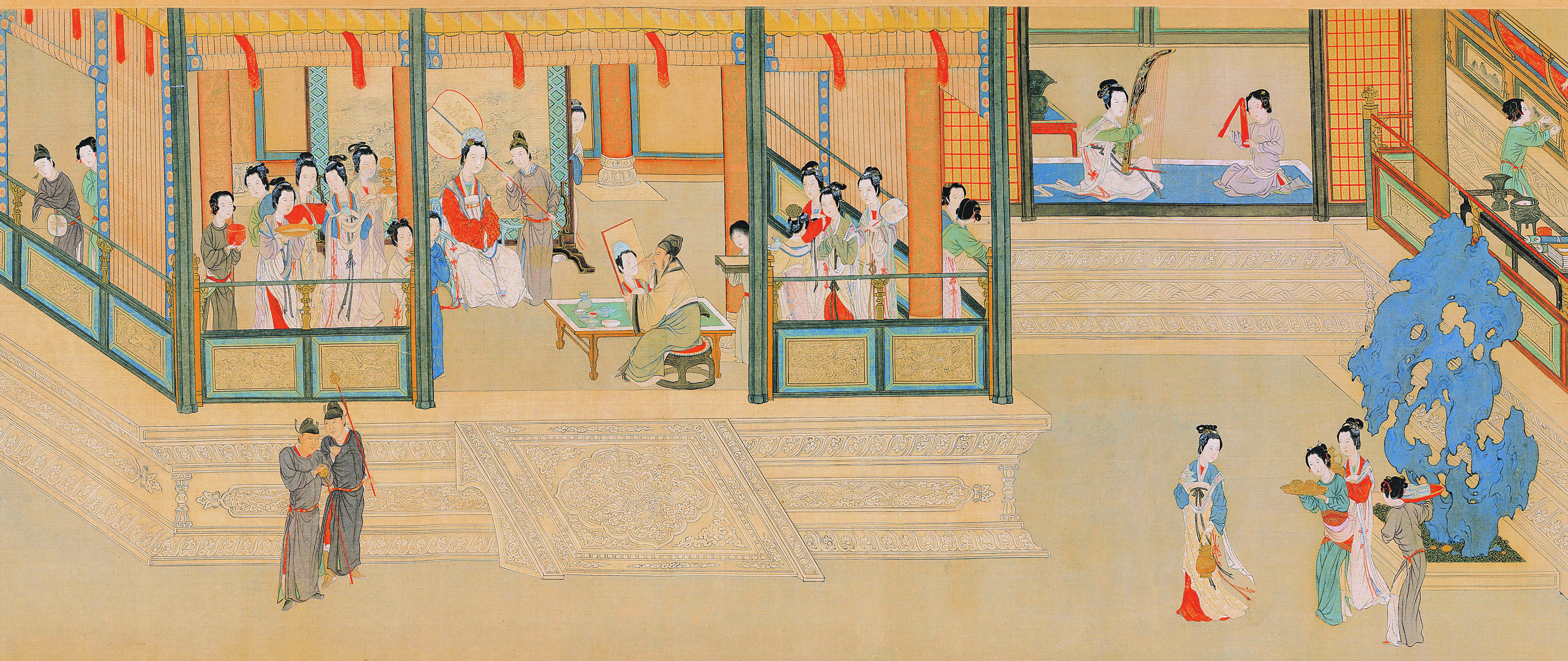 Photo © National Palace Museum, Taipei, Taïwan, Dist. RMN-Grand Palais / image NPM
The continuous scene shown in this hand scroll reveals everyday activities unfolding on a spring morning around the edges of a palace. Court ladies enjoy refined pursuits—strolling in the garden, playing musical instruments or reading—and in the center of the composition an artist, possibly Qui Ying himself, paints the portrait of one of the imperial concubines. This imaginary moment of court life during the Han period (206 BC-AD 220) was painted in the sixteenth century. Qiu Ying was a master of gongbi , or boundary painting, using a highly controlled technique and intense color, in contrast to the freehand xieyi , or sketching, of thoughts. Gongbi required the accurate depiction of architectural forms using a ruler and a meticulous brush technique. Qiu Ying sought to reveal the architectural detail of the palace, and the women’s activities take place against and within a representation of its platforms, pillars, screens, and open windows. Only a partial view is given, however, the roof is omitted so that the focus is on the gardens and the raised floor of the palace, whose depth is revealed not perspectively but through the vertical projection of the elevations that skirt its edges, shown as if seen from the left. These vertical elevations trace a plan whose bays and profections create a variety of rooms along the facade intended for different activities: some are narrow and corridor-like, others, like the portrait room, have a depth that is enhanced by screens and columns. Other parts of the scene develop natural-world images that contrast with the artificial architectural lines. Here, this is represented by the bright blue, flame-like plant, tree bark or rock—but other sections of the scroll are enhanced, and sometimes obscured, by flowing branches of majestic trees or feathery bunches of fragrant pines.
CHAMBERLIN, POWELL & BON
Barbican Centre
, 1970
Pencil and ink on paper
 John Maltby / RIBA Collections
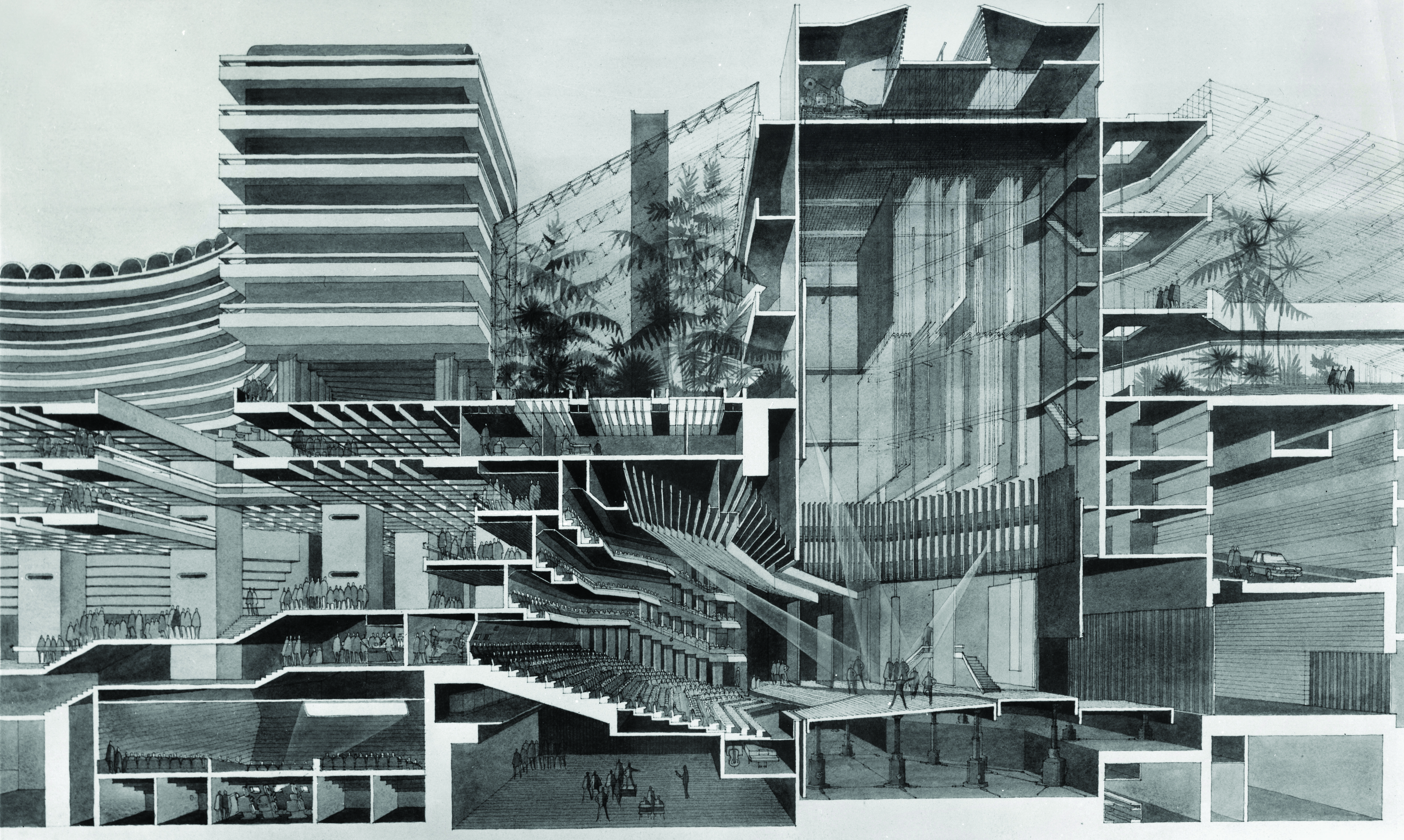
The incredible complexity of the interlocking volumes of the Barbican cultural center, the surrounding residential estate of 2,000 apartments and the public realm that connects them is fully articulated in this perspective section. The purpose of the drawing is not to explain the construction of the building or its structural organization, but purely to give a sense of the symbiotic relationship between the theater and the supporting spaces that make performance possible. The theater inhabits the center of the drawing, and the vanishing point of the perspective is located somewhere between the auditorium and the footlights, hovering in the shadowy region between the acoustic baffles and the ceiling. The soaring fly tower above the stage, with its rows of scenery hanging in waiting, is disguised on each side by a conservatory whose feathery trusses and exotic plants contrast with the powerful, concrete section. To one side, a car is seen descending a ramp into the depths of the car park, and it becomes clear that there is no longer a natural ground surface in this self-contained, utopian world. In the spaces below the auditorium, there is a mall experimental theater space called The Pit, and a cinema below the crowded foyers and suspended walkways. The architects—Chamberlin, Powell & Bon—worked on the Barbican project for nearly thirty years, from the mid-1950s until 1982, when the complex opened. Constructed on a large bomb site in the City of London, excavation for the project moved 6,709,786 square feet of soil and, at its peak, employed 10,000 workers.
Anonymous
Headless statue of Gudea
, c. 1230 BC
Carving into diorite stone
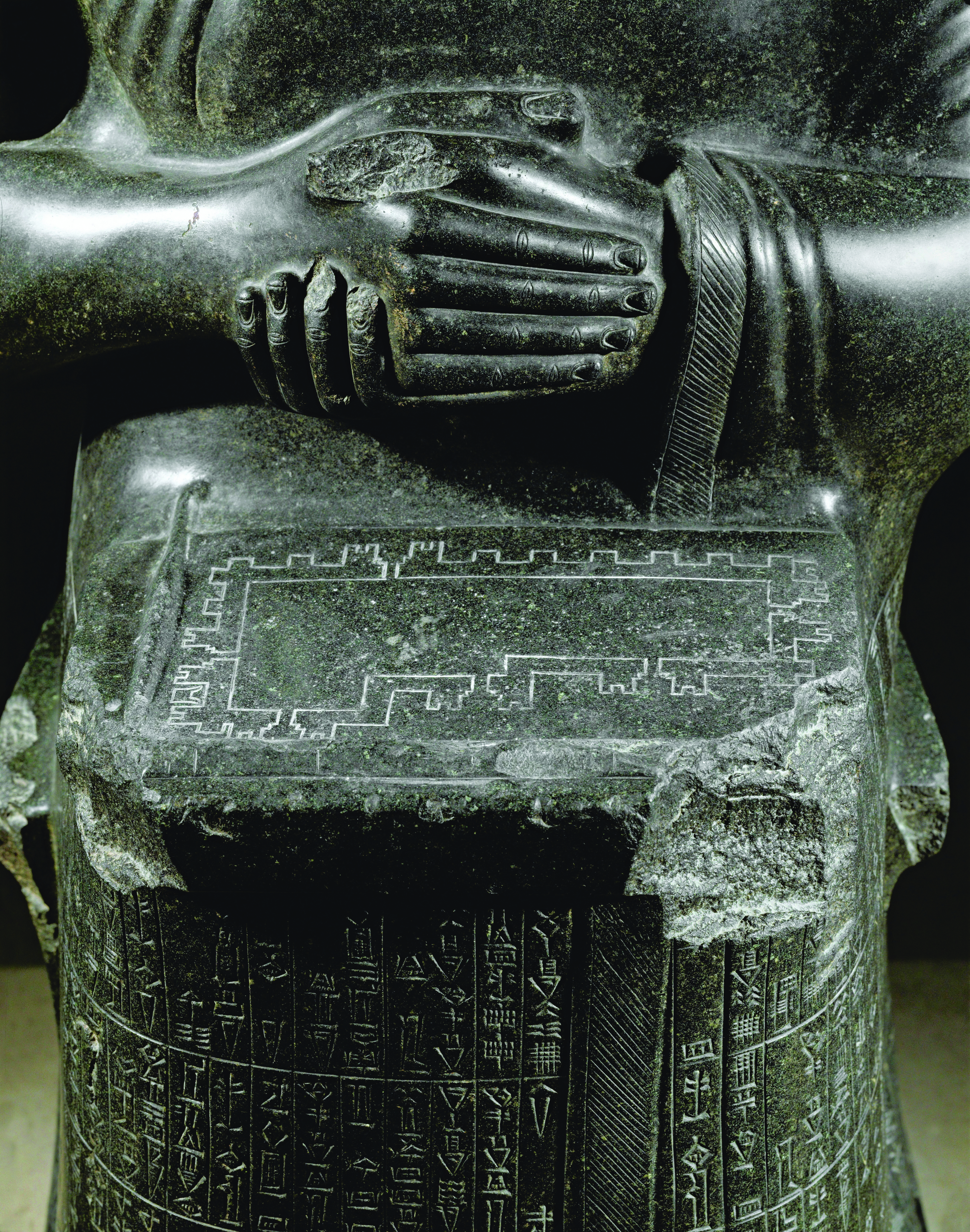
The earliest recognizable architectural plan is carved into the diorite-stone lap of a headless statue known as the Architect with a Plan. This material speaks of the importance of the statue, for diorite was known as a noble material for its durability and value. The figure was one of several excavated during the 1880s by French archaeologist Ernest de Sarzec from the Palace of Adad-nadin-ahhe in the modern-day Iraqi location of Telloh, also the modern Arabic name for the ancient Sumerian city of Girsu. Depicting the southern Mesopotamian ruler Gudea, it is one of a large number of statues that he commissioned in which he is shown either standing or sitting in front of the gods of his kingdom, Lagash. Gudea is shown here as the architect of the temple, or Eninnu, dedicated to his personal god, Ningirsu—one of the religious monuments that he built or restored during his twenty-year reign, c.2145-25 BC. The drawing is depicted on a stone tablet, and consists of an orthogonal projection of the windowless wall around Ningirsu’s shrine, which would have been made of clay and brick. The smooth inner plane of the interior is supported by a regular rhythm of pilasters that act as buttresses and it is pierced by six narrow entrances, which attest to the fortified nature of the wall. The figure itself is covered with the longest known inscription in Sumerian; it reveals an account of the construction of the temple, including the geographical sources of the building materials—stones from northern Syria, cedars from Amanus and treasure confiscated in Elam, the two last-named locations in modern-day Turkey and Iran respectively.
ETTORE SOTTSASS
(1917-2007)
Progetto di architettura monumentale per la conservazione della memorie nazional-popolari
, 1976
color gouche and india ink on paper
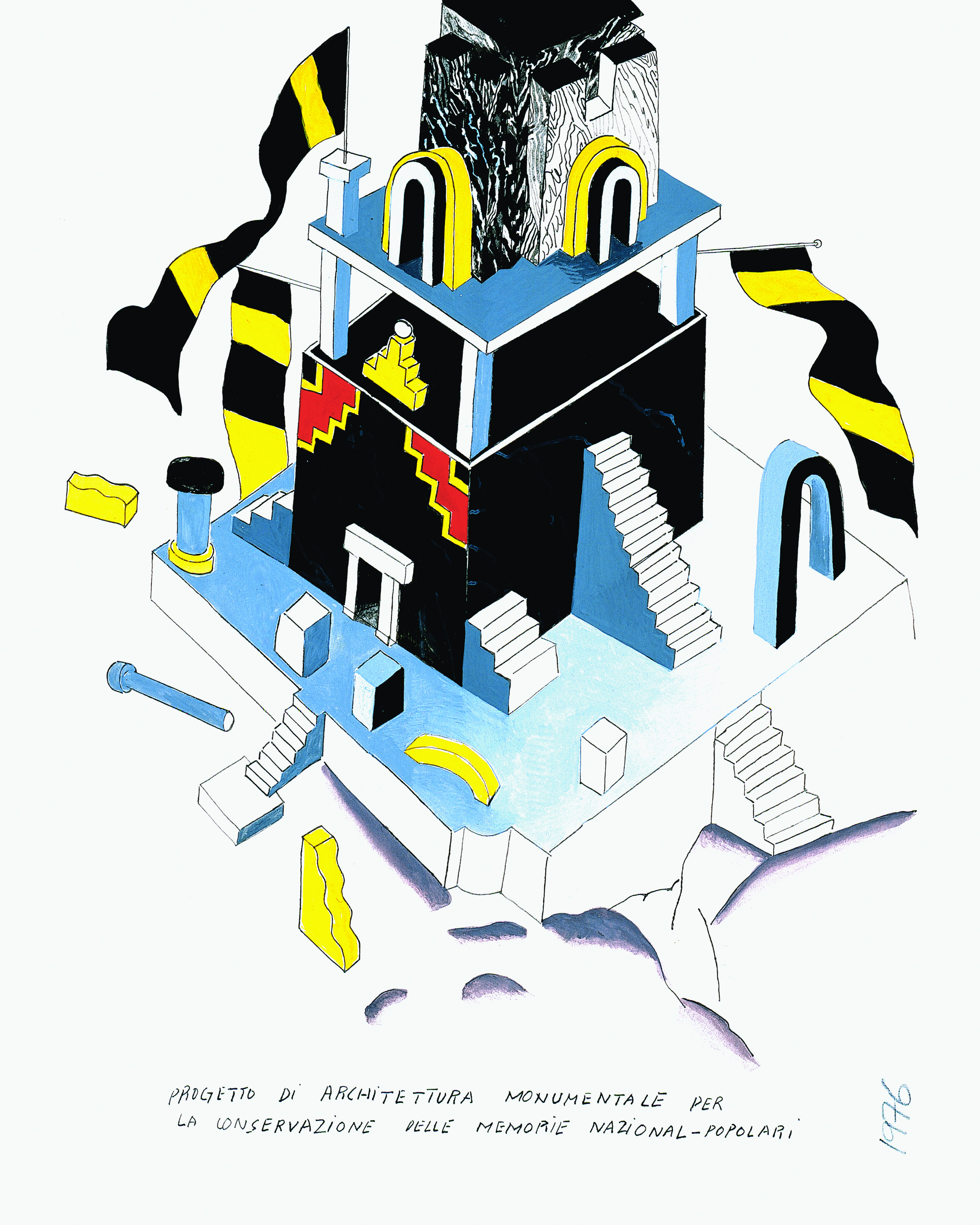 © ADAGP, Paris and DACS, London
Austrian architect Hans Hollein compares the drawings of Ettore Sottsass to the vase—a leitmotif of his work and vision, embodying his attitude and philosophy. The drawing, as the vase, is a metaphor but also an intrinsically useless object that finds its use activated by the imagination. Theorist, writer, designer and architect, and one of the founders of the design collective Memphis, Sottsass produced many different kinds of drawing. This is an example of his architectural images, in which the volumetric is accentuated and color plays a key role. In this drawing, the colors are relatively muted, dominated by black and a neutral blue. In this axonometric projection, the fields of color are solid and dense, the blue fading to white on the floor of the plinth is the only intimation of modeling by directed light. The dominant, subdued colors contrast with yellow and red details—animating the fluttering flags, for example, and coloring the archaeological fragments that lie scattered on the excavated ground and emerging plinth. Yellow is used to highlight the round arches on the top level and, along with red, defines the stepped motifs painted on the walls of the main volume that are reminiscent of Mayan decoration. Sottsass is playing with the nationalist overtones in the title of the drawing, poking fun at the earlier Novecento movement’s preoccupation with Imperial Rome and the continuity of the Classical tradition, which was reflected in the autonomous architectural language proposed by the Tendenza architects.
RELATED ARTICLES:
How Ettore Sottsass Brought the Poetics of Painting into Design and Architecture
7 Innovative Mobile Abodes (and the Artworks They Curiously Resemble)


